This spring, Instagram was abuzz with images from Atlanta Homes & Lifestyles’ 2017 Southeastern Designer Showhouse. “Perhaps no other showhouse in Atlanta’s history has felt quite this regal,” wrote Atlanta Homes & Lifestyles. The Buckhead home was built for the Haverty family in the 1960s by celebrated architect James Means, who employed reclaimed materials, from the cobblestones in the driveway and brick on the house’s front facade to the first floor’s heart pine floors and intricate paneling. Architect Yong Pak and builder Michael Ladisic oversaw a sensitive overhaul of the historic estate including a family room, master wing, upstairs laundry, basement with wine cellar, tasting room and “man cave,” a garage and above-garage apartment, a rear screened porch, infinity-edge pool with Peacock Paver deck, and a pool porch wing with pool bath and shower. Whew!
In case you missed this gorgeous showhouse, below is a sampling of my favorite rooms, photographed by Emily Followill for Atlanta Homes & Lifestyles. And at the end of this post, I have included some before images from the real estate listing!

When crafting the first impression of this historic home, its entry foyer, Jackye Lanham found both inspirations and challenges, thanks to the classical motif of the Pompeian wave on the stair skirt board and the black-and-white zigzag pattern of the freshly laid tile floors.

Jackye Lanham

In the family room, decorator Phoebe Howard took her cues from the verdant green of the exterior views and the cool blues of the kitchen/breakfast room, allowing both natural palettes to inform her lush approach to this gathering space.

Designer Tammy Connor had an English country house in mind when she took on the challenge of revamping the home’s original dining room.

State-of-the-art kitchen by Matthew Quinn of Design Galleria Kitchen and Bath Studio. The hammered brass hood and hardware, both custom creations by Design Galleria, as well as the Calacatta Gold Extra marble island by Levantina, infuse inviting warmth and storied heritage to the 21st-century space.

Lauren DeLoach was inspired first and foremost by the history of the house—and then the preferences of its inhabitants. “Blue is [the lady of the house’s] favorite color,” explains the designer, who employed a classic approach for the breakfast area and its adjacent cooking and prepping spaces, for which she collaborated with Design Galleria Kitchen and Bath Studio.

Lauren DeLoach

When designing the living room, designer Stan Topol envisioned an open space where homeowners and guests could come together in conversation.

Tristan Harstan drew influence from writer and fashion designer Pauline de Rothschild when designing the tranquil master bedroom and sitting room.

Tristan Harstan

In the master bathroom, Matthew Quinn of Design Galleria Kitchen and Bath Studio Studio stayed true to the architecture, making subtle yet substantial design choices in the dreamy suite.

Matthew Quinn

Matthew Quinn

Matthew Quinn

Matthew Quinn

Inspired by English and old-world European styles, Sarah Bartholomew used a hand-printed fabric from Bennison Fabrics (American Resist in New Blues on Oyster) as the basis for this mother’s suite. In addition to upholstering the walls with the elegant fabric, Bartholomew employed the print for the window treatments, headboard and bed coverlet, enveloping the space in classic blue and white.

Sarah Bartholomew

Sarah Bartholomew

A floral fabric (Tree of Life by Michael S. Smith for Jasper) takes center stage in the master passage, where designer Anna Braund, inspired by spring’s blooms, decided to upholster the walls with the eye-catching print.

Anna Braund

Cate Dunning and Lathem Gordon of GordonDunning turned to a favorite wallcovering in new colors—Schumacher’s Lotus Garden pattern in lavender, blue and pink—to set the whimsical tone of the art study.

“When the homeowner walks into her office, we wanted her to feel good entering her own little jewel box with a mix of accessories and a blush-pink ceiling,” designer Margaret Kirkland said.

“A powder room doesn’t need to demand attention, but rather fit in its surroundings, acting as a complement to its grander adjacent rooms,” says designer Randy O’Neil of Renaissance Tile & Bath, which was the exclusive tile and stone provider for the Southeastern Showhouse.

“We felt it was important for the feel of the wine tasting area to harmonize with the aesthetics of the adjoining wine cellar itself, which meant creating a space that was contemporary, clean and crisp,” says Boxwoods Gardens & Gifts co-owner Dan Belman, who, along with co-owner Randy Korando, outfitted the commanding space with luxe details and comfortable accents.

Laundry rooms lend themselves more to function than fashion, but Minhnuyet Hardy blended both in a smart and sophisticated manner.

The timeless veranda and vestibule by Will Huff and Heather Dewberry of Huff Dewberry pushed the limits of outdoor living.

Yong Pak of Pak Heydt & Associates and builder Michael Ladisic of Ladisic Fine Homes

Yong Pak of Pak Heydt & Associates and builder Michael Ladisic of Ladisic Fine Homes

Dana Wolter was tasked with designing the mudroom, powder room, and butler’s pantry.

Ann Huff and Meg Harrington of Huff Harrington Home channeled their penchant for all things French into the veranda and vestibule gallery.

In the rear courtyard, an infinity-edge pool by Neptune Pools overlooks Nancy Creek below. Landscape architect Richard Anderson completes the private-estate feel.
Images and captions above via Atlanta Homes & Lifestyle. Images below are from the real estate listing…
For sources and a plethora of additional beautiful images from the 2017 Southeastern Designer Showhouse, please visit Atlanta Homes & Lifestyles. Which room is your favorite?

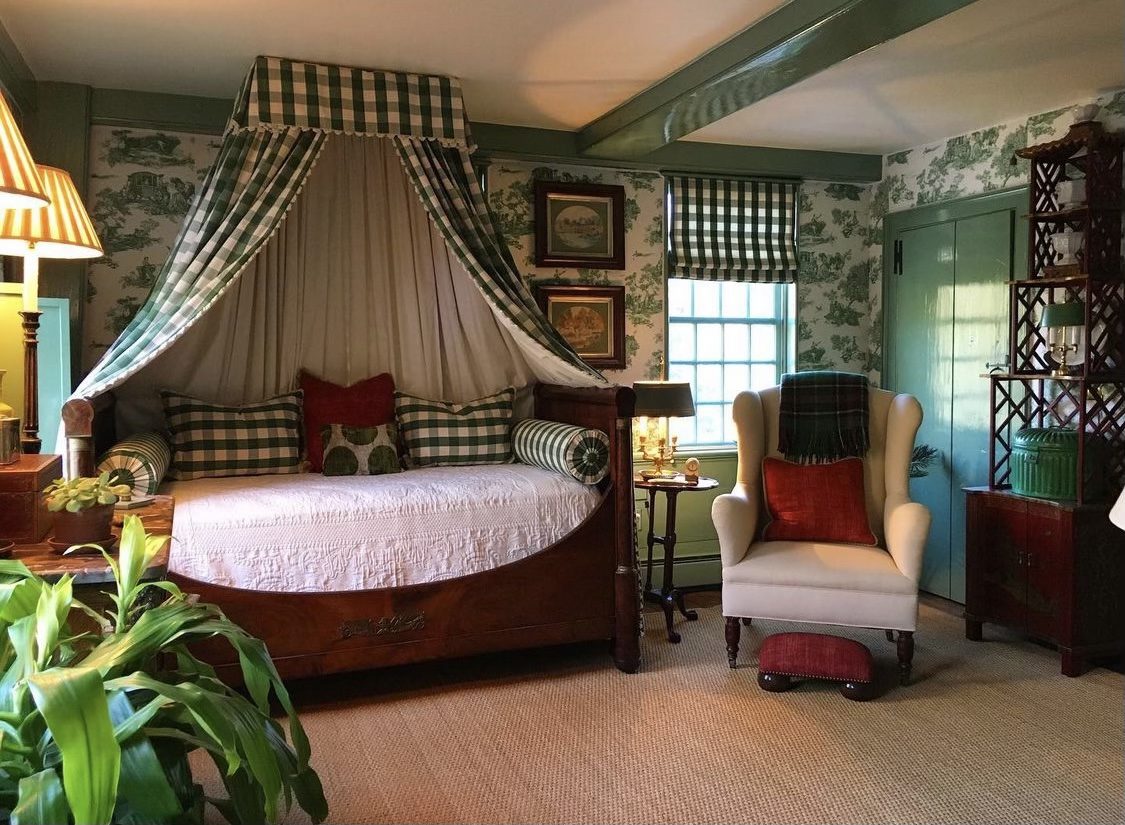
With the exception of the floor in the stair hall, I loved the ‘before’ so much more. Maybe it’s the overexposed photography so popular these days, but it all looks rather blanched. There is nothing wrong with original wood finishes. They look right for the house. That being said, there are a lot of good things that the designers added. The light fixture in the stair hall is all wrong, however. The original was better. I shudder to think what was removed in this “sensitive” redecoration. The bedroom with the Gracie panels is lovely, and I see a lot of good ideas here. It pleases me that the overall decor is traditional, as modern style would not be appropriate.
I agree. It was so beautiful before. What a shame.
I like the house in its original condition in the MLS listing. Too OTT decorating, house lost its soul, needed a more sensitive respect to the architecture
Liked the “before” much better. The new rendition seems cold and often generic. Also as with most showcase homes, the rooms never seem to be cohesive or consistent.
It’s all for a very good cause.