


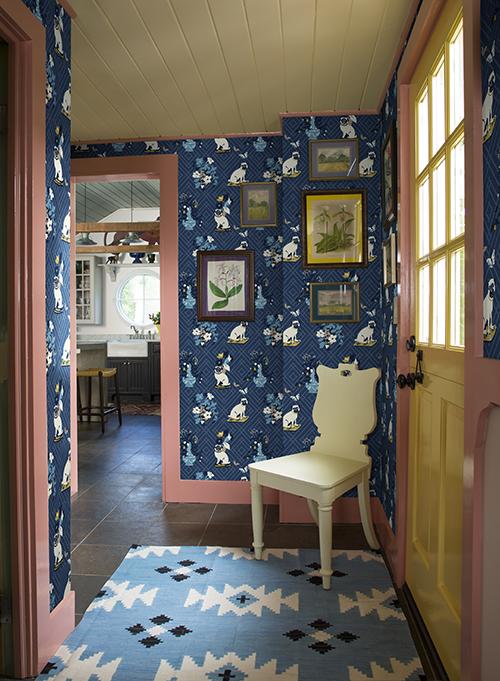
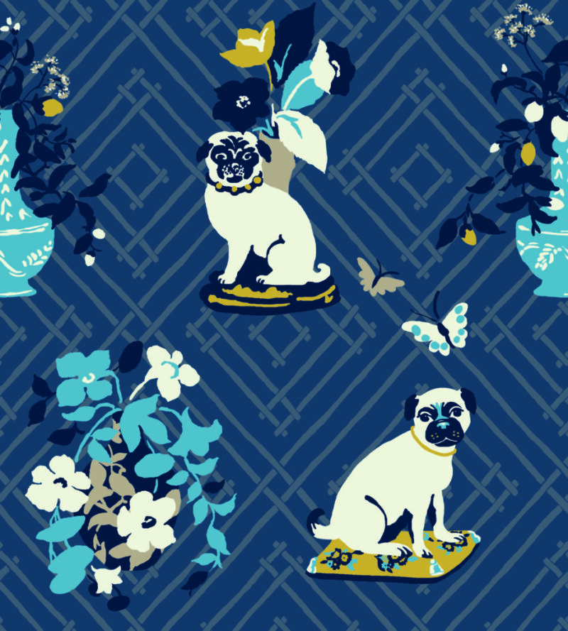
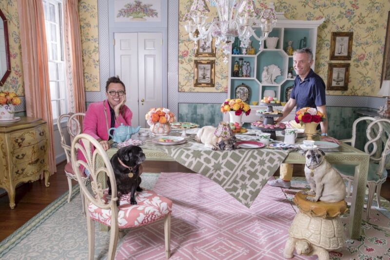
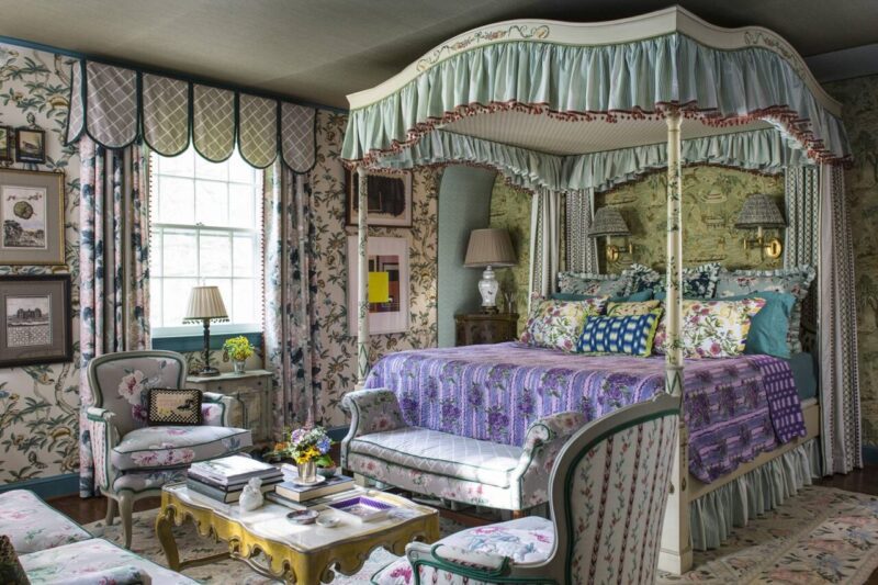
In anticipation of the Madcap Cottage (@madcapcottage) gents launching their brand-new, printed-in-America collection of fabrics and wallpapers this Labor Day weekend, we asked the designing duo for their tips on how to mix prints and patterns. All fabrics and wallpapers are available at madcapcottage.com, and all images are from their elegant portfolio infused with whimsy and charm…. just like the gentlemen themselves! It is a delight to welcome John and Jason back to The Glam Pad today!
Hello, friends! It’s John Loecke and Jason Oliver Nixon of Madcap Cottage… We are known for our passion for prints and patterns and find that folks are often intimidated or scared by the process of pairing florals with stripes and geometrics with scenics. We certainly hope that you are following our marvelous, Madcap adventures on Instagram at @madcapcottage, but if you aren’t, skip on over there right this very second.
Be bold, be brave, and dive into that wonderful, whimsical pool of all things prints and patterns. Who wants a world that is beige and boring. And, no, that was not a question. With that said, here are ten tips to get you started on your prints and patterns adventure.
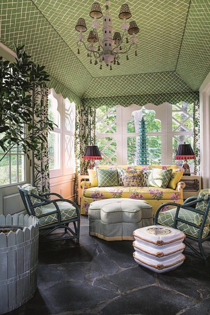
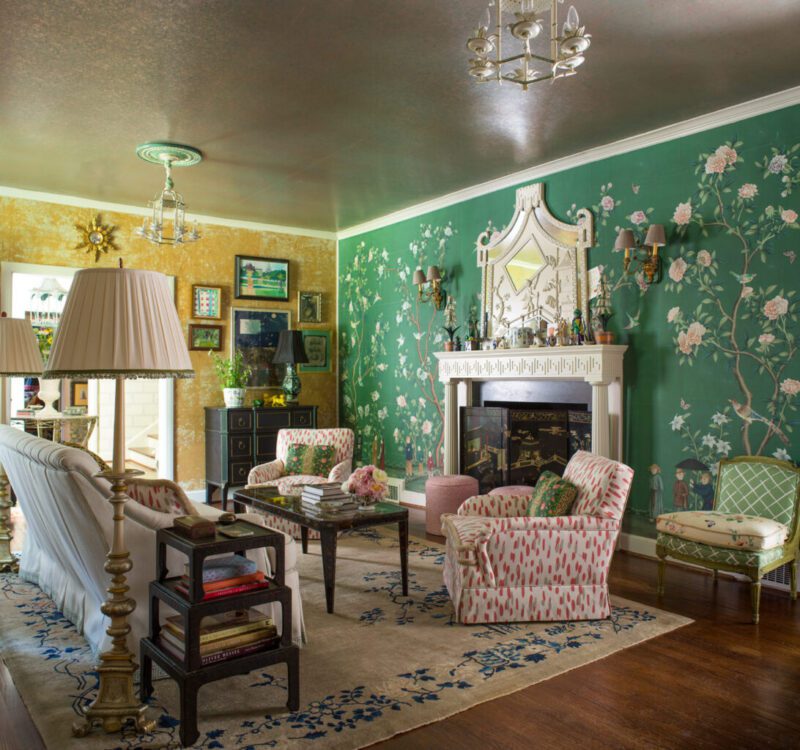
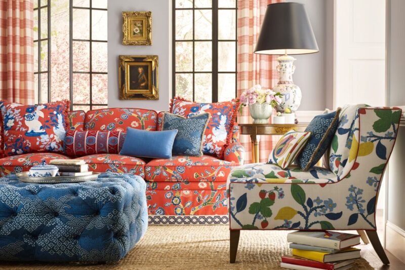
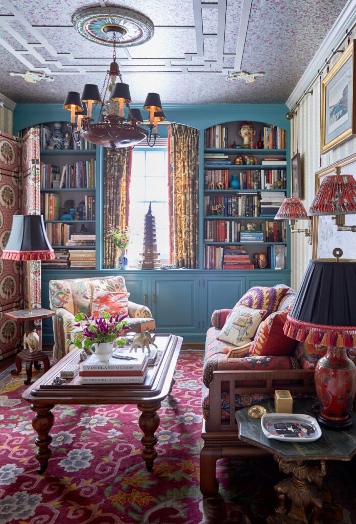
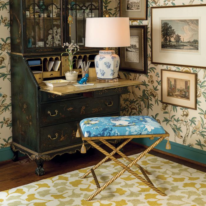
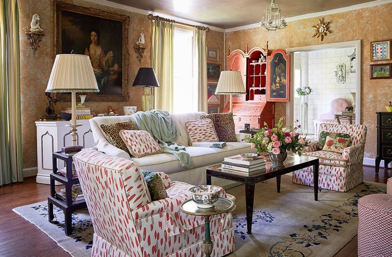
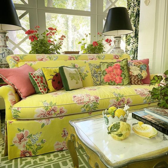
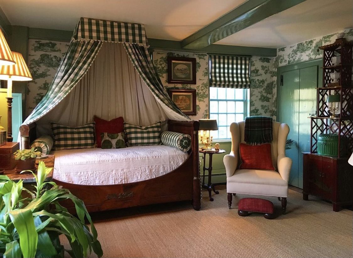
1. Choose one color and carry that hue across all of the patterns in a room. Let’s say you choose blue as a room’s dominant color. Mix turquoise stripes with navy florals, pale blue geometrics with aqua polka dots, and teal palm trees with indigo gingham. The eye will read the colors as one. Same with green. Red. And extrapolate from there.
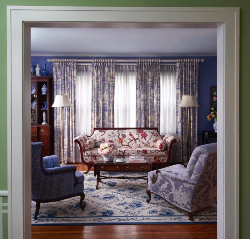
2. Do look for prints that share common colors. This will make seemingly disparate patterns work together.
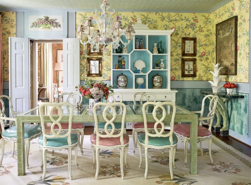
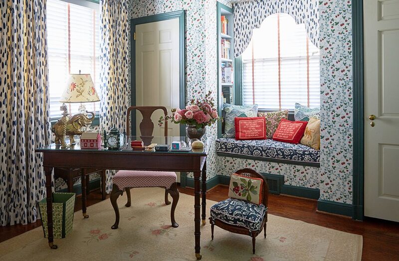
3. Don’t go halfway with your use of prints and patterns. It will look like a mistake. Instead, go all out: Mix florals, stripes, and checks. The result will appear effortless.
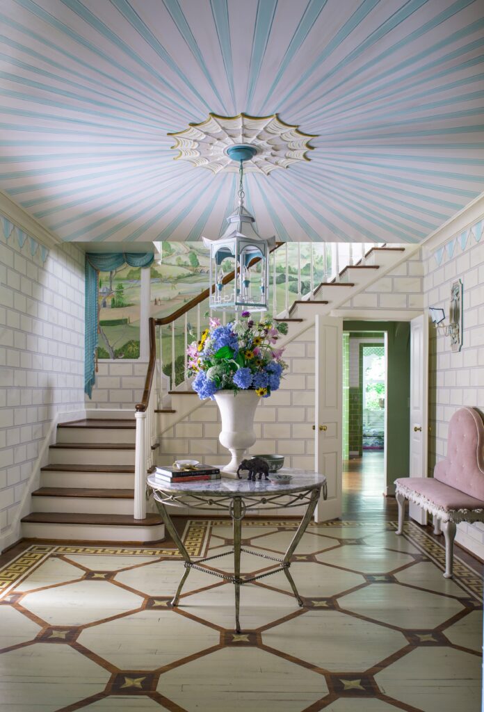
4. Don’t forget about scale! You want to mix big patterns with small to keep the eye engaged as it moves across a room.
5. Don’t think trendy and “of the moment.” Think timeless. Florals, stripes, and checks are classic prints that never go out of style.

6. Do look to the fashion runway for inspiration. Floral prints and embroidered details are HOT this season and the high-end fashion world offers inspiration for breaking out of mixing and matching stereotypes.

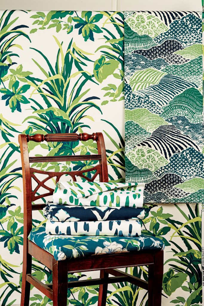
7. Look to nature for inspiration on pairing colors. For instance, every color works beautifully with green. Says John, “If it works in your garden, it will work in your home.”
8. Don’t be afraid to take a risk with a print or pattern. If you love the pattern, that’s all that matters. Understand the principles of mixing and matching but feel free to break them.
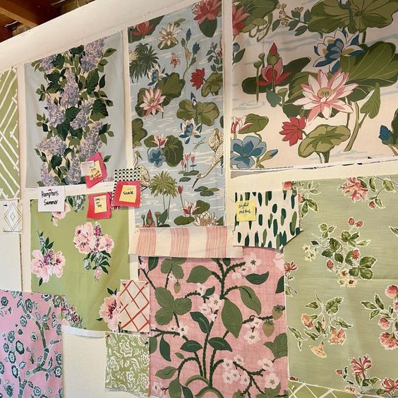
9. (Gratuitous plug alert!) Shop within a curated collection. The brand-new Madcap Cottage fabric and wallpaper collection, for instance, delivers highly curated prints and patterns in which everything within the line works together. Pair any pattern in Hamptons Summer, Postcards from Maine, Sunnylands, Up at the Lake, Viva America!, and Weekend in Palm Beach together, and watch the magic unfold.
10. Details make a difference. Just as that special piece of jewelry or pair of shoes can make an outfit, the right window treatments or decorative pillows can really transform a room. And window treatments and pillows are a great place to start your prints and pattern journey.
And there you have it! Ten tall, tan, terrific tips…
And if you have any questions about how to become true mix masters, you can always reach out to us on Instagram. And be sure to check out our brand-new fabric and wallpaper collections on the Madcap Cottage website—all printed in America.
Most importantly, have fun!

Thank you John and Jason for these fabulous tips! The Madcap Cottage gents are truly masters of the mix. Would you like to learn more design lessons and tips from this dynamic duo? They have graciously offered to return to The Glam Pad to answer your decorating dilemmas… Please email me with your questions or concerns!
For additional information on Madcap Cottage, please visit their website and follow @madcapcottage on Instagram for ongoing inspiration.


Timeless interiors….love everything right down to the minute details.
I love mixing patterns and agree with the idea that if you like it…it works. But, it still can go horribly wrong LOL.
Love John and Jason’s decorating style! Have been following them on IG for a while now and they always make me smile.
I appreciate the varied patterns “thrown” ( by design!) together and the bold use of color. It gives inspiration even for those of us who are more conservative! This is a very enjoyable post, thank-you.
Finally! Color, pattern and Fun! I’m so over neutrals. I just love this!
I love EVERYTHING John and Jason design. They have the magic of creating color, pattern and unique design that expresses comfort and pure joy! I purchased a magnificent area rug from them recently…it not only dazzles the room but keeps me dazzled too!
I love everything they do. Simply, their interiors spell Happy, Happy, Happy!!!!