

In all honesty, I have always rolled my eyes at the annual “Color of the Year” announcement, dismissing it as a marketing ploy, but it turns out there is actually a science behind it! Contributing Editor, Natalie Aldridge, is giving us the inside scoop… and we are also taking the opportunity to share some of our favorite “peri” rooms. We have loved this lovely color for years and feel that it is timeless!
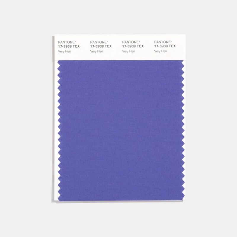
Pantone Color of the Year: Very Peri
Color us delighted! Pantone has announced 2022’s Color of the Year as (drum roll) Very Peri. Each new year the formidable company best known for its development of the first color matching system selects a color to reflect global culture, interests, and events of the moment. Here at The Glam Pad, Pantone’s yearly announcement offers an exciting opportunity to reflect and look forward to the year ahead.
At a surface level, the selection of Color of the Year can appear arbitrary and maybe even a tad pomp. With the vast range of colors selected throughout the years, it could even appear as though the hue declared “It” for the entirety of a year may have been pluck from a hat.
On the contrary, Pantone conducts immense research in preparation for the selection. What originally began as an afterthought developed into a panel of twenty individuals dedicated to careful analysis. Research begins in the Spring and lasts nearly nine months. The team evaluates everything from current events, economic conditions, films in production, sports, global shifts in culture, emerging fashion, new technology, home furnishings, etc. No theme is off-limits when exploring possible trends. Since its inception, Pantone’s Color of the Year has widely impacted product design, packaging, and purchasing decisions across numerous industries. The selected color then often makes its way into every day by way of interiors and fashion.
This year’s selection of Very Peri represents transition with “carefree confidence and a daring curiosity”. With our rapidly changing world, the hue evokes feelings of expansion, opportunity, the metaverse, and new realities of modern life. More so than in previous years, Pantone explored the idea of bringing color inspired by the digital world into the physical world.
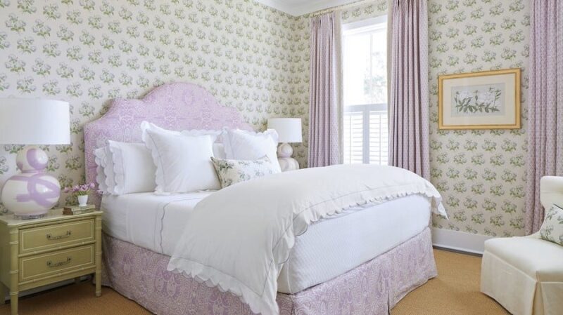
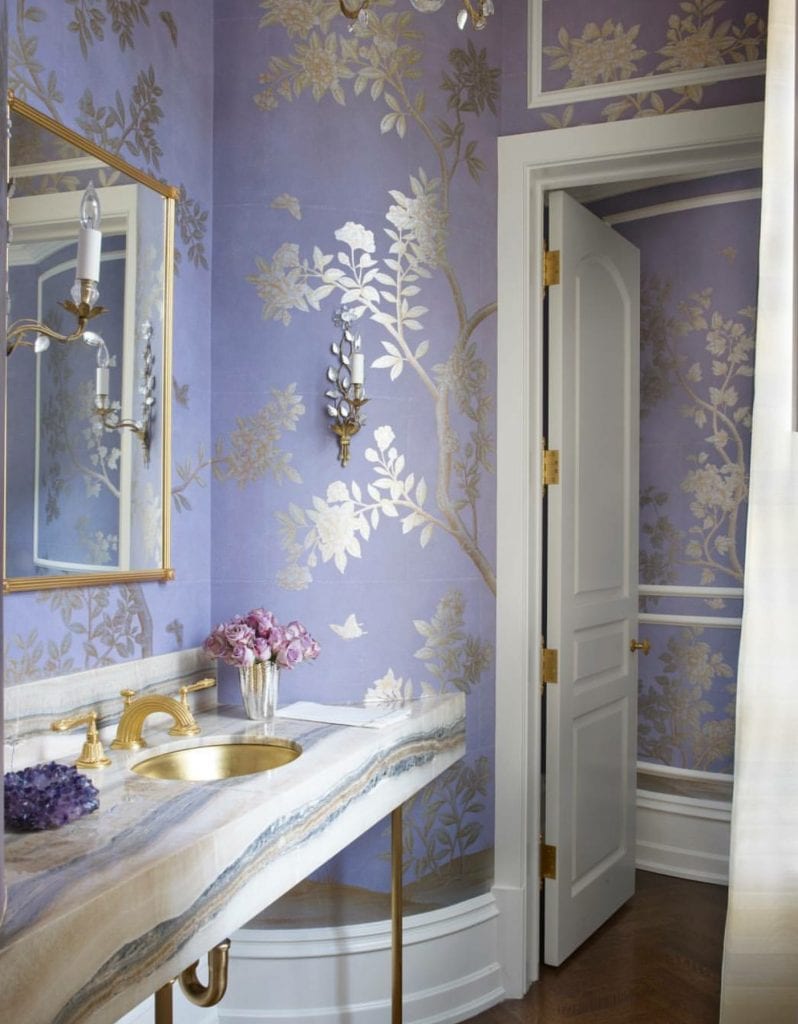
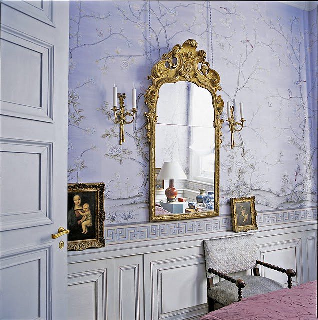
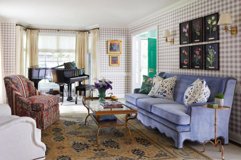
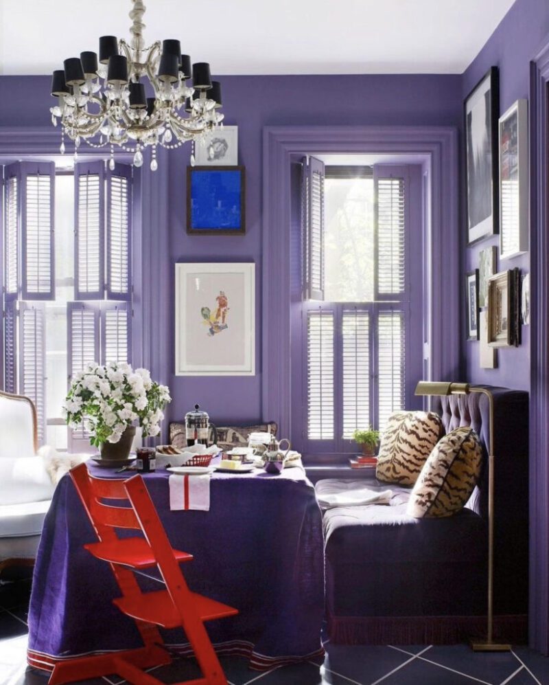
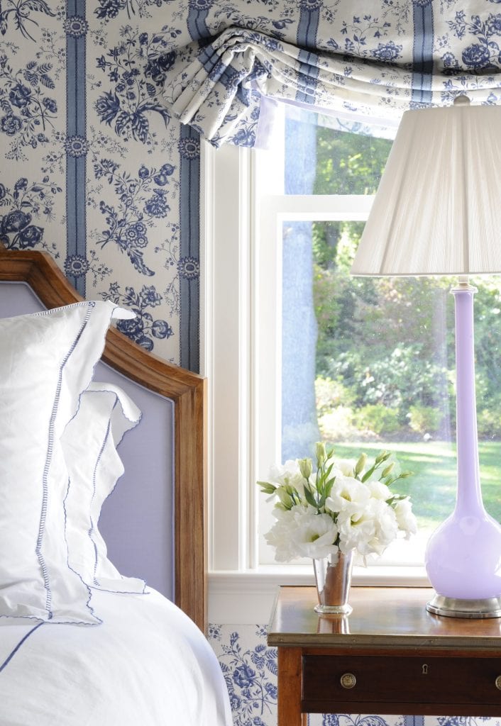
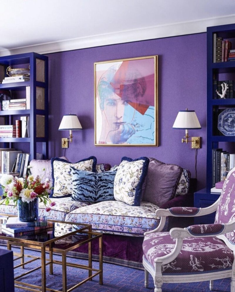
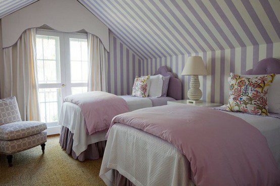
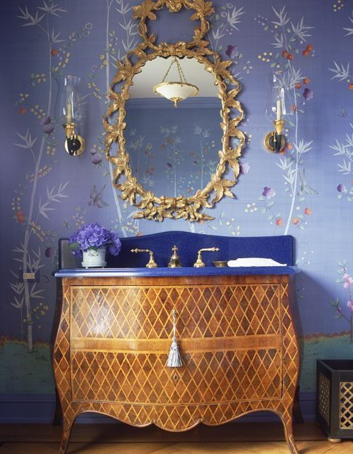
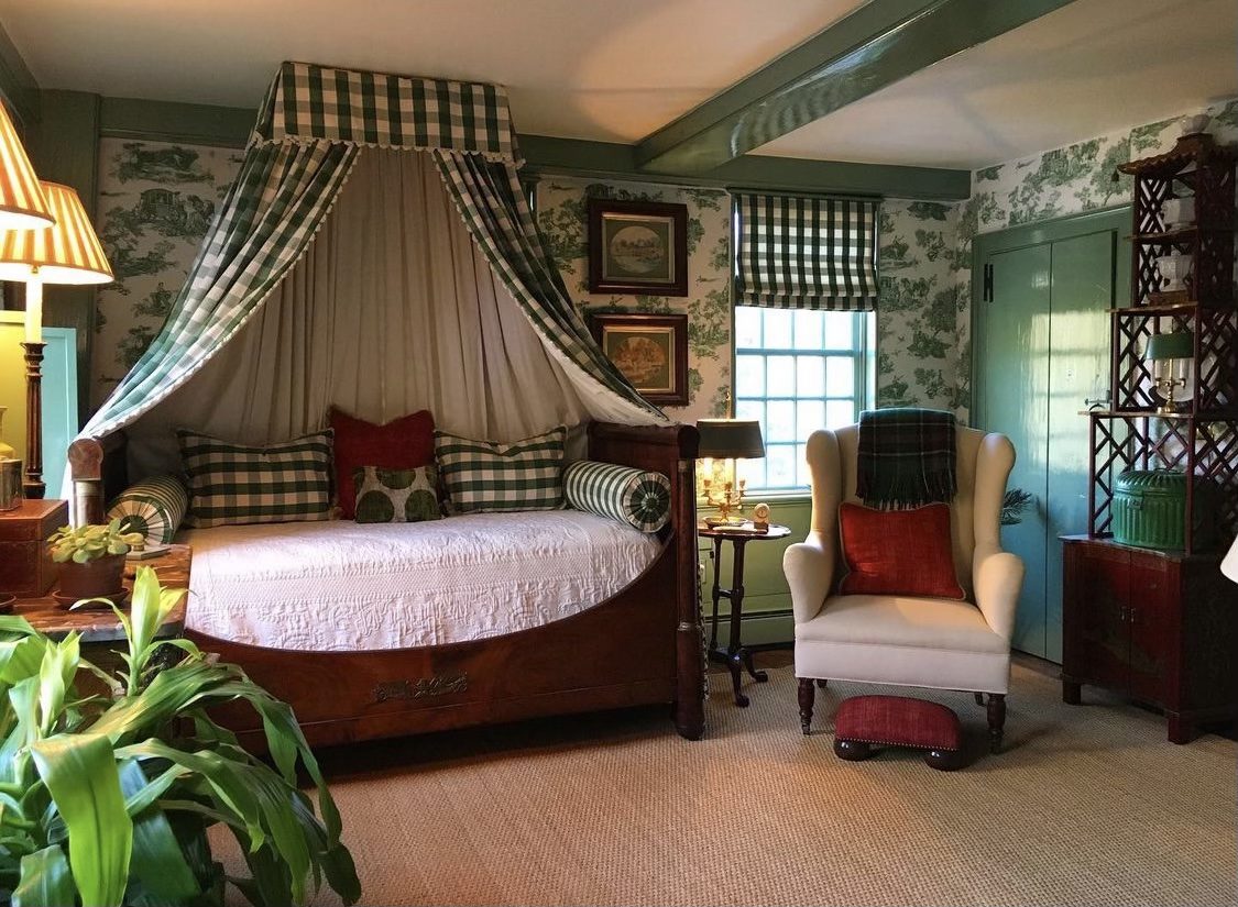
Technical analysis aside, Very Peri is bright and cheery with a rich depth. Its undertones of blue keep it classic and inviting making it a perfect shade to work into the home. Explore some of The Glam Pad’s favorite Very Peri inspired spaces below.
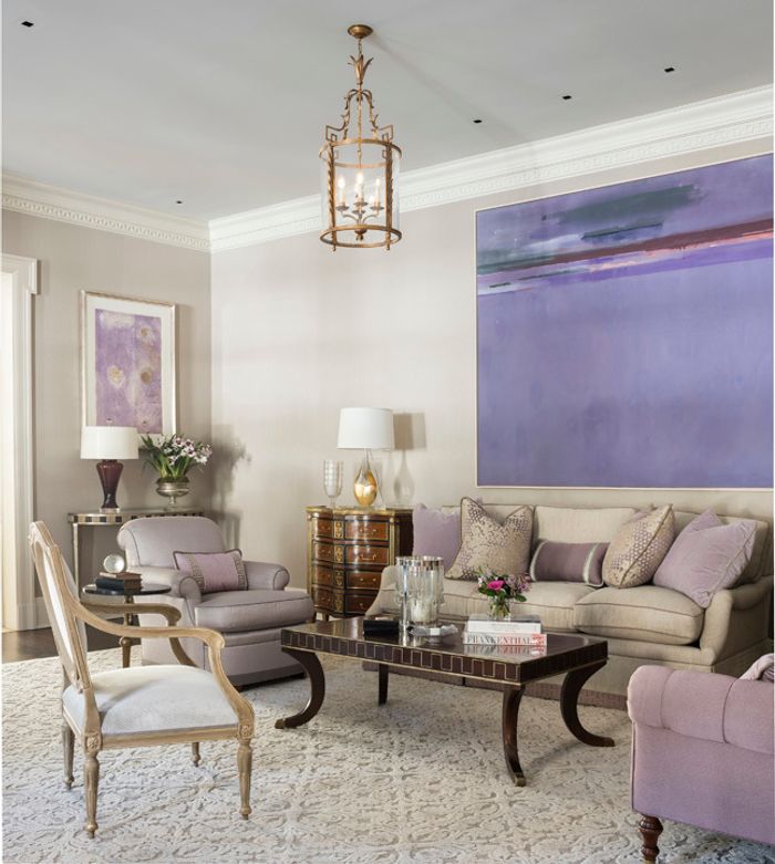
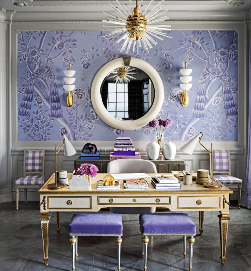
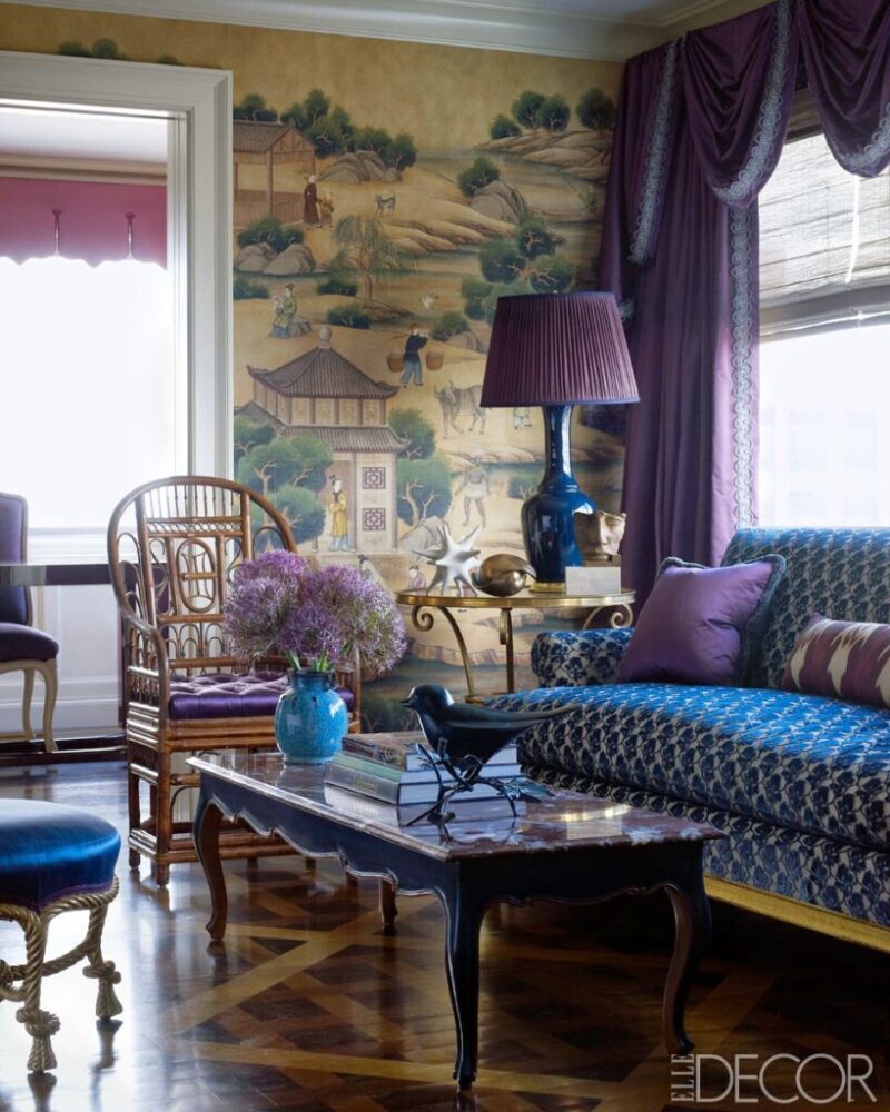
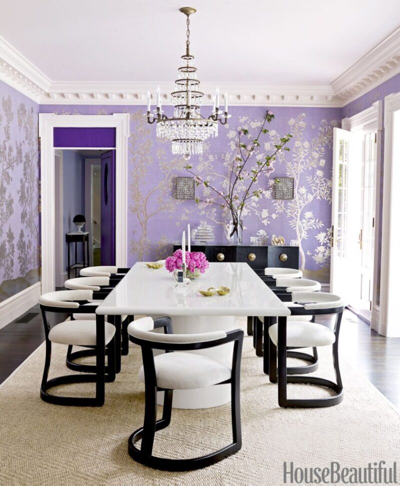
What are your thoughts on this lovely lavender hue?

I too have always done the “eye roll” at this “we will tell you what color to use this year” theory. BUT this year my heart jumped for joy! Peri is a shade that looks good on everyone. It pulls both cool & warm tones out within the wearer and makes their face radiate. I am looking forward to a new wardrobe of this enchanting shade!!
Well, I love lavender and all its variations. Some of the rooms you chose are some favorites of mine; however, their color of the year is very, very far removed – it is a blue with a purple lean/undertone. Periwinkle Blue, which they have shortened to “Peri”. I wish they HAD chosen a color in the purple to lavender family, with blue undertones, rather than the reverse. They should have followed your lead.
Not my choice, but not offensive. At least it’s not white, greige or charcoal. Doris Duke’s bedroom at Rough Point was this colour when I saw it. They have since painted it yellow, but the draperies are still there https://www.newportrestoration.org/room/doris-dukes-bedroom/
I love it! But, (there’s always a but) it is not an easy color to insert in a current living space, especially if you’ve painted your rooms Pantone’s previous years picks. It is surely grand if painting your rooms is on the agenda for this year, some of the subtler shades may work but they do tend toward gray and cooler tones which is definitely not the current direction of mainstream right now.
I LOVE periwinkle blue in fashion; in interiors, not so much. Ditto for purple and lavender. :-/
I could live with the paler periwinkle shades (for a while). The neutral colors of my wardrobe (including the boring and currently unstylish greige) are permanently and unapologetically reflected in my choice of room color. Trends will have you constantly painting your house, and it seems that contractors will have you tearing up and rebuilding everything every five minutes. I do enjoy the gorgeous photos, but I think I’ll just buy a pair of periwinkle sneakers to pep up my greige wardrobe and be done with it.
The Glam Pad never advises falling prey to trends! We just happen to love this hue, no matter if it is “in” or “out”. 🙂
Xx,
Andrea
The Glam Pad
I’m a new subscriber, and I must love the site!
…JUST love the site!
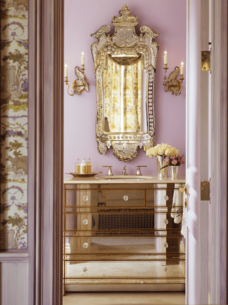
The Suzanne Kasler powder room is fabulous!
One bedroom in my home was painted periwinkle when I bought it – not a great fit for the palette of the house: tuscan yellows, sap green, and coral. Yet, everyone who walks into the periwinkle room gasps and says, “ahhhhh…” because it is such a relaxing color. It’s not the paint I would have ever picked out, but there is something magical and soothing about periwinkle.
My mother used to call it “menopause blue” !
All of these rooms are lovely and I totally agree with Terry…Suzanne Kasler’s Periwinkle Powder Room is absolutely fabulous! Another color unusual color to use is Sky Blue Pink…
I think that this color is just too “trendy” and if used anywhere, it will look dated very quickly.
These pictures in this post were collected over a period of a decade… Nothing “trendy” about them! It is a beautiful hue… today, tomorrow, and yesterday. 🙂
Xx,
Andrea
The Glam Pad
This post is a feast for the eyes! I find “Very Peri” very appealing… but then, I have always liked periwinkle blue. The majority of rooms depicted here, however, range from lavender to purple… which are colors that I also love, but they are not true periwinkle blue (the emphasis in “periwinkle blue” being on the blue, rather than the purple undertone.) But to each, his/her own! We all perceive color in own unique way! Given the number of purple outfits that appeared in Chanel’s latest collection, I’m willing to bet that purple will be a big trend in the year ahead.
I’d have to say, and truly purple is my favorite color. Very Peri is tough, and I’m not sure that really any of these rooms are Peri…it’s actually very red. And Periwinkle is not red at all, which some of the folks have talked about. Anywho…there’s nothing negative here…I love your Glam Pad…and I think you are super cool. We’ve made the color in house just in case someone wants any of our patterns translated. While I love love love purple…I don’t really use it. I guess it’s like a special thing I don’t want to abuse.
Thank you for adding beauty to my everyday life. Do you know where to find the wallpaper used in Allison Caccoma photo here? I so love this site, but often go crazy trying to find sources. Oh — and I can live with Very Peri easily as I have been for almost 74 years now.
Hi Margaret,
Thank you for the kind words! The wallpaper is by Raoul, but I don’t remember the name. I hope that helps!
Xx,
Andrea
The Glam Pad
Hi Andrea, I agree on the eyerolling over color of the year!! But I happen to love soft periwinkle. Our bedroom walls in our old house were light periwinkle and I had our bedroom and bathroom painted the same shade when we moved to a new home 18 years ago. So I guess I’ve had this color for well over 20 years. For once I’m on trend!! LOL. Cathy Temple