

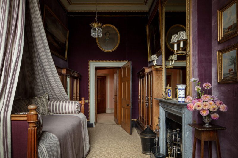
Each year, Benjamin Moore announces it’s color of the year, and The Glam Pad simply could not be more enchanted with their choice for 2025… Cinnamon Slate. As lovers of all shades of lavender and lilac, this delicate mix of heathered plum and velvety brown lends a cozy and understated perspective to a classic hue.
“One of the things that really stood out for this year was diving into the complexities and nuances of color, talking about undertones and thinking through what makes a given color special,” Andrea Magno, Benjamin Moore’s director of color marketing and design told ADPRO. “The catchphrase we really latched onto was ‘quietly colorful’.”

While The Glam Pad never advocates jumping onto the bandwagon of any “trend,” we love the quiet elegance of Cinnamon Slate and feel it is a lovely and timeless option for any classic home.
Let’s take a look at some “Cinnamon Slate” inspiration from Benjamin Moore along with rooms from our favorite designers featuring similar hues…


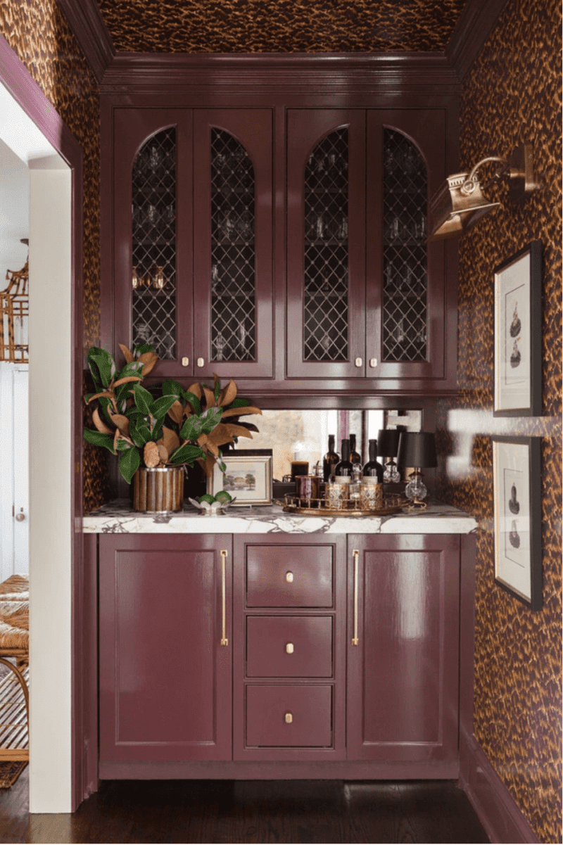

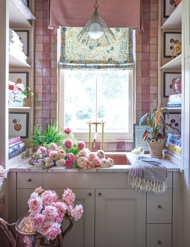

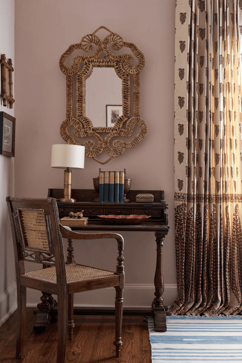
View this post on Instagram
View this post on Instagram


To learn more, please visit Benjamin Moore where you can also download their Color Trends 2025 Brochure.
What do you think of Cinnamon Slate? We’d love to hear your thoughts!

I often wonder how paint companies choose the names for their colors. When I read Cinnamon Slate I was expecting some sort of cross between rust and grey. This lavender shade was completely unexpected. I do think it’s a lovely color – muted, moody and calming. I also wonder how many people are influenced by the announcements of colors of the year and use those colors to paint spaces in their homes.
I’ll pass on this color.
I agree.
It reminds me of a color I’ve used before called “Flexible Grey”. Beautiful!!
This is a lovely color. But what I really love is the cut gray couch featured in front of the wall. Can you tell me any more about that couch? It’s exactly what I’ve been looking for. Thanks
Used in my guest room as an accent. It’s soft, with a velvety richness. I am not a purple person per se but this is great in my south facing guest room and pairs nicely with my plum bedding, ORB lights and hardware and wall art with distressed purple frames and lavender matts.