


Written by Natalie Aldridge.
Before the turn of the new year, Pantone crowns a Color of the Year, offering a glimpse into possible trends for the coming year and what we are meant to want right now. The ritual implies novelty, urgency, and a collective pivot toward something new. Each year, the color leans punchy, saturated, and somehow expected. This year, however, came with renewed surprise, as for the first time Pantone chose a white shade as its Color of the Year. Meant to represent calm, serenity, and a fresh start in a noisy world, Cloud Dancer is a soft, floaty white.

As an interior designer, I often think of white as a non-color. A given, and an accidental afterthought. Therefore, I initially rejected the notion of white being the Color of the Year. White exists entirely outside this system. It is not new, not reactive, and not especially interested in being noticed. White does not mark a moment. It ignores it. Yet, upon further thought, it brings to light the true role of white in interiors.
The recent framing of white as a “return to simplicity” misunderstands its role altogether. It is not a reaction to visual noise or a corrective to maximalism. It is not a detox. It is a constant. Long before trend cycles accelerated and color became content, white existed as an architectural and decorative baseline, ever-present and grounding. It has always been there, waiting for everything else to fall away.
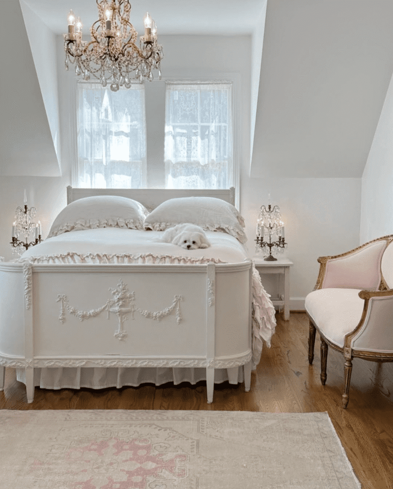
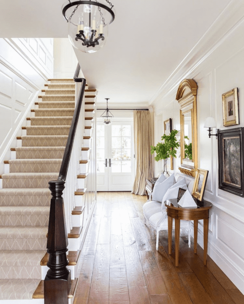
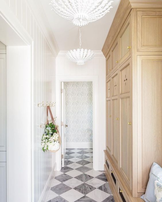
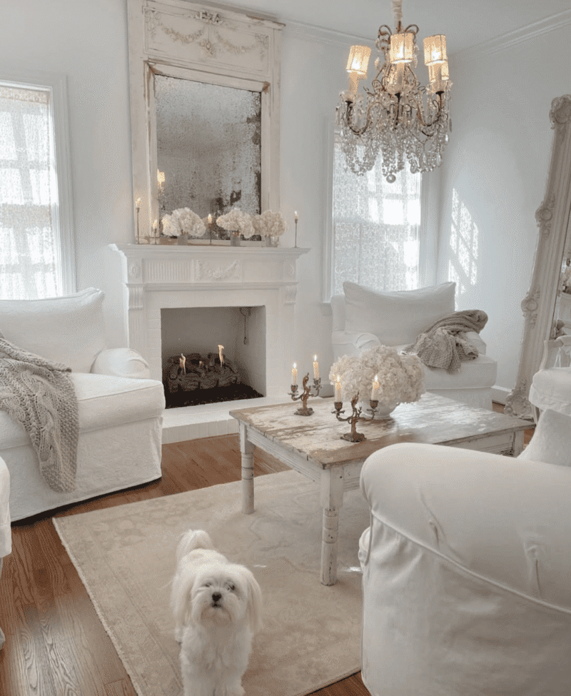
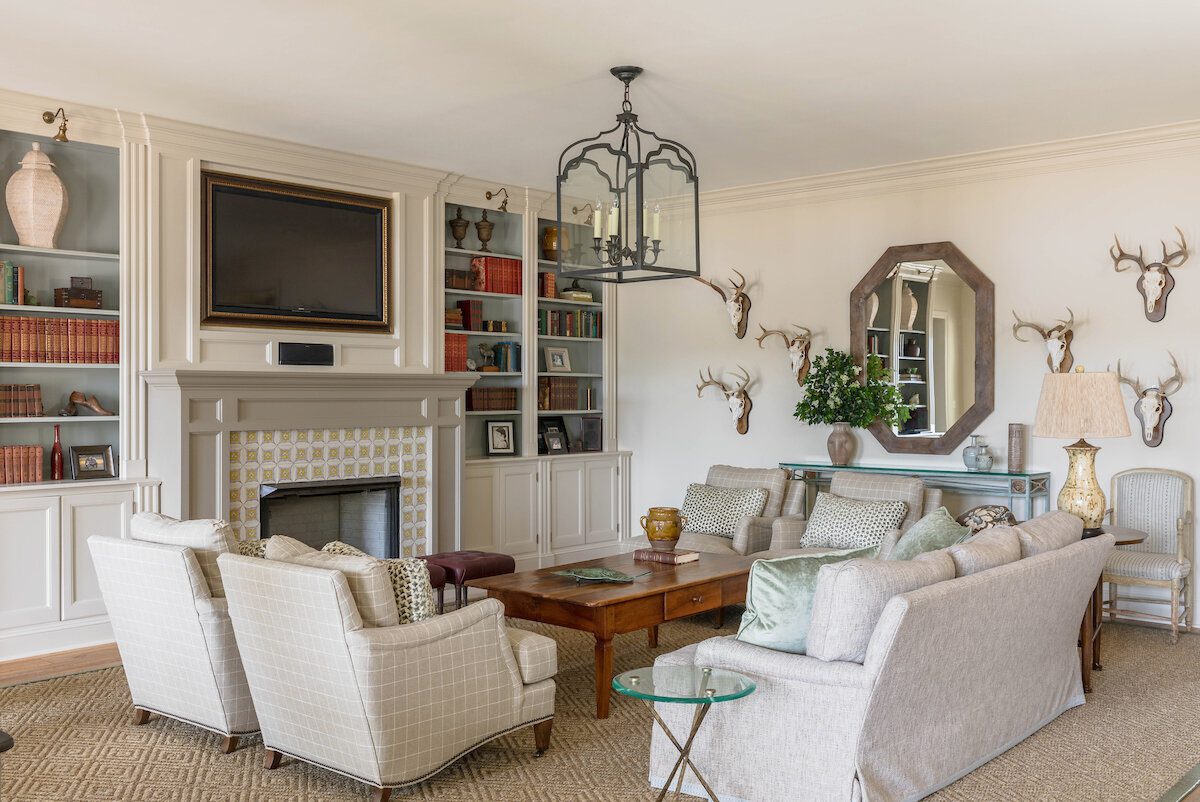
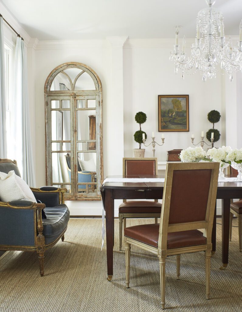
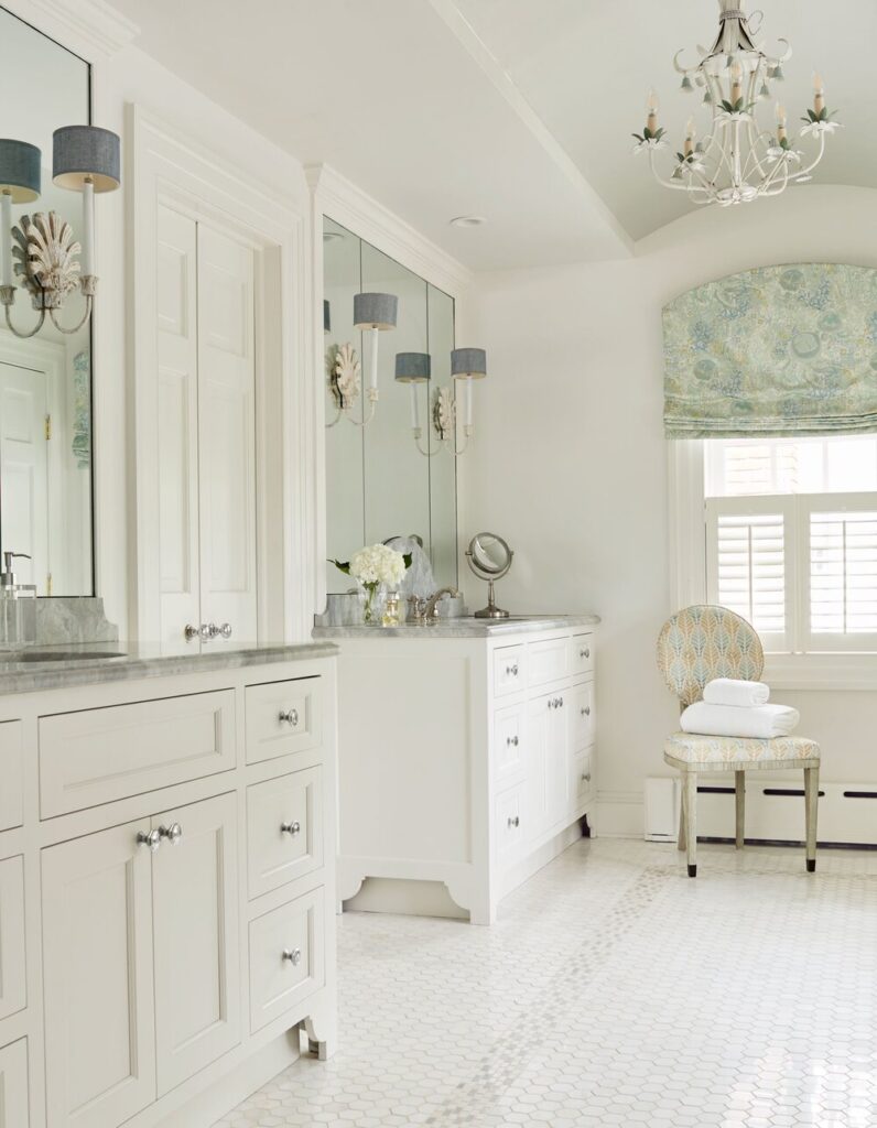
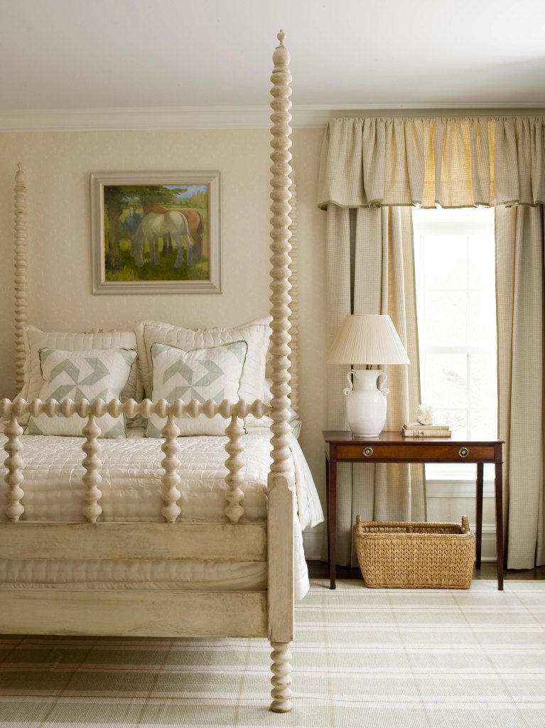
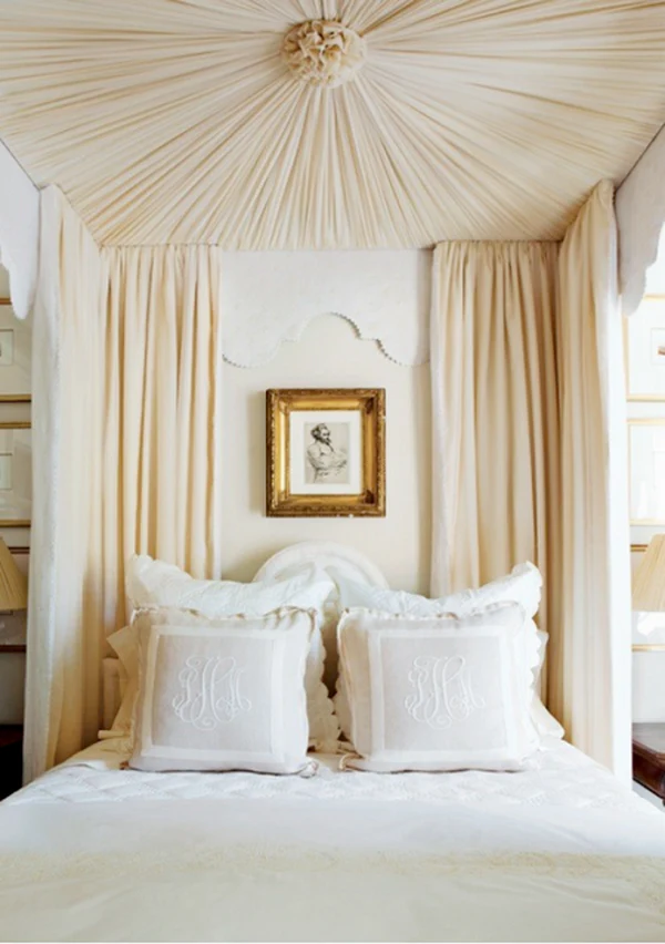
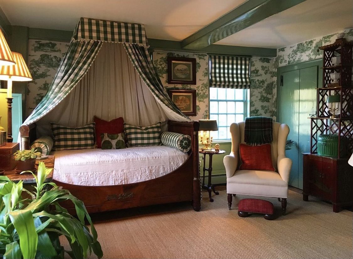
What makes white compelling is not its neutrality, but both its difficulty and necessity. A white room leaves nowhere to hide. Proportion, material, light, and craft are all exposed. Bad detailing becomes obvious. Cheap materials feel cheaper. There is no color to distract from imbalance or excess. White demands restraint, editing, and a clear understanding of when to stop. It is less forgiving than almost any color precisely because it appears so simple.
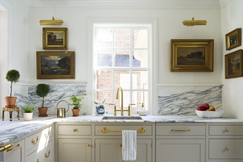
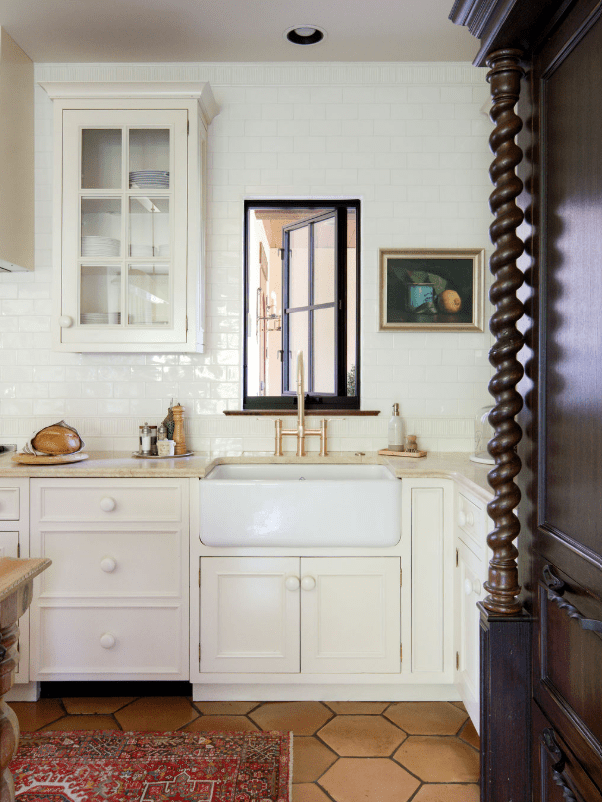
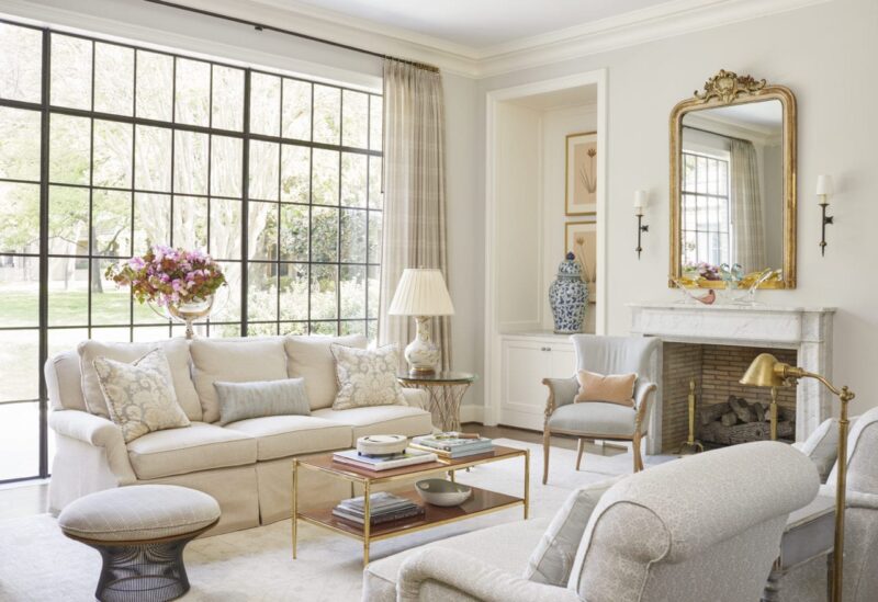
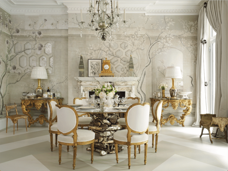
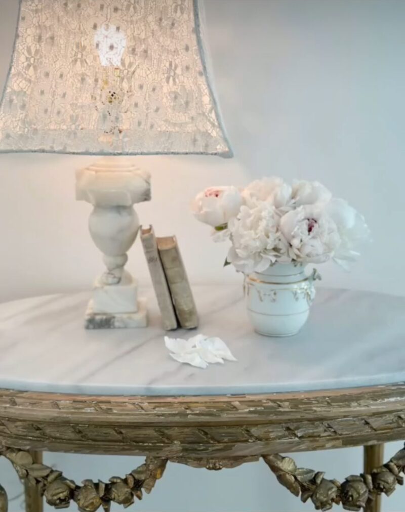
Contemporary designers like Rose Tarlow, Axel Vervoordt, and Rose Uniacke have long understood this. In their work, white is not a backdrop but a discipline. It is layered, weighted, and deeply intentional. Plaster against linen, aged wood against stone, with light doing as much work as any object in the room. Suddenly, the textures of fabric, the finishes of surfaces, the shadows of moldings, and the curves of furniture take center stage. These are interiors that absorb history rather than erase it, where time is an asset, not something to be disguised.
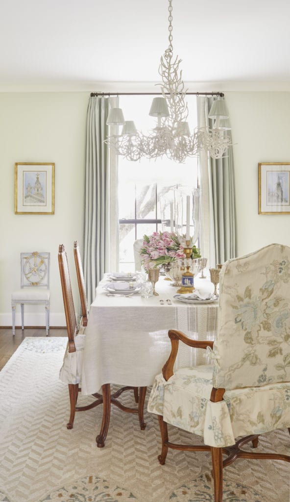
Historically, Elsie de Wolfe, arguably the original modernist in interiors, used white to reject Victorian heaviness. Her whites were about light, air, and clarity, a radical move in the early 20th century. White was used as liberation, not minimalism. The great Billy Baldwin quite often used white with equal elegance and ease. His rooms balanced comfort and refinement, using white to unify disparate furnishings and collections, making it livable rather than precious.
In our world, we champion color, often leaving us to believe white is a cop-out. Yet white asks more of a space than almost any hue. If it requires greater confidence, restraint, and understanding to get right, shouldn’t white be considered the boldest choice of all?
x Natalie
Follow TGP on Instagram: @theglampad
Follow Natalie on Instagram: @natalieealdridge

White is just too sterile to me. White would need a lot of art and accessories to give life to room.