Home Blog Page 59

Tips for Using Stationery in a Digital World

5

Investing in a stationery wardrobe can be a daunting task as there are so many variables to take into consideration. Do you prefer notecards, sheets, fold-overs? And what size? Should you engrave, letterpress, emboss, or print your name, monogram, or logo? What colors should you choose? And of course, there is budget to consider. The options are endless! Personalized stationery can be pricey, so you want to make decisions that will suit you for years to come.

Today is the third installment of our series on letter writing and stationery, and we have asked some of our favorite stationers to weigh in on this subject. Below are a few tips from the experts!


Take a cue from your closet

“When working on stationery with a client, I usually chat with clients about 15 minutes first. I take cues from the way they are dressed,” say Margaret Jones, founder of Scriptura in New Orleans. “People tend to wear colors they favor. Some people wear blues and greens, others prefer reds, pinks and oranges. Many are quite classic and wear whites, taupes and neutral colors. These non verbal clues tell me a great deal about the samples to present.”

You can also take your cues from your interior design! This is the perfect selection for the Gracie lover. Available here via Scriptura.

via Scriptura

via Scriptura

via Dulles Designs

Consider your handwriting style.

Margaret Jones also asks clients to write a few words on a piece of paper so she can see the size of their hand writing. “For instance, mine is very large and bold, consequently I prefer oversized cards, and letter sheets,” she says.

via Scriptura

How will you use your stationery?

“I also like to ask how clients are going to use the stationery,” says Jones. “Different situations require different approaches. For instance, brides usually prefer a small folded note due to the large number of thank you notes they will be writing. I also like to know if we will be creating the only set of stationery the client will be using. If so, I want it to be versatile and appropriate for a variety of purposes – thank yous, sympathy and business. The real fun begins when we can create a few different types – a classic one for restrained circumstances, and kicky one with bright colors for happier missives.”

via Scriptura

via Scriptura

Engraving, Letterpress, Thermography, or Hand-Lettering? 

“For men and women, there is nothing like a beautiful engraved or letterpressed correspondence card, whether it is with a monogram or a name,” says Nancy Smith, founder of Walton Street Stationers.  “It suits so many occasions, and the color of the paper and ink can make it more or less formal. We strongly believe the quality of the paper matters, and with that, thermography can also be nice when it is on good quality paper. For children, it is so fun for them to have something with their name on it, and sometimes, depending on their age, a fun motif that reflects them. We work with vendors who have some absolutely adorable motifs and we can also have them custom made, which is really fun!”

Emilie Dulles, owner of Dulles Designs, says, “Engraving is the most luxurious form of printing and it stands out in a sea of quickly printed, lower-end, online papers.  I have seen an increased appreciation for engraved stationery over the last few years, especially with clients who are very color conscious and want to have their stationery reflect their level of taste, sophistication, and style.”

“Hand-lettering artwork for your name and hand-drawn monograms are also highly sought after by clients who appreciate a bespoke stationery concept from start to finish and are interested in having a font for their name that might be used by a family member or friend,” says Dulles.

Engraved notecards via Walton Street Stationers

Hand-lettered notecards by Kim Peters

Other flourishes and personalized touches 

Dulles says “Our custom printed patterned envelope linings – using florals, stripes, motifs, and watercolors – are a trend that is here to stay as they are the essence of bespoke stationery and embellish any envelope and message delivery with distinction and panache! Hand-painted edges, bevels, and borders are sumptuous embellishments to dress up any note card and elevate stationery to a work of ‘mailable’ art!”

Smith says, “I love a printed return address, as it just gives the stationery a polished finish. But, if you have moved and still have envelopes that you don’t want to waste, you can get nice return address labels that will cover the old address without having to order new envelopes. Another thought, if you think you might be moving, is to order an embosser or a stamper with the return address, and then you can update those with a new address. We sell the stampers with many different setups as well as ink colors, so it will still give your stationery a finished look.”

Dulles says, “Lastly, don’t forget to pick pretty and on-theme stamps and PLEASE affix them squarely and carefully in the top right corner of your envelope. A crooked or boring stamp can ruin a first impression, so it is critical to put in a little extra effort in gathering lovely stamps to finish off your stationery or invitations.”

Perfect Pens and Ink Colors

Nancy Smith with Walton Street Stationers says, “I am a big fan of different ink colors. While blue and black are always good choices, it can be fun to bring out some other colors, depending on the nature of the note. One of my personal favorites was a light gray correspondence card that we did, with a white border, and white engraved name….suitable for serious correspondence, including sympathy notes, with blue or black ink but such fun with turquoise or hot pink ink for something happy.  Another fun option can be a monogram in two ink colors, and then play up those colors with your ink.”

Emilie Dulles says, “All pen selections are very personal! I prefer the fluid application of ink to paper that comes from using a fountain pen or a roller ball, but I’m also apt to use a ballpoint pen if the right tip feels right on certain papers – also depends on the texture and finish of the stock.”

Dulles continues, “I always recommend buying a number of pens in different colors to complement your stationery and to test them out before committing to writing out a full letter or note. It is important to not give up on using stationery just because you don’t love writing on it with a certain pen. Just like a certain pair of shoes can make or break an outfit, the right pen can make all the difference with bespoke stationery.”

“In terms of ink colors for pens, you always want to make sure your selection looks intentional,” says Dulles. “Black, navy, and charcoal are safe bets to go with most stationery designs, yet there are some lovely pen colors that can really pop and elevate a more muted look as long as the tones are consistent and don’t clash.”

via Walton Street Stationers

via Scriptura

via Dulles Designs

Calling cards are back!

Nancy Smith says, “Calling cards are such a great things to have for all ages… when you meet someone and want to be able to connect, you can just give them a nice calling card. For 20+ somethings, they are fabulous as they are entering the work world and meeting with people, networking, etc…it is a great way for that person to be able to follow up with you, and, along, with a hand written thank you note, a great way to stand out in the crowd.”

“The elegant world has grown tired of email and texts and Zoom communication. Calling cards are not only terribly chic and refined, but they are also wonderfully discreet and useful for today’s networking and socializing,” says Dulles. “Not only can a calling card be designed to each person’s aesthetic and reflect their unique tastes in ways that a text or email never could, but they can also include as much or as little personal information as they desire to share. You can hand-write any necessary contact details on a need to know basis, which allows both ladies and gentlemen to be discerning about who will have their private cell phone number or email address.”

via Dulles Designs

via Dulles Designs

Building your Stationery Wardrobe: Tips from Dulles Designs

GENTLEMEN

Gentlemen who wish to make a distinctive impression socially and professionally should have a well-adorned stationery wardrobe.

It starts with a classic note card, either soft white or ecru paper, engraved in a handsome ink color with their full name in a timeless block font, of which there are many in our collection.

Charcoal, indigo, navy, hunter green, and chocolate brown are always handsome ink colors for gentlemen –– akin to having a bespoke navy blue blazer or dark grey suit for all occasions.

One strong Dulles Designs recommendation is to include a letter sheet that is twice the writing area of a note card, for writing longer missives whilst sharing the same envelope size as their note card.

Lastly, every gentleman should have a personal calling card that is not his career business card, to match his stationery wardrobe. Calling cards can also be as traditional as stating his full name only, or include his cell phone and/or email address.

My husband insists on presenting a couple’s calling card, one that has both of our first names, cell phones, and emails, to be sure recipients know full well that he is happily married!

via Dulles Designs

via Dulles Designs

via Dulles Designs

LADIES

A woman’s stationery wardrobe can be as aesthetically driven and customized as their clothing wardrobe or jewelry collection.

All ladies, at the minimum, need a classic note card personalized with their full name or monogram to handle a variety of messages akin to a LBD. A soft white or ivory card engraved in a chic timeless ink color is ideal.

Hermès orange is a neutral for some ladies, yet it wouldn’t be appropriate for writing a condolence note, so best to stick to metallic gold, navy, grey, taupe or hunter green for example.

Then ladies need a letter sheet and/or fold-over note for longer messages. Both formats are lovely for more traditional notes and it is up to personal preference as to which is added to their stationery wardrobe first. These can be engraved with their full name or their monogram.

A fun set of note card with a bold color is a must for the fashion forward writers! I love a bright card stock engraved in white or gold ink paired with a colored envelope and unique lining inside. Think of the favorite room in your home or the outfit that makes you feel amazing, then draw inspiration for your stationery that makes a stylistic splash!

Calling cards are always a must for a lady – much more elegant and distinctive than a text message – and if they include just your name, then they can double as a gift enclosure.

Otherwise, the most thoughtful of gifts includes a lady’s gift enclosure with can be paired with a darling petite lined envelope.

via Dulles Designs

via Dulles Designs

via Walton Street Stationers

via Dulles Designs

CHILDREN

The art, tradition, and joy of hand-written notes are ideally shared with children from a young age. The best way to instill this gracious habit in younger generations is for children to have their own custom stationery, even before they can write the notes themselves.

A small note card printed with their name in a cherished ink color and an age appropriate motif is a favorite for children.

Gift enclosures are also a must in a beginner paper lover’s stationery wardrobe, because they are so helpful for the many birthdays and events that little ones attend.

via Dulles Designs

FAMILY

Family crest stationery, either embossed or engraved or full-color printed, is an elegant option that can be used by every member of the family.

Estate or seasonal home stationery with a bespoke rendering or watercolor artwork of the façade or the property name can also serve as thank you notes, as well as for hand-written invitations to planned or impromptu cocktail parties or an intimate dinner party – so chic!

Couples stationery is perfect to thank for a dinner party invitation or to reply to a formal event or to send in lieu of a pre-printed greeting card. This can range from the formal with full “married names” to the more casual with first names only.

Pet stationery is also a fun family favorite that includes a rendering of your furry friend.

All of the above pieces also make fantastic gifts for engaged couples or newlyweds or on the occasion of an anniversary.

via Dulles Designs

via Dulles Designs

via Dulles Designs

via Dulles Designs

via Dulles Designs

via Dulles Designs

via Dulles Designs

via Dulles Designs

via Walton Street Stationers

Are hand-written letters still relevant in today’s digital world?

In closing, we asked our experts to weigh in on why it is more important now than ever to take the time for handwritten correspondence…

Emilie Dulles, Dulles Designs: 

Stationery sales have definitely been going strong the last few years as we all realize the importance of staying in touch and also reconnecting with our loved ones in meaningful ways! Stationery is the perfect tool and gift to reach out and also stand out when so much of our world is going digital.

Stationery, hand-written envelopes, and custom printed invitations also have the advantages of discretion and distinction. You can’t hack or forward or “reply all” to a piece of mail! Our stationery and event printing clients at the highest levels appreciate that their formal correspondence, invitations, and celebrations are kept safe and secure via bespoke papers and a postage stamp.

Writing is an integral part of the human experience for gracious living and communicating.  It is also good for our mental health. Writing by hand forces us to slow down, carefully select the piece of paper we want, take out a favorite pen, and then gather our thoughts before putting pen to paper.

Writing words of gratitude –– be they for a joyful occasion (birthday, gift, anniversary, wedding, graduation) –– help anchor gratitude into our spirits or for more somber occasions (illness, grief) they help us to process emotions in a tangible way and remember the love and support that surrounds us.

There is also an element of romance to sending hand-written correspondence that connects us to how our ancestors stayed in touch with loved ones regardless of geographic distance.

When you hand-write and mail thoughts of love, gratitude, and wisdom, you make them even more real and they become part of your personal history to be revisited by and shared with generations to come.

Margaret Jones, Scriptura:

We are all in such a hurry these days, sometimes so much so that sitting down to write a thank you note seems unimaginable – especially with the ease of typing a text or shooting an email. This however, defeats the purpose of genuinely expressing thanks. Out of respect for the individual who hosted a dinner party, referred a client or sent a present, we owe them the gift of our time and consideration in composing a thoughtful note of thanks. There is something satisfying about sitting down, writing on a carefully selected card or piece of personalized stationery and finding just the right words of appreciation. Doing so honors the recipient and helps maintain the bonds of friendship in an elegant and lasting way.
Your mother was right, there simply is no substitute for a hand written note.

Nancy Smith, Walton Street Stationers

Stationery sales are strong…I think there is a real connection that people are having with an actual hand written note, as opposed to something fleeting like an email or text. During the height of Covid, it was a wonderful way to “be with friends”, if you will. Hand written notes are heartfelt. Writing a note, can also be meditative, and in this fast paced world, slowing down to write on nice stationery, is a wonderful way to relax.

I just discovered a book, The Lost Art of Handwriting by Brenna Jordan, and in her introduction, she says “The value of handwriting in relation to our interactions with others is immense. Handwriting is a slowing down, a connection to one another, and the history of our complex humanity. And because there is an in exhaustible craving within us for beauty and creative expression, handwriting is getting noticed in our fast paced culture.”

I am very happy to see the ‘grand millennials’ embracing beautiful stationery. It bodes well for the future. Since cursive writing is no longer being taught in schools, I would recommend the book mentioned above for anyone looking to improve their handwriting as she has wonderful tips to practice penmanship.

Thank you, ladies, for these wonderful and inspiring tips. I want to order one of everything! For additional information or inquiries, please visit the following:

Emilie Dulles, Dulles Designs
www.dullesdesigns.com
@emiliedulles

Margaret Jones, Scriptura
www.scriptura.com
@scriptura_nola

Nancy Smith, Walton Street Stationers
www.waltonstreetstationers.net
@walton_street

THE GLAM PAD’S LETTER WRITING SERIES

Below is an outline of The Glam Pad’s six-week series on the art of letter writing, and all that is related to the subject. Below is an outline of topics are covering:

  • APRIL 8: Why hand-written letters and fine stationery (and calling cards!) are making a comeback, particularly among the Millennial generation. CLICK HERE TO READ
  • APRIL 15: The fascinating history of calling cards, and how they are relevant today. – A guest post by Nancy Sharon Collins. CLICK HERE TO READ
  • APRIL 22: An overview of resources for fine stationery.  What pieces do today’s letter writing enthusiasts need in their wardrobe and why?
  • April 29:  A fabulously fun trend… Vintage stamps! How to begin a collection and use them to personalize your correspondence.
  • MAY 6: Why cursive handwriting is making a comeback, and what you can do to learn or improve.
  • MAY 13: The ultimate in customization – A bespoke monogram and stationery created by Nancy Sharon Collins.

Another One Bites the Dust

68

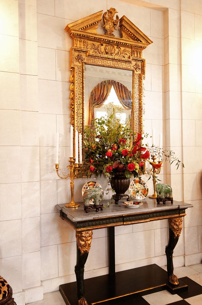
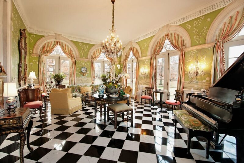
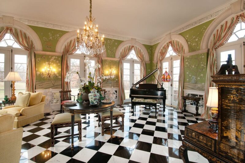
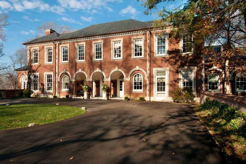
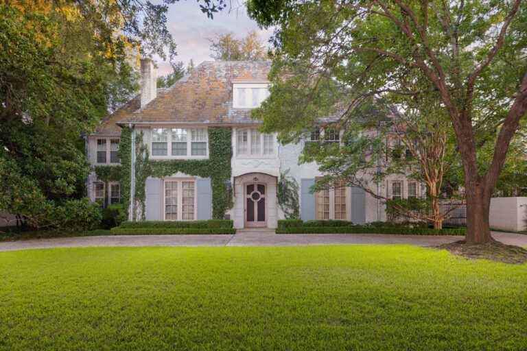
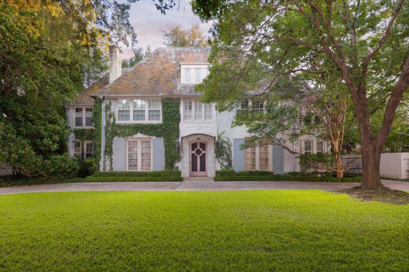
Last month we reported on a horrible trend taking over the lovely Highland Park suburb of Dallas… The city’s most majestic and historic homes are being torn down at record number. And unfortunately there’s another one to add to the list.. 4908 Lakeside Drive, one of Dallas’ great architectural masterpieces. Built in 1918 by Hal Thomson, the 7,600 square foot mansion was situated on three quarters of lush acreage and was one of my favorite homes in Dallas. This one was particularly gut wrenching.

image via @preservationparkcities

Today we will pay tribute by revisiting the real estate listing. The write-up read:

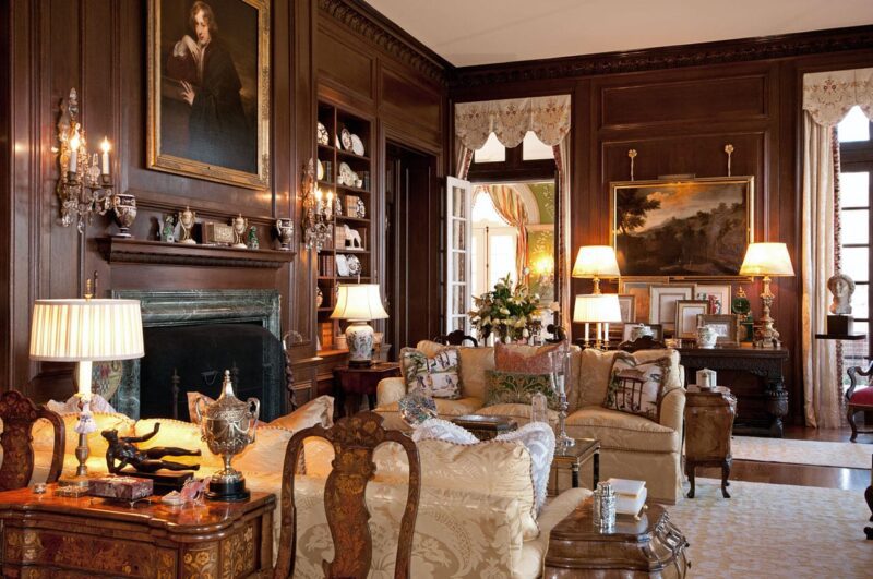
Elegant details throughout the home include marble and inlaid marble & wood flooring, meticulously detailed moldings, trim and plaster treatments, Gracie hand-painted wallpaper, Guerin hardware, five fireplaces, and a magnificent Treillage room looking onto a side-yard area shaded by a specimen 100-year-old Magnolia, and private spa. The graceful kitchen features Viking & Sub-Zero appliances, stone flooring, gas fireplace, cast stone moldings and a floor-to-ceiling glass breakfast room overlooking the grounds. Upstairs you’ll enjoy the richly detailed library with fireplace, luxury master suite with sitting room overlooking the grounds, and three additional guest bedrooms. The elevator takes you to all floors, including the basement with a climate controlled wine cellar. Outdoors, take in the expansive and private setting with lush gardens, majestic trees, entertaining patios and romantic columned gazebo with seating. Truly one of Highland Park’s most prized homes and location.

You can learn more about the former Lakeside home and what the city can do to aid preservation via Douglas Newby.

My personal opinion is that one never “owns” a historically significant property, but is simply a “steward” honored to temporarily enjoy the home and preserve its legacy for future generations.

Coral Gables, Florida serves as an excellent example of enforced preservation. The process engages the community to determine what homes will be given Historic Designation, and designation can even take place once a homeowner begins the demolition process in order to save the home. The details are outlined in this document, and I have copied and pasted the process for historic designation below…

Coral Gables HISTORIC DESIGNATION PROCESS: Proposals for designation of potential historic landmarks may be submitted to the Historical Resources Department by any citizen who provides information which illustrates that the property meets the established criteria for listing. The Historic Preservation Board then conducts a public hearing to determine whether or not the property possesses sufficient historical, cultural, aesthetic or architectural significance to qualify for listing in the Coral Gables Register. Initially, the property must be at least fifty (50) years old or older to qualify for listing. The property may be considered significant if it can be associated with persons or events which have made an impact on our community, or if the property is deemed to possess architectural distinction. If the Board votes in favor of the historic designation, an ordinance is enacted which designates the property as a local historic landmark and lists it in the Coral Gables Register of Historic Places). For each of the public hearings the property owner is notified and encouraged to attend.

Fifty of the homes photographed for Great American Suburbs: The Homes of the Park Cities, published in 2008, have since been demolished. Unless the Park Cities establish similar enforcements, I am afraid that we will see our beautiful suburb turn into something completely unrecognizable. I would love to hear if your town is doing anything to control preservation… Please weigh in below!

The History of Calling Cards

9

Today is Week Two in The Glam Pad’s six week series on stationery and the art of letter writing, and we are delighted to welcome a very special author, Nancy Sharon Collins. Principal of the eponymous Nancy Sharon Collins, Stationer LLC, Nancy is the country’s leading expert on engraved stationery and designer of bespoke hand-drawn monograms. She is author of The Complete Engraver a guide to monograms, crests, ciphers, seals, and the etiquette and history of social stationery, and she has contributed to and been the subject of popular media such as PRINTTown & CountryVerandaVogueThe New York Times, and NPR.

I learned of Nancy originally a few years ago through Pinterest when I stumbled upon one of her exquisite custom-designed monograms engraved upon the most scrumptious papers.  Her work bears the craftsmanship, quality, and personalization of a bygone era, and is unlike anything produced today. (Click here for a brief video explaining her approach.) Intrigued, I learned all I could through her website, culled through her entire Instagram feed, and purchased her book which was so spell-binding I read it in one afternoon. Immediately, I knew we were kindred spirits, and it is an honor to have Nancy guest post today!

Do you remember the left fold on the Astor calling card in last week’s feature on the resurgence of stationery?  In this article, Nancy will share not only the history of calling cards, but also the secret code you may vaguely recall from literary classics by Edith Wharton, Jane Austen, the Brontë sisters, etc.

Welcome, Nancy!

Codes and Cards: Symbology from Victorian-era to Mid-20th Century Calling Cards

By Nancy Sharon Collins

Chapter I. Ancient History

Calling card use began in China in about the15th century and was later popularized on the continent (of Europe) in the late 17th and early 18th centuries.

Gerald Berg autograph collection, images from 2002 auction catalog, Ira & Larry Goldberg Coins & Collectibles
JOHANNES BRAHMS CALLING CARD: Gerald Berg autograph collection, images from 2002 auction catalog, Ira & Larry Goldberg Coins & Collectibles

The behaviour for Western use was defined during the Victorian era. Then crystalized in Edwardian England and America where consumerist spirit, fueled by a newly minted ability to surmount social boundaries, held sway.

QUEEN VICTORIA

Along with an increasing popularity of calling cards by the middle and upper classes, authors such as Samuel Clemens (Mark Twain), Rudyard Kipling, Jack London, and Edith Wharton, relied upon calling cards to identify class, gender, and economic ability in their writing and amongst their peers.

MARK TWAIN (a/k/a Samuel Clemens)
SAMUEL CLEMENS CALLING CARD: Gerald Berg autograph collection, images from 2002 auction catalog, Ira & Larry Goldberg Coins & Collectibles

In the day, even manly men, could be terribly concerned with social convention.

HAPPY EDWARDIAN COUPLE

For instance, in his semi-autobiographical novella Martin Eden, Jack London—swashbuckling author of adventures such as White Fang and Call of the Wild—relied on the social currency of calling cards.

1942 MOVIE POSTER: The Adventures of Martin Eden. Director: Sidney Salkow (adapted from Jack London’s Martin Eden)

Eden’s concern for social convention in this excerpt is evident.

“… When you meet a young lady and she asks you to call, how soon can you call?

… when he found the right shelf [in the public library], he sought vainly for the answer. He was
appalled at the vast edifice of etiquette, and lost himself in the mazes of visiting-card conduct between persons in polite society. He abandoned his search. He had not found what he wanted, though he had found that it would take all of a man’s time to be polite …”—Jack London, Martin Eden, 1913, Macmillan and Company

With one striking exception, calling cards developed in an almost parallel fashion with trade cards.

TRADE CARD: Courtesy of Richard Scheaff

While trade cards became ever fancier, with borders, decorative cartouches, and ultimately striking full-color, their social cousins grew more sedate.

FAMOUS AMERICAN TYPOGRAPHER’S ENGRAVED CALLING CARD: Courtesy of Martin Hutner and The Grolier Club, engraved in London ca. 1900

“By the 1860s and 1870s most of Europe, including Britain, had wholly espoused sobriety in personal cards …

“ … the etiquette of typographic style and layout was rigorously observed: the wording was engraved, printing was in black, card color was white. A man’s town address appeared in the lower left-hand corner, his club on the right; if he had a country address this went on the right, and the mention of the club omitted.”—Maurice Rickards, The Encyclopedia of Ephemera: A Guide to the Fragmentary Documents of Everyday Life for the Collector, Curator, and Historian, 2002, Routledge.

When the 20th century came around, styles associated with the calling card, had formed.

CA 1950S CALLING CARD SAMPLE BOOK: The Complete Engraver, 2012, Nancy Sharon Collins, Princeton Architectural Press

Before the telephone, calling cards were the vehicle by which social calls were made.

Think of them as the original social medium.

CALLING CARD OF THE TELEPHONE’S INVENTOR, ALEXANDER GRAHAM BELL: Gerald Berg autograph collection, images from 2002 auction catalog, Ira & Larry Goldberg Coins & Collectibles

Chapter II. Social Norms and whatnot

Seventy or more years ago, everyone aspiring to polite society carried a calling card. Calling cards represented refinement in all social graces and indicated that one honored accepted social manners.

Unmarried daughters living at home did not have cards of their own. Their names appeared, somewhat as an afterthought or burden, on their mothers’ card …

“Sisters without parents used cards with their names listed in order of seniority, or simply as,
‘The Misses Smith’, in the courtesy of the call.

“A gentleman’s card, it follows, was never thus presented; there might well have been unmarried ladies in the household whom it would have been improper for him to have called.”— Routledge

These little cards, usually engraved with just the bearer’s name, were used to make the social call. The word “bearer” is used with care as calling cards were definitely social currency.

“The responsibilities of upper-class and aristocratic women [in the Victorian era] were limited because of the common opinion that they were weak. These women had a range of servants to perform the domestic chores for them, so they usually just had to oversee them. An everyday task of upper-class women was accepting and paying visits, as well as organizing dinner parties for their friends and family. These were occasions where women could prove their homemaking skills and good taste, and to serve as symbols to others about their social status.”Social Life in Victorian England

When calling, one would not expect to be received; one leaves one’s card, indicating the call has been made. Should your visit be a desirable one, the lady of the house would return the call, leaving her card.


Chapter III. How calling cards worked

And the proper manner for social calling.

Remember, single ladies were never on the street un-escorted. Suitable escorts were considered a husband or male relative.

In a pinch, great gaggles of related ladies with an elder female companion might make the rounds. But a handsome gentleman would definitely be preferred.

A LADY AND SUITABLE ESCORT MAKING A SOCIAL CALL. The escort would have been a brother, uncle, or husband
A SERVANT ANSWERS THE DOOR
THE CALLERS LEAVE THEIR CARD(S) IN A PROPER CALLING CARD TRAY. Usually located in the front hall and proffered by the butler or maid. The lady of the house would never answer the door herself!

After the social call is made and the calling card(s) are left, it was hoped that the social call would be returned.

“Next day Paul found Stubbs’ card on his table, the corner turned up. Paul went to Hertford to call on Stubbs, but found him out. He left his card, the corner turned up.”—Evelyn Waugh, Decline and Fall, 1928, Chapman and Hall.

Chapter IV. A 20th century case study

A little dusty and vintage, this example illustrates how a simple calling card can be put to very personal use.

A GENTLEMAN’S CALLING CARD. Found in a mid-20th Century minaudier.

This particular calling card, front, was found in a gold toned minaudier containing a woman’s absolute essentials ca. 1940: 10 cigarettes, lipstick, face powder—loose, of course—and a gentleman’s calling card.

The back was discovered to have a love note. Perhaps, an army officer on his way to port and to battle in WWII. It can be imagined that Patricia and Lyle met very briefly on a dance floor. Or randomly, at a cocktail party. He leaves possibly forever with only the mash note scribbled in his own hand.

Calling cards can be pretty provocative don’t you think?

Such fascinating history. Nancy, thank you for joining us and sharing this wisdom! Next week will touch on modern applications for the calling card.

For further inspiration and to learn more about Nancy’s services, please visit www.nancysharoncollinsstationer.com and follow @nancy_sharon_collins on Instagram. The Glam Pad also highly recommends her book, The Complete Engraver.

In addition to Nancy’s day job working with engraved stationery clients, she makes time for lectures and presentations nationally, and she partners with local cultural institutions in her hometown New Orleans. With Antenna Gallery, she produces Letters Read the ongoing series of live events in which local actors interpret personal letters written by culturally vital individuals from various times and Louisiana communities. Listen to recent podcasts of some readings here.

LETTER WRITING SERIES

Below is an outline of The Glam Pad’s six-week series on the art of letter writing, and all that is related to the subject. Below is an outline of topics are covering:

  • APRIL 8: Why hand-written letters and fine stationery (and calling cards!) are making a comeback, particularly among the Millennial generation. CLICK HERE TO READ
  • APRIL 15: The fascinating history of calling cards, and how they are relevant today. – A guest post by Nancy Sharon Collins.
  • APRIL 22: An overview of resources for fine stationery.  What pieces do today’s letter writing enthusiasts need in their wardrobe and why?
  • April 29:  A fabulously fun trend… Vintage stamps! How to begin a collection and use them to personalize your correspondence.
  • MAY 6: Why cursive handwriting is making a comeback, and what you can do to learn or improve.
  • MAY 13: The ultimate in customization – A bespoke monogram and stationery created by Nancy Sharon Collins.
A bespoke engraved calling card and hand-drawn monogram created by Nancy from scratch is pictured nestled within one of her custom French fitted stationery cases. Stay tuned for more on her artistic process!

Kips Bay Palm Beach 2022 In Review

3

By Natalie Aldridge

The Kips Bay Decorator Show House has completed another successful year in Palm Beach. With proceeds benefiting the Kips Bay Boys & Girls Club, twenty-four of the top industry leaders embarked on a journey to transform their given space into an enrapturing display of style and ingenuity. Marking the fifth annual showhouse set in Palm Beach, the 1920s home in the Old Northwood Historic District was entwined with bold color and pattern. Each room told a distinct story illustrating each designer’s unique perspective, something we adore to see.

Today, the Glam Pad will revisit some of our favorite rooms of The Kips Bay Decorator Show House Palm Beach 2022 including previously unseen images courtesy of Carmel Brantley, Brantley Photography.

3001 Spruce Ave, West Palm Beach, Brantley Photography
Brantley Photography
The entryway by Craig & Company is feast of blues with incredible wall treatment done by MJ Atelier. Sargent Photography
The treillage clad sunroom by Paloma Contreras, Brantley Photography
A favorite de Gournay wallpaper in Jim Dove’s “monkey bar.” Sargent Photography
Stripes on stripes and classic silhouettes by Ashley Gilbreath Interior Design.
A punchy balcony with a mid-century twist ready for entertaining by Amanda Reynal Interiors. Brantley Photography
Amanda Reynal Interiors, Brantley Photography
The “Jewel of the Jungle” guest house designed by Catherine M. Austin – Click here for a full tour from the designer.
Cathy Austin, Brantley Interiors
“The Closet Reimagined” by The Lewis Design Group, Sargent Photography
An English gentleman meets Tangier by Nashville designer Sarah Bartholomew. Sargent Photography
Pink poolside oasis by Janie Molster, Brantley Photography
Janie Molster, Brantley Photography
A delightful powder bath by Andrea Schumacher, Brantley Photography
Tropical Splendor in the Garden by Bob Bell, Brantley Photography
Bob Bell, Brantley Photography

With such an array of talent and spaces to discover within the showhouse, it is hard for us to pare down our selection of favorites. Congratulations to all the inimitable designers who left their mark on the beautifully restored “Mansion of Northwood.”  To fully appreciate the transformation, click here for the before pictures.

Learn more about the Kips Bay Showhouse and Kips Bay Boys & Girls here.

Images: Carmel Brantley and Nicholas Sargent

The Resurgence of Stationery

23

By Natalie Aldridge

I have a confession. The number of times I have mailed a handwritten note total the number of digits on my hands. Growing up in the age of the internet has provided me with a superb sixth sense for computer skills but a lacking penmanship ability. It comes as quite a surprise to those my senior to learn I was not taught cursive in school.

Now in my young adult years, I find myself gravitating towards pen and paper. I crave the beauty of pristine stationery and the physicality of inscribing a note. My telephone has become rife with images of ornate typography, charming note card designs from decades past, and of course, the exquisite artistry of vintage monograms.

Erica’s Sweet Tooth

Fort Bend Museum

While devouring the latest episode of The Gilded Age with a group of friends, we discussed the use of calling cards throughout the series. The tradition of a bygone era struck a chord in each of us.

Hardly a necessity in the modern era, each of us dreamed of whipping out a calling card to leave with a friend or a potential suitor. Better yet, leaving a card for one Mrs. Astor just as Bertha Russell so gracefully did in episode one. Though not so kindly taken by Mrs. Astor, the idea of toting delicately personalized cards with one’s information provides such an intimate and tangible moment.

A selection of calling cards from Newport Historical Society collection. Note the fold on the Astor card… We have a special guest post on the history of calling card etiquette next week!

It was clear after this conversation that we all desired to spark a resurgence of not only calling cards but traditional stationery. All of us having grown up in an era of digital communication suddenly began eagerly formulating ideas of how to incorporate the use of stationery in our everyday lives.

A likely result of digital fatigue, lack of personal connection throughout the pandemic, and the decline of formality in society, stationery has made a comeback. According to an article by Town & Country titled A Side Effect of the Pandemic? Stationery Sales Are Booming Right Now, Google Trends reported a 180% increase in the search term “what to write in a ‘thinking of you’ card?” in 2020, and the stationery brand Papier experienced a 300% increase of online sales.

Last fall, Inc. magazine highlighted the powerful business advantage companies can achieve through handwritten communication. “Emails and printed mailers aren’t reaching your customer,” the magazine reports. “More importantly, neither form of communication tells your client or customer something vital: that you care about them.” However, estimates suggest that personalized notes are opened at an overwhelming rate of 98 percent! “Handwritten notes are treasured and saved, creating an ongoing brand impression for months or even years,” states Inc.

Love letters from Jackie to JFK at auction

Over the Moon

Mrs. John L. Strong

Everything old is new again. In December 2020, Marie Claire highlighted the new digitally savvy generations putting their stamp on the traditional greeting-card business. “Thanks to millennials and Gen Z, the incredibly analog business is experiencing a rebirth,” the magazine reports. Winnie Park, CEO of Paper Source told Marie Claire, “People may be surprised, but our number-one customers for paper goods are actually millennials. They are our fastest growing segment.”

Why? “Blame screen burnout, for one—the same thing that has millennials snapping up vintage typewriters and real-film Polaroid cameras,” says Marie Claire. And let’s not forget the Grandmillennial movement that has sky-rocked the popularity of timeless, classic “Granny Chic” interior design.

While stationery and hand written notes never disappeared, they have certainly taken a back seat to technology, and a rebound seems inevitable. What was thought to be a custom of the past has taken hold once more, filling the void of physical connection we have missed over the last two years.

Ashley D. Studio

Dulles Designs

Emily Post writes, “When I get a handwritten letter, I’m excited to open it. The art of the postage stamp, the feel of the paper, the graphic quirks of a friend’s handwriting: There is simply nothing as personal as a handwritten note. In a stack of bills and flyers, it’s a treasure in a sealed packet, full of promise and potential. It is a visceral reminder of someone far away.”

The Glam Pad has eagerly taken note and watched with great interest as countless new players have entered the stationery market. Fresh and whimsical stationers such as Papier, Clementina Sketchbook, Dogwood Hill, and The Chain Press have started to dominate our Instagram feed as individuals are finding ways to correspond in an old-school manner while bringing a contemporary twist to the task.

Stephanie Fishwick

Walton Street Stationers

As guardians of tradition and old-fashioned niceties, the use of beautiful paper to convey personal thoughts kindles our hearts. It is safe to say the generation raised with computers as extensions of their arms has had enough. Nothing can compare to the personal touch. Analog always prevails.

x Natalie

Follow Natalie on Instagram: @natalieealdridge

NEW SERIES ALERT! 

Today’s feature marks the beginning of an exclusive six-week series on the art of letter writing, and all that is related to the subject. Below is an outline of topics we will cover:
    • APRIL 8: Why hand-written letters and fine stationery (and calling cards!) are making a comeback, particularly among the Millennial generation.
    • APRIL 15: The fascinating history of calling cards, and how they are relevant today. – A guest post by Nancy Sharon Collins.
    • APRIL 22: An overview of resources for fine stationery.  What pieces do today’s letter writing enthusiasts need in their wardrobe and why?
    • April 29:  A fabulously fun trend… Vintage stamps! How to begin a collection and use them to personalize your correspondence.
    • MAY 6: Why cursive handwriting is making a comeback, and what you can do to learn or improve.
    • MAY 13: The ultimate in customization – A bespoke monogram and stationery created by Nancy Sharon Collins.

STAY TUNED!

Elegant Easter Tablescape Ideas

3

Easter is April 17, and it’s time to start thinking about your tabletop! The Glam Pad has partnered with Scully & Scully to share some ideas that will add a touch of Easter elegance to your home. When I think of Easter decor, I immediately think of Herend bunnies. Scully & Scully is the largest distributor of Herend in the United States, with a large collection of treasures made for them exclusively… including bunnies and other figurines perfect for Easter. They also have an exclusive set of Royal Limoges Faberge Egg plates plates that are at the top of my wishlist! Are you ready to be inspired?

A darling Herend Bunny pairs beautifully with Royal Crown Derby Harlequin china

My absolute favorite china pattern is Herend’s Queen Victoria, a classic first unveiled in 1851. I have the classic green, but did you know it also comes in pink?! Butterflies and blossoms hand painted in cheerful colors made Queen Victoria perfect for spring and a natural addition to your Easter table… It also happens to pair perfectly with Herend’s fishnet figurines.

Easter Tablescape Ingredients: 

When it comes to Herend figurines – particularly bunnies! – you can never have too many. They are so lovely arranged en masse on a silver platter, which you can display anywhere in your home and use as a delightful centerpiece.

These Royal Limoges Faberge Egg plates, exclusive to Scully & Scully are exquisite and really add pizazz to an Easter tablescape. Handmade in France, the rims are adorned with 24k gold, and each piece depicts an Imperial Egg.

Here are a few more goodies you will want the Easter Bunny to bring you!

Herend Bird on Leaf card holder, Exclusive Butterfly Limoges boxes, Herend egg, Herend Rose card holder, Rabbit in Carrot Car Limoges Box, Queen Victoria by Herend in Green and Pink, Herend Baby Lamb, William Yeoward Fern Crystal, Repousse Sterling Silver Flatware, Lily of the Valley Butterfly Vase by Limoges, Herend Bunny with Carrot, Herend Dashing Duck, Herend Butterfly Bunny, Anna Weatherly Butterfly card holder
Herend Bunny Eating Carrot Leaves,  Herend Duck and Bunny, Bunny with Easter Basket, Chubby Bunny, Bunny with Crossed Paws, Herend Rabbit in Grass, Large Rabbit on Base, Herend Bunny with Tulip, Easter Bunny with Colorful Egg, Bunny with Gold Egg, Herend Bunny with Carrot
Rabbit On Easter Egg Limoges Box, Rabbit in Basket with Eggs, Exclusive Blue Butterfly Pocket Emptier, 18k Pink Topaz & Peridot Diamond Ring, Exclusive 18K Yellow Gold Rabbit with Diamond Collar Pin, Pink Rose Limoges Box,Halcyon Days Annual 2022 Easter Egg, Redoute Pink Rose Pillow, Blue Birds Limoges Bow with Nest, Baccarat Lucky Butterflies in pink, turquoise, amber and purple
The Dignified Rabbit Lamp is on my Easter Bunny wishlist!

Scully & Scully is a family-owned luxury purveyor established in 1934. You can find unlimited treasures on their website, and you will want to request their inspirational catalogue. They also offer complimentary gift wrap, which makes the Easter Bunny especially happy. 🙂

Happy Easter! 

Insta Crush: House and Garden Dog

Instagram has such a wonderful way of bringing people together, and today I’m delighted to share the home of Phaedra Brown @houseandgardendog where she shares glimpses into her “layered, collected, colorful, pattern-filled, English country cottage inspired, a-house-is-not-a-home-without-a-dog-and-flowers world.” Phaedra does not have professional interior design training, yet she has created a beautiful home worthy of any shelter magazine.  Gracing the interiors is Phaedra’s adorable West Highland Terrier, Wellie. You will definitely want to follow her adventures on Instagram, and today you can get to know more about Phaedra through our Q&A, below! Welcome, Phaedra!

Q:  Please tell us about your home and what you have done with it since purchasing.

A:  We live in a traditional style home on the Eastern Shore of Maryland. It was a semi-custom spec home built in the mid 2000’s that the previous owners purchased to live in temporarily while their permanent residence was being constructed. It had good bones and a neutral base. We’ve added more classic elements – wood floors in lieu of carpet (except for my Stark Antelope carpet in the family room), limestone and Belgian blue stone checkered floors in the sunroom and mudroom and crown molding throughout. We also added a fireplace to the dining room, plus paneling, a new mantelpiece and custom painted tile to the bedroom fireplace. Paint has made a tremendous impact. We’ve done a lot of landscaping and gardening as well as some hardscaping. We’re getting ready to gut our primary bathroom which I am really excited about.

Q:  Do you have any professional design training? If not, how did you learn?

A:  I don’t have any design training. When I was little, I loved to rearrange the doll house furniture more than I wanted to play with the dolls themselves and I do also remember drawing elaborate floor plans. My parents and I used to tour model homes for fun. I’ve always loved looking at magazines and that grew into a love for design books. I think it’s important to understand good design and why things work, even if they aren’t to your specific taste. There is so much to learn and absorb from studying and appreciating beautiful interiors.

Q:  How do you define your style?

A:  I’d call it a layered and colorful traditional style with an English influence – I love the vibe of English country homes and their bold and sometimes unexpected blending of colors and patterns. There is an appealing looseness to English interiors that doesn’t feel as intentional as American design often is. I love a wonderfully collected look that is full of pattern play.

Q:  Where do you find inspiration?

A:  Books, magazines, IG… I love to read or watch interviews with designers and hear about their processes. I also love to shop and hunt for things, both in person and online. Looking at beautiful things is always inspiring. Following “tastemakers” – not just for décor, but for their beautiful gardens, flower arrangements and tables can help you enhance your own lifestyle. Think Christopher Spitzmiller, James Farmer, Charlotte Moss and Jenny Rose Innes…

Q:  Who are your favorite designers (past and present)?

A:  It is hard to narrow down, but here are a few! Bunny Williams – I loved getting to meet her and see her Connecticut home a few years ago. Mario Buatta – I love how he could stuff a room with such enticing layers and color! Cathy Kincaid, Markham Roberts, Matthew Carter. Gil Schafer. Jeffrey Bilhuber, Miles Redd, Tom Scheerer. And the English influences – Ben Pentreath, Emma Burns, Daniel Slowik… I could go on and on!

Q:  What are some of your favorite treasures in your home, and why?

A:  My stained-glass door panels that my parents commissioned for us as an anniversary present. The Hunt Slonem Bunny painting my husband bought me for Christmas a few years ago. A vintage Hermes Westie ashtray that I spent years hunting for. A tiny chinoiserie lamp that was on my grandma’s telephone table (I wish I had the table too!) and my antique scorched bamboo pieces.

Q:  Do you have any favorite collections?

A:  I collect Westie needlepoint and artwork. The paintings cover our mudroom walls and I am almost out of space! I’ve been lucky to have been gifted several portraits of both Wellie and my Angel Dempsey that I had before him. I absolutely love lamps and can never pass up a beautiful one, even if I don’t have a spot for it. I’d say we have about 75 in use right now. I love having books everywhere because I like to read and I’m always adding to my collection. I hope one day to have a large library full of books. Right now, they are spread out throughout the house. I love rows of books behind glass. I also love to buy vintage china, especially cabbageware, to mix and match.

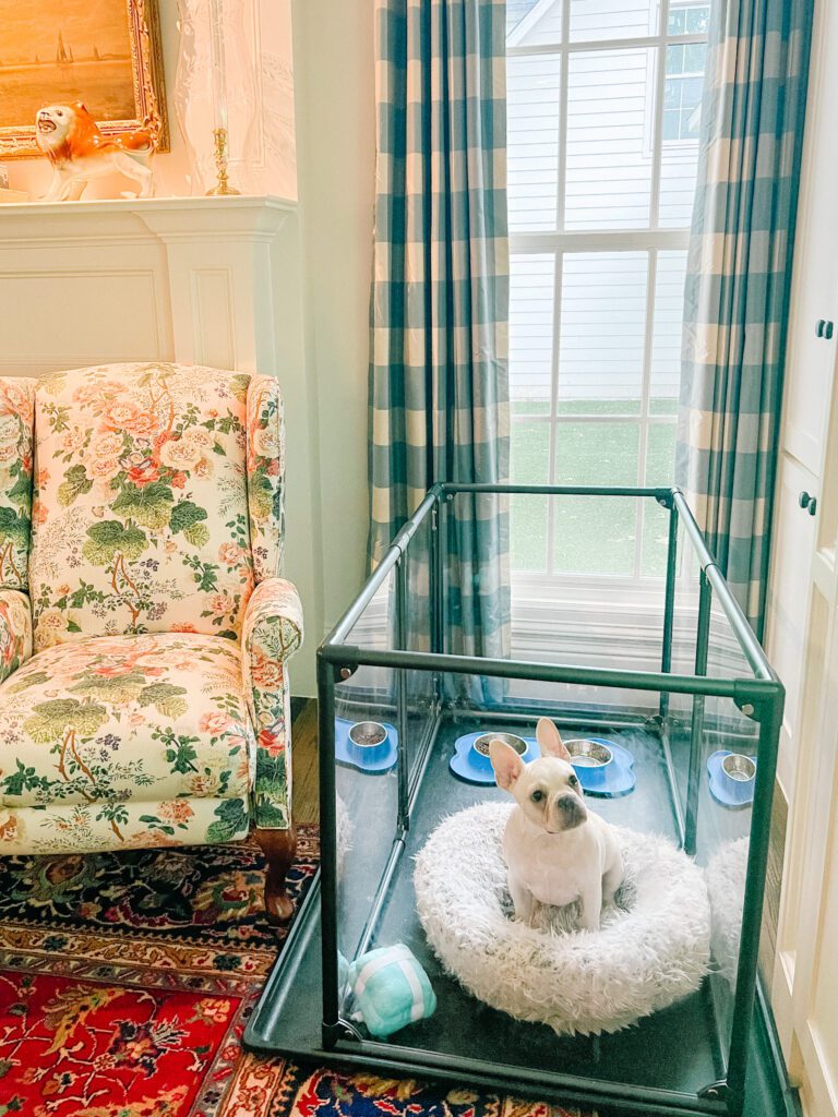
Q:  Your Westie is so precious! What is your secret to living elegantly with pets?

A:  Good manners! No, seriously, dogs need to be trained. I also believe in crate training for puppies. They make beautiful crate covers that can spruce up a metal crate and make it easier to look at. Buy dog beds for different rooms that will fit in with your décor. Throw a colorful quilt or blanket on your sofa if you’re worried about the fabric. And a gorgeous Persian rug will hide a multitude of sins and add so much visual warmth. My go-to rug source is @suzanne.the.rug.dealer . And why have ugly toys when they make so many adorable ones?

Q:  What are 5 every day luxuries you could not live without?

A:  My morning iced coffee. Fresh flowers (even better when they are from your own garden). The glow from a beautiful lamp. We have lamps on timers in most rooms. Feeding the birds year-round. I love watching them. A beautiful candle. I love Baobab and Nest. And a myrtle topiary. You’ll find you can’t have just one!

Q:  When you aren’t busy decorating, what do you enjoy doing in your free time?

A:  I love gardening and putting together flower arrangements. I love an exuberant, cottage-style garden. I think garden design is as important as interior design and the two should correlate for a cohesive feel. I love to read. And I’m working on my needlepoint skills so that I can complete a game table top I purchased years ago. I’d love to do a chinoiserie-inspired backgammon board but I’m not there yet!

Q:  Anything else you would like to add?

A:  Thank you so much for having me! The Glam Pad is the only blog I read. I’m especially jealous you got to interview Mario! It’s an honor to be featured.

Thank you, Phaedra, for joining us today! Your home is proof that you don’t have to be a designer to have great style.

For ongoing inspiration, please follow @houseandgardendog on Instagram.

Artist Spotlight: Clementina’s Sketchbook

By Natalie Aldridge

When I stumble upon something new that sparks my interest, I often become engulfed with fascination. A small flame quickly becomes a raging fire. I must pour my soul into learning all I can of said something until exhaustion. This instance was no different. Meet Clementina Zegna, the Italian-born globetrotter who turned her artistic talent, vision, and exceptional taste into a stationery empire.

Clementina Zegna

Having spent her childhood surrounded by the beauty of Italy she developed a fervent passion for the natural world and a discerning eye for color. After attending Georgetown University, she fell for the Southern Hemisphere and packed her bags for Buenos Aries. Her nomadic spirit then led her to Cape Town and to New York where she pursued a degree in fashion design at Parsons School of Design (fellow Narwal!), and other far-flung corners of the world.

While exploring the globe, Clementina honed her skill eventually landing in London where Clementina Sketchbook was born. Spanning multiple product lines and numerous collaborations, Clementina’s work evokes boundless emotion, the vibrance of life, and her old and well-traveled soul.

Not only does Clementina provide phenomenal products but has developed a community of “Sketch Bookers” through her watercolor classes, miniature painting kits, and transparent dialogue through social media. More than a successful company Clementina has harnessed a true brand with her heart at the center of it.

I had the pleasure of speaking with seasoned explorer about her work and life:

Is there a particular memory or experience that led you to become an artist?

My mother used to host an annual open-house pop-up at our home in Milan for a friend’s jewellery brand. At the time I was already painting with watercolours, and I was asked to create the artwork for the invites. I was 14 years old, and I remember painting hundreds of her earrings for her to choose from whilst sitting next to a graphic designer giving directions on how to set up the invite for printing, and being paid in earrings I still use today! At the time I did not think of it as a job, or as something I could be asked to do on more occasions, but here we are!

A book you cannot live without?

Shantaram. A story of adventure, crime, depth, philosophy, love, and India. I even had a passage from it read at my civil wedding!

Your work is highly organic and colorful, what do you attribute this to?

I am crazy about animals and nature and I have always had a keen detailed eye when observing it. I have always dedicated time to look at things, from how a branch unravels into leaves, how ladybirds move around, the shape of clouds, the tossing of grass, the poses of animals, and the movement of their eyes and furs. I think this has always inspired me to search for that natural and organic effect that feels right exactly how it is, rather than forcing shapes and colours into something that feels odd.

A dream project to work on?

I have two. As an artist, I would like to create a collection of huge charcoal drawings inspired by my beloved Africa. As an illustrator, I would love to design products for Hérmes children!

You have studied, lived, and worked around the globe with many of the places being vastly different from one another. What draws you to a particular city, country, or space?

I am nomadic and adventurous at heart. I’ve always loved moving somewhere new and starting from zero, having just my curiosity and enthusiasm to conquer people and my new city. I would say that overall I have been attracted by the two opposites: bustling and exciting cities like London and New York, and secluded nature & adventure places like Buenos Aires and Cape Town.

I am so happy now in London, but I can feel the craving for an adventure creeping up already!

A person of the past you most admire?

Leonardo da Vinci, I am fascinated by his sketches and genius.

An adventure on your travel bucket list?

Orca diving in Norway!

A medium of art you rarely use but would like to experiment with?

I have been craving breaking beyond the precision of my current watercolours, and am determined to experiment with gigantic abstract canvases in oil or acrylic to express something completely opposite to what I am used to.

What was the pivotal turning point in the development of Clementina Sketchbook?

When I decided to create a ready-to-buy collection of stationery under my name, until then I had only focused on fully bespoke projects, and the collection gave a complete twist to my business model as much as a channel for me to create products I wanted to create for myself.

A cause you are most passionate about?

I am a proud Young Ambassador to the incredible wildlife conservation work that African Parks (@africanparksnetwork) does for the preservation and saving of ecosystems across the entire African continent. Their work comes from the heart, it’s extremely cleverly managed and their success rate is without equals. That’s why 10% of all my animal-themed products go straight to them.

Clementina’s collaboration with Massimo Alba for African Parks. Signature handkerchiefs adorned with wildlife watercolors.

How do you anticipate Clementina Sketchbook developing over the coming years?

My vision for Clementina Sketchbook is to grow into a leading illustrations company with expertise in anything children, bespoke, and otherwise. I am looking to explore further into this world of colours and creativity, and extend my product range to name & alphabet prints, fabrics for interior decor, bespoke wallpapers, one-off pieces like hand-painted lamp shades… I have millions of ideas and so much to paint!

With a long career ahead of her, I look forward with great anticipation to see what is to come from Clementina Zenga. A true adventure just beginning to unfold.

Thank you, Clementina.

Shop and discover Clementina’s Sketchbook

Follow Clementina on Instagram: @clementinasketchbook

Follow Natalie on Instagram: @natalieealdridge

x Natalie

Images: Clementina Zegna

A special thank you to Leona Ajdan of Sophie Elliott for making this piece possible.

New Series Alert! 

Beginning next Friday, The Glam Pad will begin a six-week series on the art of letter writing, and all that is related to the subject. Below is an outline of topics we will cover:

    • APRIL 8: Why hand-written letters and fine stationery (and calling cards!) are making a comeback, particularly among the Millennial generation.
    • APRIL 15: The fascinating history of calling cards, and how they are relevant today. – A guest post by Nancy Sharon Collins.
    • APRIL 22: An overview of resources for fine stationery.  What pieces do today’s letter writing enthusiasts need in their wardrobe and why?
    • April 29:  A fabulously fun trend… Vintage stamps! How to begin a collection and use them to personalize your correspondence.
    • MAY 6: Why cursive handwriting is making a comeback, and what you can do to learn or improve.
    • MAY 13: The ultimate in customization – A bespoke monogram and stationery created by Nancy Sharon Collins.

    Stay tuned!

Style Profile: Sara Hillery Interior Design

Selected as a House Beautiful 2021 NEXT WAVE Designer, Sarah Hillery specializes in creating beautiful and functional spaces with a focus on honoring each client’s personal history. Her firm excels at updating and transforming interior spaces both architecturally and decoratively, making previously acquired and antique pieces more relevant and practical. While Sara draws inspiration from her travels to Europe, India, and Japan, her style invariably reflects her Southern heritage and familial roots in Virginia, Texas, and New Orleans. A mother of three, Sara’s mission is to make design family friendly while still remaining creative, elegant and timeless. Her work has been featured in House Beautiful, Southern Home, Veranda, and The Wall Street Journal. Today, The Glam Pad is delighted to feature Sara’s work, and get to know more about her through a Q&A… Welcome, Sara!

Q:  When did you know you wanted to pursue a career in interior design, and what did your career path look like?

A:  During college, I interned for an interior designer, and my job was to organize their library of fabric. That meant checking the price of each brand and every piece of fabric, and, since this was before the internet, calling every brand to do so. After three months of doing this everyday on repeat, I still wanted to be an interior designer, which felt like a sign!

I was an art major in college, and I loved how interior design takes art to the 3D level. You are creating an environment using all your senses. For me, it felt like a natural growth and expansion from the two dimensional page. I worked for an interiors company as an assistant after college and continued working there through grad school in Richmond. After I got married, I moved to Houston and worked for Lucas Eilers before venturing out and starting my own company.

Q:  How do you define your style?

A:  A fresh take on traditional with a clean and modern eye. My design tends to be cheerful with bold colors and not a lot of clutter. My work has elements that are both minimalist and traditional.

Q:  Who are your favorite designers (past and present)?

A:  Darryl Carter–His designs are refreshing, visually clean, and restful. He uses old lines, minimally paired, and his designs aren’t stuffy.

Dorothy Draper—Her use of color and color pairings were wacky and thought-provoking. They worked even when it feels like they shouldn’t!

Susan Kastler—She epitomizes classic, understated design.

Q:  What is the first thing you do when embarking upon a new project?

A:  I like to immerse myself in learning as much as I can about the client and their needs. I do a lot of fact-finding and information-gathering: the more I know about the client, the more tailored the design can be for them in both an aesthetic and functional way. We want the design to work for them!

Q:  Over the last two years, how has interior design changed and also the way your clients are living? Are they requesting fewer open concepts, and more home offices, gyms, etc?

A:  Clients are at home more, even with many being thrilled with the idea that we can finally start going back out into the world. My clients are still focusing on how they can make their house their center, their home base for their life, and so they want it to fit their needs and be uplifting and comfortable. It’s the “home as staycation” mentality that many adopted during the pandemic. We are seeing more requests for home gyms and home offices. For the latter, this may not be an entire room; it could be a nook that can be a flexible office space if necessary. Outdoor spaces continue to be really important for entertaining family and friends and catering to groups that may have different levels of comfort regarding gathering during the pandemic.

Q:  What are 5 every day luxuries you could not live without?

A:  I love a really good cup of coffee, super soft Weezie towels, nice sheets, my phone, and my Delsey rolling suitcase for traveling.

Q:  Where do you find inspiration?

A:  I am always inspired by nature: the colors in gardens, the way that nature makes color combinations on its own. I’m a voracious tracker of images, whether from magazines on the internet, and I love paging through design books. There’s something about turning the page of a book that stays with me much longer than something I see on a screen. And I love getting new ideas and perspectives from travel.

Q:  What is your favorite movie house of all time?

A:  I don’t know if I have a favorite, but I do love the house from the Durrells in Corfu. The house isn’t necessarily in the best shape, but it has an earthly quality to it, and it just has the necessities so it’s not overly stuffed. The house is on a bluff, so the views are amazing!

Q:  When you aren’t busy designing, what do you enjoy doing in your free time?

A:  I love digging in the dirt and playing in the yard, trying not to kill the things growing there! And, even though this is still technically designing, I really enjoy drawing floor plans for houses that either exist or I imagine.
Q:  Anything else you would like to add?

A:  I love this business, and I have met so many wonderful people doing my job. I also love a transformation and being a creator and an inventor of new spaces and environments. It’s really rewarding to feel like you’ve helped someone. Design feels like solving a puzzle in a colorful, creative way. I started out as a single person and now I have a family. I’ve learned so much in my own life, and I enjoy applying that knowledge to the design. I’m continuing to hone the ability to see not just what the clients’ needs are now but also to project how their interiors will serve them in the future.

Thank you, Sara, for joining us today! What a beautiful portfolio! To learn more about Sara, please visit Sara Hillery Interior Design and follow @sarahilleryinteriordesign on Instagram for ongoing inspiration.

The Destruction of Highland Park, Texas

48

In the Highland Park neighborhood of Dallas, the most beautiful, architecturally significant and historic landmark homes are being torn down by people who think colossal white boxes with all the charm of a prison are more important than preserving the soul of our city.  I was physically ill when the local news recently reported that one of my favorite homes, 4908 Lakeside Drive, has been sentenced to execution by wrecking ball.

The owner of the home (who declined to go on camera) told NBC5 that they intend to demolish the home and sell the lot!!! And that “preservationists should not be able to tell people what they can do with their property.” Why not at least put the home up for sale and give it a chance?!

4908 Lakeside Drive was built in 1918 by noted Dallas architects Thomson & Fooshee. You can see the real estate listing and pictures for this exquisite home here. For years, it was famously painted pink!

Last fall, the city watched in horror as new owners demolished 3800 Beverly Drive, a 9,000 square-foot mansion built in 1922 by one of Dallas’ most celebrated architects, Hal Thomson. It had been fully renovated in 2000.

3800 Beverly Drive was built in 1922 by Hal Thomson. Click here to see the stunning real estate listing and images.

“For decades, Highland Park homes have been torn down, however, this year this activity has accelerated. Perhaps new residents have had an impact,” Douglas Newby, a realtor who specializes in architecturally significant homes, wrote in his recent article “Why There Is an Acceleration of Highland Park Homes Being Torn Down”. In fact, the Dallas-Fort Worth metroplex has attracted more out-of-state transplants than any other metro area in 2021 (source) and the real estate market here is completely out of control.

“The people who are razing these properties are sort of destroying the very thing that made them want to move here in the first place,” the incoming Park Cities Preservation president told NBC5. 

Another architectural gem that was razed this year was 4400 Belfort Avenue, also built by Thomson & Fooshee.  The real estate listing read, “One of the most significant sites in Highland Park, this stately home sits on a corner lot at .997 acres. This property features intimate Formals, family room, library, sunroom, gourmet kitchen, third floor complete with large off-season closet, family room, bedroom and bath. The grounds include an outdoor living area with grill and fireplace, pool, and guest house. This is a perfect opportunity to add your personal touch or build your own grand estate!”

4400 Belfort Avenue was built in 1938 by Thomson & Fooshee. Click here for the real estate listing and pictures.

Back in 2016 I featured my dream home which had gone on the market… Located on Beverly Drive, the 1930s home had been one of my favorites since ever since moving to Dallas for college. It was demolished, and here is a link to the listing of the oversized spec house that has taken its place.  I purposefully go out of my way to not drive by this intersection because it makes me so upset.

3401 Beverly was built in 1936 by Everett Welch. You can tour this home, RIP, here.

Preservation Park Cities has compiled a list of Highland Park homes slated for demolition (sadly it is a long list), and they have also listed the historically significant architects of these homes.  They are working tirelessly to get ordinances passed to prevent, or at least slow, this continued loss of architectural history, and they ask for help in spreading awareness.

Douglas Newby has also listed 5 steps we can take to save these homes. Per suggestion #3, I encourage like-minded architects and interior designers who want to help to create preliminary sketches illustrating how best to approach renovations as these architecturally significant homes come on the market…. The Glam Pad would be happy to promote and feature your work!

Mark your calendar for the 2022 Park Cities Preservation Historic Home Tour: May 7 & 8!

Tour four beautifully preserved homes from the comfort of your own home… from anywhere online! The Park Cities Home Tour can be viewed online only May 7 & 8th. Click here for additional information and for tickets which start at $25.

Please follow @preservationparkcities on Instagram for ongoing information and updates. Spread the word – let’s preserve!