


Newport, Rhode Island: Behind the Scenes with Bettie Bearden Pardee

Renowned as a summer resort for the American aristocracy, Newport, Rhode Island is legendary for its stately mansions, stunning seascapes, world-class sailing, and lavish entertaining. In this fabled town where privacy is a treasured asset, Bettie Bearden Pardee takes us behind the scenes into the world of Newport’s old guard and new tastemakers through her blog Private Newport and her new book Living Newport: Houses, People, Style. Bettie shares how America’s Society Capital entertains, decorates, parties, gardens, and dresses with Newport’s exceptional old-world architecture as the exquisite backdrop. Town & Country featured Bettie’s book as proof that “Newport is the epitome of old school American elegance.”
I am honored to have Bettie join us here today!

The lush 63 acres at Hammersmith Farm, the childhood home of Jacqueline Bouvier Kennedy Onassis. Photo credit: Alexander Nesbitt for Living Newport: Houses, People, Style.
Bettie and her husband live year-round in Newport. Bettie’s design talents and love of landscape were put to use in the design and building of their home, Parterre. An accomplished hostess and active community leader, Bettie has chaired many events that are staples of the social season, including seven years with the Newport Flower Show. She has lectured extensively in the garden club and design world around the country. Most importantly, Bettie embraces the ethos of giving back, especially to the Newport community.
Q: What made you and your husband decide to move to Newport?
A: My husband, Jonathan, is from Newport; for his business, we had moved from Atlanta to NY to Boston, so it was an easy decision to make our weekend home a full time residence.

Parterre’s often-toured gardens are documented in the Archives of American Gardens at the Smithsonian Institution and are featured in the Garden Club of America’s Gardens, Private and Personal, in which the frontispiece highlights the Parterre Bench designed by Bettie.
Q: Newport sounds like a magical land untouched by time. What do you find are its greatest charms, and how does Newport inspire you?
A: Newport’s sophisticated charm has a ‘vibe’ that heralds the next chapter in this town’s history-repeating-itself scenario — attracting a vibrant new crowd and social energy to our shores… It is these impressions that inspired me to take pen to paper and write my most recent book, Living Newport: Houses, People, Style and now blog, Private Newport, to celebrate the private side of this City by the Sea through the prism of those who had the means and opportunity to live anywhere but chose Newport.

Q: In his recent guest post for your blog, photographer Nick Mele said, “In many ways Newport, Rhode Island is one of the last bastions of old school American high society. The grand houses of yesteryear still stand, often untouched by modern renovation and style.” What are some other examples still remaining of the old guard?
A: They don’t tear down homes, their favorite hors d’oeuvres is a small toast round with crunchy peanut butter topped with crumbled bacon (referred to as “Newport caviar”) and they don’t seek publicity.

Newport is world of culture and elegance, where one must still wear full tennis whites to play at the club and a sport coat for a night on the town, said Nick Mele for Private Newport. “Things like artwork, fine china, and the importance of good manners are passed down from generation to generation. It is a town that refuses to forget its history and tradition.”

“Many Newport kitchens haven’t been updated in years. They are functional, not showy. Their modesty is a delightful contrast to the magnificent ballrooms, dining rooms, and gardens whose purpose is entertaining,” said Nick Mele for Private Newport.
Q: Are there many similarities between Palm Beach and Newport?
A: The biggest similarity is that Newport heads to Florida, especially Palm Beach, in the winter; I call PB “Newport south.”
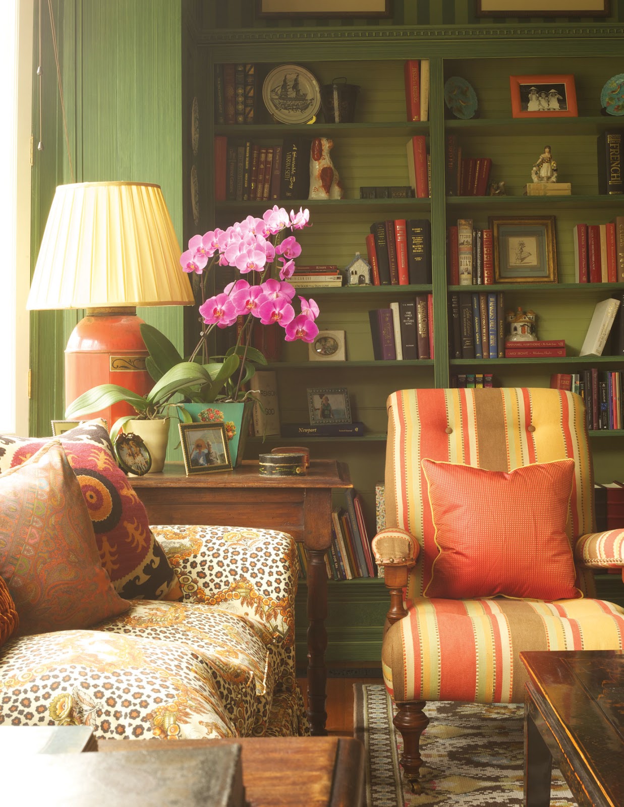
Photo credit: Mick Hales for Living Newport: Houses, People, Style.
Q: Your professional background is incredibly inspiring to me. How did you become interested in journalism, and what are some of your favorite career highlights?
A: As a young single girl in Atlanta, far from Beverly Hills, California where I grew up, I loved entertaining but always wished that there was one little “primer” that I could reference for details I’d forgotten. Moving to New York after my Papillon catalog years gave me the time and opportunity to create just what I’d been looking for; they’re called Pardee Guide to Great Entertaining and Pardee Guide to Great Weekend Entertaining. These, in turn, led to an 11 year career at Bon Appétit as a contributing editor producing “Entertaining with Style.” At the same time, I became the host and creative producer of a 13 part PBS series entitled, “The Presidential Palate: Entertaining at the White House.”
And finally, to wrap up the journalism note, the decision to build our home in Newport prompted my first coffee table book, Private Newport: At Home and in the Garden followed by Living Newport: Houses, People, Style.
Other career highlights? My upscale catalog company in Atlanta, “Papillon,” that was an offspring of my needlepoint shop which I started right after college. As we grew into lifestyle products (i.e. tabletop, entertaining essentials, decorative accessories and furnishings) the by-line of my catalog was birthed… “The Art of Living Graciously.” And this was way before the word “lifestyle” became part of our lexicon.

Ronald Lee Fleming was inspired by Villa Lante in Italy when creating the “American Renaissance Water Garden” at his Newport home. Photo Credit: Meredith Brower for Living Newport: Houses, People, Style.
Q: Your garden is truly amazing. How did you develop your green thumb? And how did you become interested in interior design?
A: I came late to the gardening game, but like so many, once bitten it was enthusiasm that drove me…attending every garden tour I had time for, peppering established gardeners with questions, pouring through books. It was all about immersion! And the same with interior design, though I am a design graduate of UCLA so that study started much earlier than gardening.

As the warm weather approaches, Bettie’s tulips begin to bloom in front of the orangerie.

Bettie’s garden in June.

Bettie enjoys using vintage perfume bottles as vases for the beautiful clippings from her garden. Such a lovely idea!

“On my first trip to Paris, I bought Arpege perfume first because I fell in love with the bottle; filled with two or three stems, it joins other perfume bottles on my bathroom sink,” said Bettie via Instagram.

“Placing the lid beside its container filled with daffodils adds the final touch to a mantle vignette,” said Bettie via Instagram.
Q: I love that you founded a needlepoint store in Atlanta! I have recently begun to needlepoint, and I am completely obsessed. I would love to learn more about your favorite pieces, and hopefully see a few pictures!
A: Thank you for letting me take this trip down memory lane. I was just in North Carolina for a wedding and our host pulled out some old designs that his mother had done from my shop many, many years ago. Oh, the stories and the lovely customers…here are a few designs (I have vellums and original canvases stacked up in my studio because I just can’t bring myself to toss them out). These photos are taken in my house, some favorites that still fit my design aesthetic after all these years…and were stitched by me.

A blue and white geometric 4 ½’ x 2’ rug that was created by counting out every stitch by stitch.

“Shells were one of our most popular designs; once the painted shell had been stitched, the background and border were counted out stitch by stitch,” said Bettie.

Chinese designs were a favorite and this, in petitpoint, Bettie copied from an antique textile.
Q: Where in the South did you grow up, and how did this guide and inspire you to where you are today?
A: Atlanta, in the summers. And then I moved there full time after college. Gracious living and a love of people is such a southern hallmark, and both my parents were from the South so it was part of our life, no matter where we lived. The preface to my first Pardee Guide says it so well (I’m paraphrasing)…“Growing up Southern is all about entertaining; we were either recovering from the last party or concocting a reason for the next one.”

“Every time I walk into my dressing room I see my mother’s designer shoes, propped up on my chair, elegant watered-silk taffeta Herbert Levine’s (7 AAAA) from way back in the 60s,” said Bettie via Instagram.
Q: I have been taking keen note of your fabulous hostessing skills! Can you tell me more about your popular lecture “Entertaining, Newport Style….when Grace Kelly was a Guest”?
A: Newport has always been at the epicenter of the action; summer in Newport, whether you were a Gilded Age mogul or a college age preppy, attracted a long list of talented, inquisitive, successful (or soon to be) people. Parties, and many of them, brought people together; Grace Kelly was here filming “High Society.”
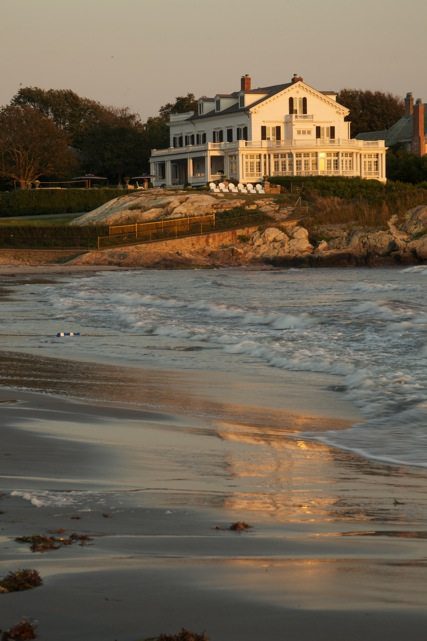
With its exceptional ocean views “Seaweed” had been home to the same family for more than 100 years before it was recently purchased by its current owners. Photo credit: Mick Hales for Living Newport: Houses, People, Style.
Q: Please tell me about your favorite causes, and the importance of giving back.
A: Giving back to the community is the essence of gracious living; it’s also following in the tradition of a town that has existed for over 375 years! From the Redwood Library and Athenaeum (our country’s oldest circulating library, 1747) to the Aquidneck Island Land Trust to the Boys and Girls Club, and many more deserving, well supported causes in Newport that contribute to the quality of life we all enjoy here.

Photo credit: Mick Hales for Living Newport: Houses, People, Style.

Photo credit: Mick Hales for Living Newport: Houses, People, Style.
Q: Please tell me about your newly released Parterre Bench.
A: A very exciting debut took place last week…the “Parterre Bench,” which I designed for my garden a few years back and have now decided to make this iconic accessory available to others. I was inspired by a bench in an Irish garden I had visited 35 years ago! But what makes this especially meaningful to me is that it substantiates holding on to a vision, no matter how long it might take to realize.

The Parterre Bench

The Parterre Bench as featured via Traditional Home on Instagram on Sunday.

Bettie Bearden Pardee
Thank you Bettie for providing such an elegant glimpse inside your enchanted world. I am now ready to pack my bags and move to Newport! Bettie’s book Living Newport: Houses, People, Style and her first book Private Newport: At Home and in the Garden are available through her website. For inquiries regarding the Parterre bench, please click here. And you will want to subscribe to her blog Private Newport for ongoing inspiration!

Design Crush: Patricia McLean Interiors

Atlanta-based designer Patricia McLean is a true traditionalist through and through. Born in Atlanta, she spent her childhood in High Point, North Carolina, where her mother would take her to the legendary Otto Zenke decorating studio. She grew up surrounded by antiques and traveling to Europe to see the great homes and cathedrals, all of which influenced her love of classic design. Patricia does not like to follow trends, but instead seeks to create a look that is collected and timeless.
I first learned of Patricia’s work while reading the March/April 2016 issue of Victoria magazine. A Georgian-style residence in Brookhaven, Georgia she had designed was featured, and I fell in love. Patricia began working with the homeowners (their third project together!) long before the foundation was poured to create a home with an air of tradition and ageless grace that will last for generations. Let’s take a tour of this exquisite home along with a few more of my favorites from Patricia’s portfolio…


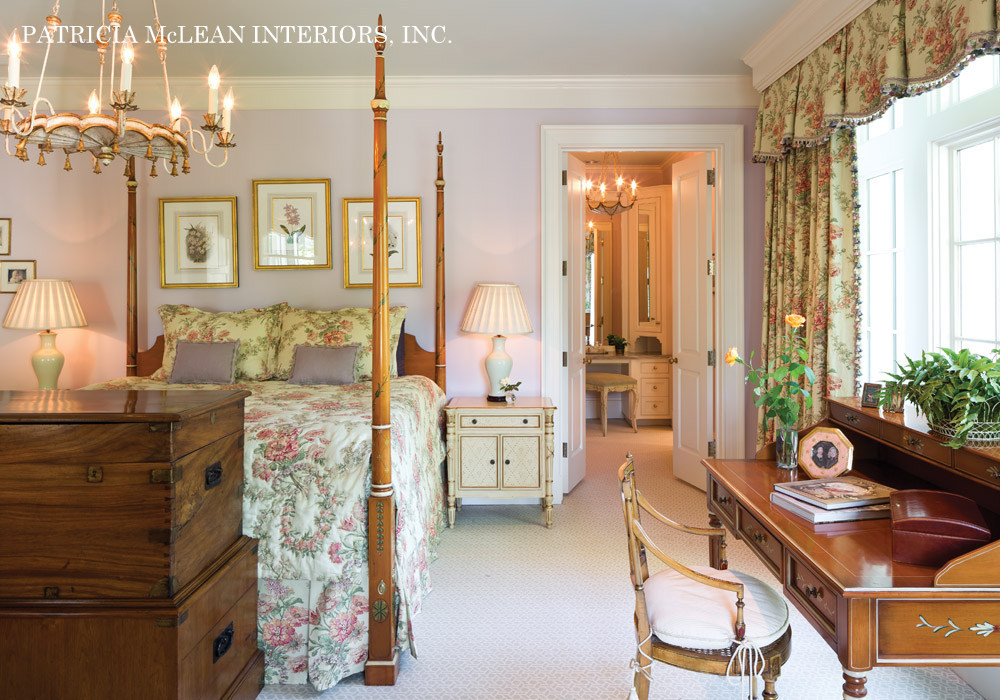
I am also madly in love with the bedroom she created for the 2015 Atlanta Symphony Associates’ Decorators’ Show House & Gardens…


I love this skirted dressing table!
The bedroom she designed for the St. Regis Atlanta Traditional Model Home is an absolute dream…


And last but not least, how beautiful is this Buckhead living room?

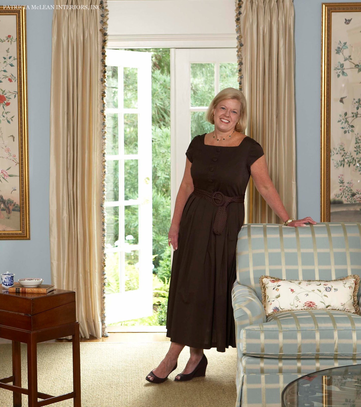
Patricia McLean
Everything Patricia does is absolute perfection… these are interiors designed to last a lifetime. To learn more about her work, please visit her website, Patricia McLean Interiors, Inc. And there is a fabulous Q&A you will want to read here. I am looking forward to seeing her room at the 2016 Cashiers Designer Showhouse, August 13-28. Patricia was named Honorary Regional Designer, and she is designing the living room with an English Justin Van Breda print. She is also Honorary Interior Designer Chair for the 2017 Cathedral Antiques Show. Such talent!


The Father of the Bride Home is for Sale!

The quintessential all-American dream home from the 1991 movie Father of the Bride is for sale, and now it can be yours! Located in Alhambra, California, the 4,397 square foot 1925 Colonial is poised on an 18,110 square foot lot and features four bedrooms and four baths. It is truly a dream!

I have always loved this home, and you can read all about it at Hooked on Houses… Julia explains that it was actually just the driveway and backyard from this home that were used in the movie. (She also wrote about this house when it was for sale in 2011.) The front exterior belonged to a different house in Pasadena. You can read more about it here.

The Father of the Bride house in Pasadena.
According to Zillow, there is already a contract pending on the Alhambra home, but you can still click over and take a sneak peek… And if you loved this movie as much as I did, you will want to see Hooked on Houses’ thorough analysis of the two homes here and here. Enjoy!