


Welcome to TGP Tidbits where we round up the happenings and our musings of the design industry each week. This week we take a look at Hill House Home x Roller Rabbit, Ralph Lauren’s American Icons, and Tuckernuck Comes to Nantucket. Written by Natalie Aldridge.
Summer with Tuckernuck
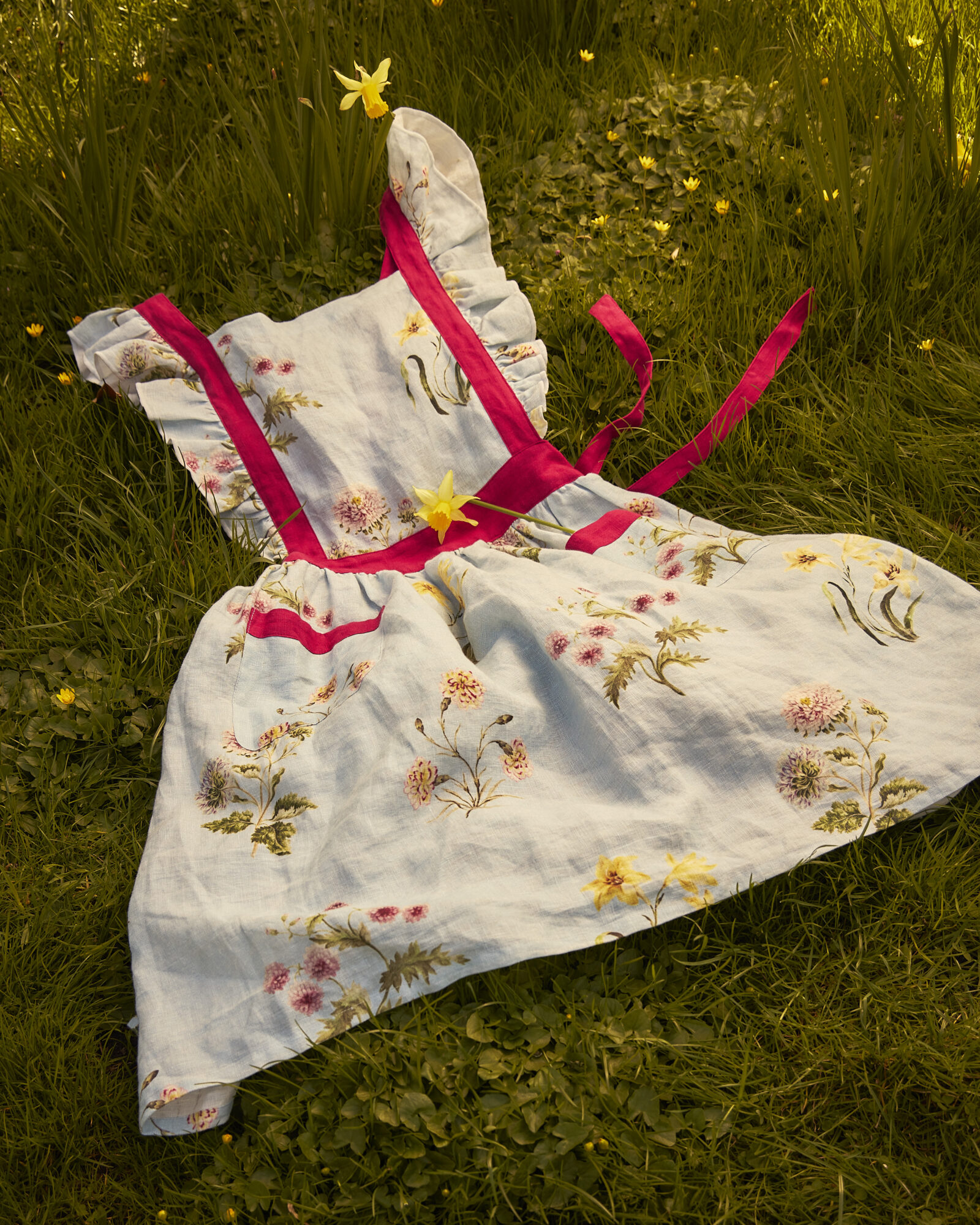
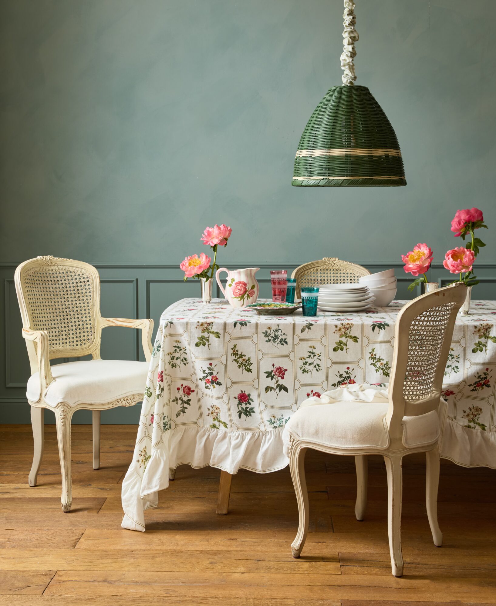
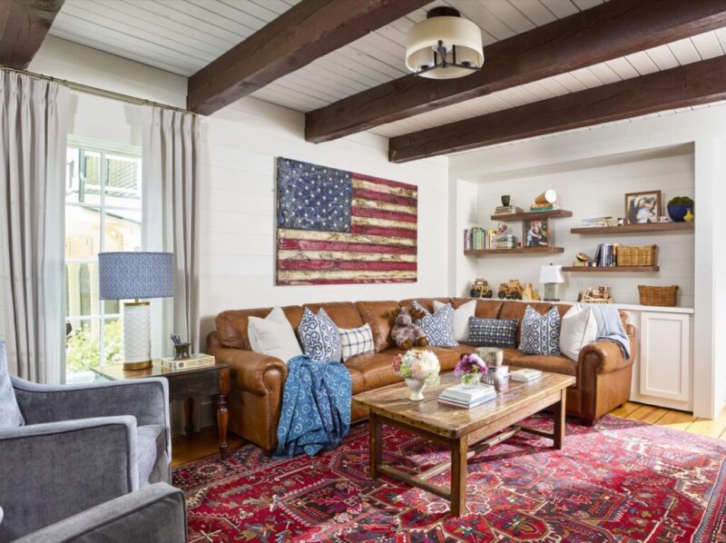
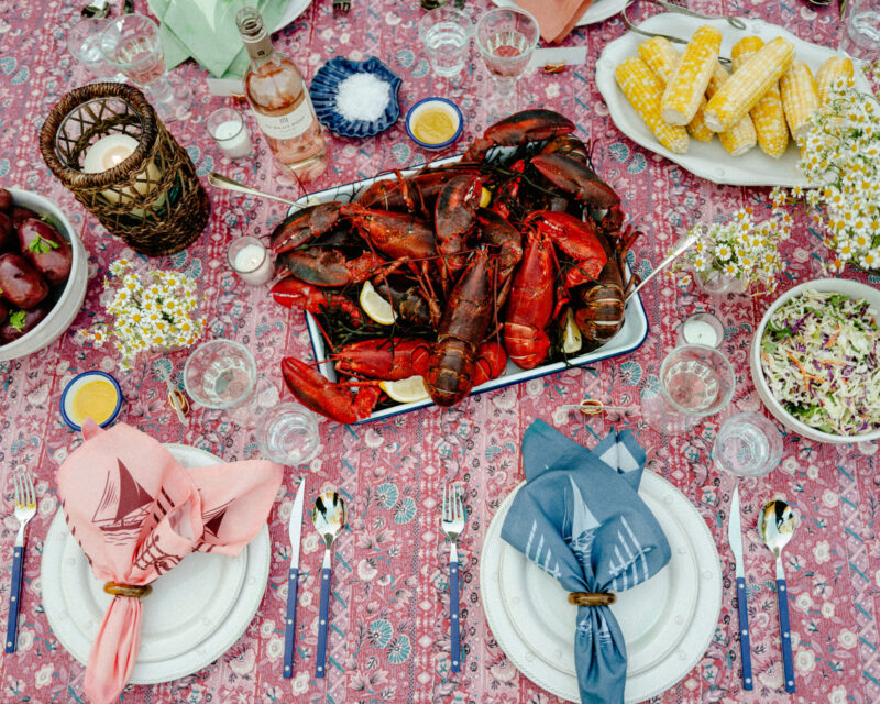
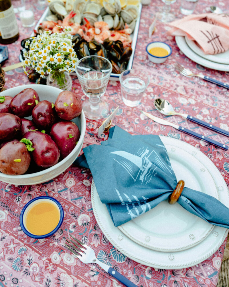
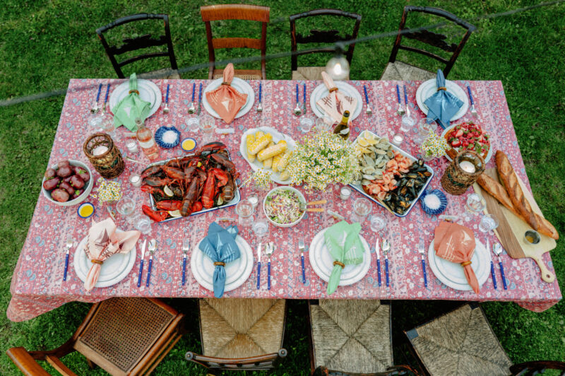
Tuckernuck just launched a new Summer Entertaining Collection, featuring a beautiful Americana print just in time for the Fourth of July! The red, white, and blue pattern is available across tabletop essentials perfect for summer entertaining.
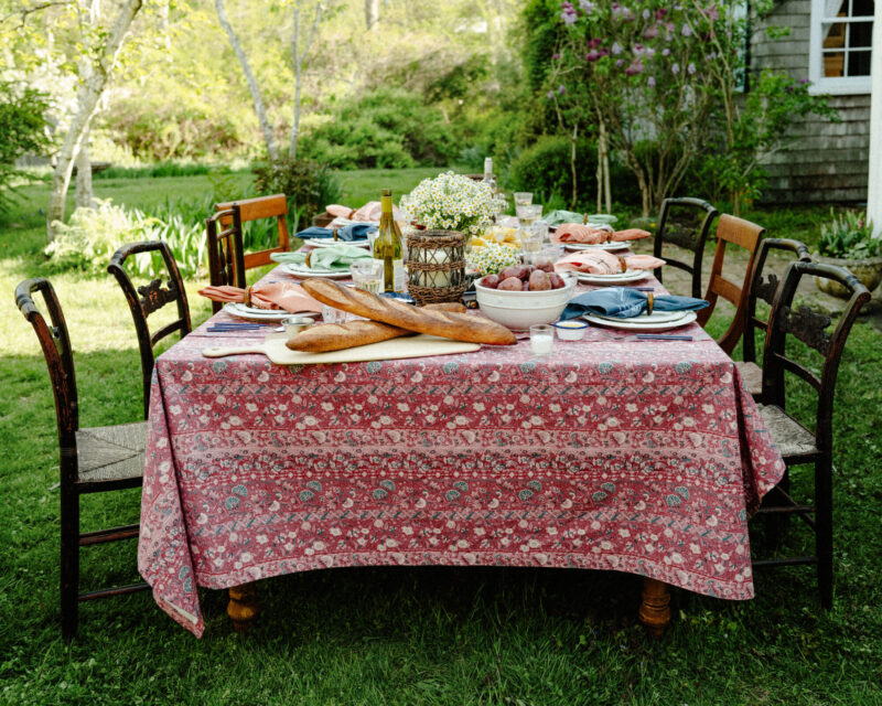
The Americana-inspired collection is perfect for celebrating the season with informal meals in the backyard. Good friends, good food, and the kind of easy entertaining summer calls for.
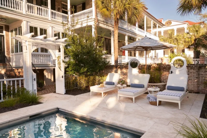
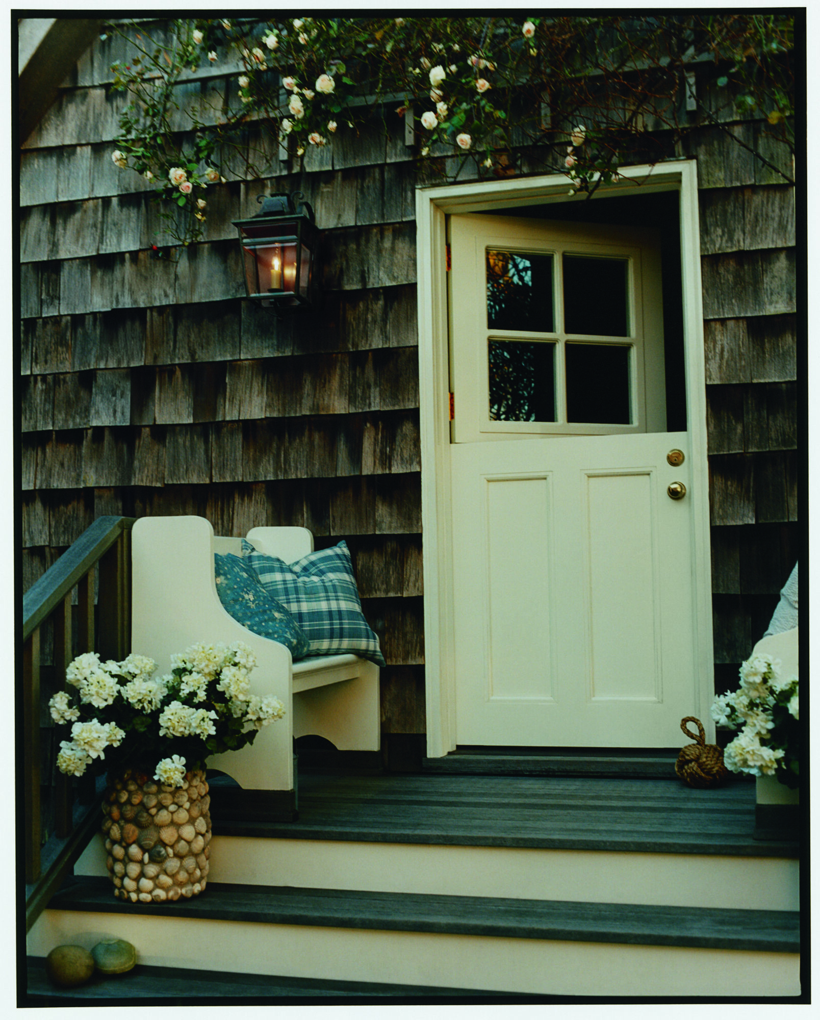
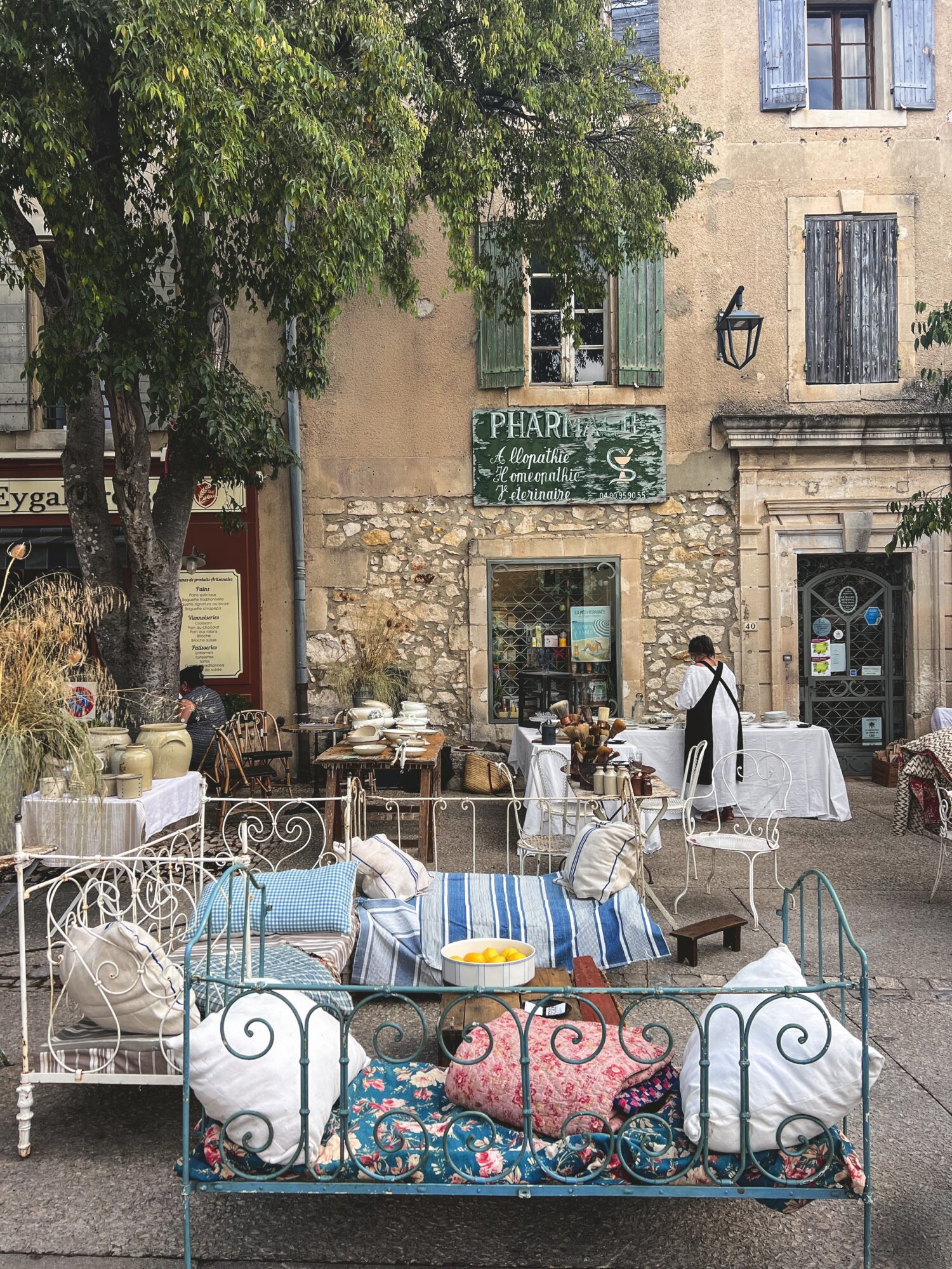
Furthermore, Tuckernuck has officially arrived on Nantucket with the opening of A Sailor’s Valentine, a delightful new concept store on Centre Street that celebrates all things chic Americana and Nantucket lore. While the thoughtfully curated capsule collection is certainly worth browsing, it is the interiors that truly stole our hearts.
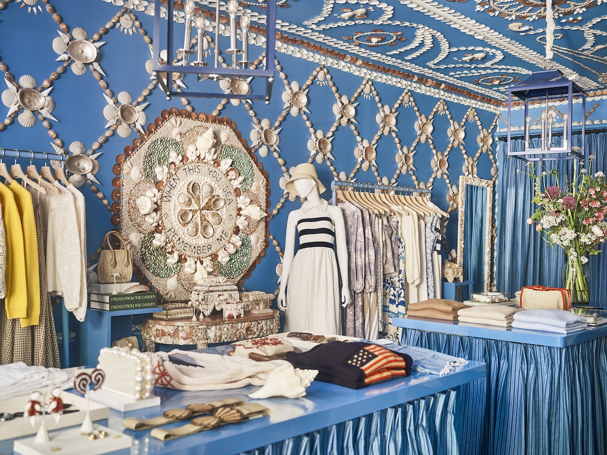
Named after the intricate shell mosaics sailors once brought home as gifts, the shop embraces the tradition in the most charming way imaginable. Bright, punchy, and unabashedly cheerful, the space is layered with nautical references, bold color, and playful details that feel perfectly suited to summer on Nantucket. Most enchanting of all are the shell-covered walls, where shells have been meticulously arranged into decorative patterns that manage to feel both wonderfully creative and surprisingly elegant.
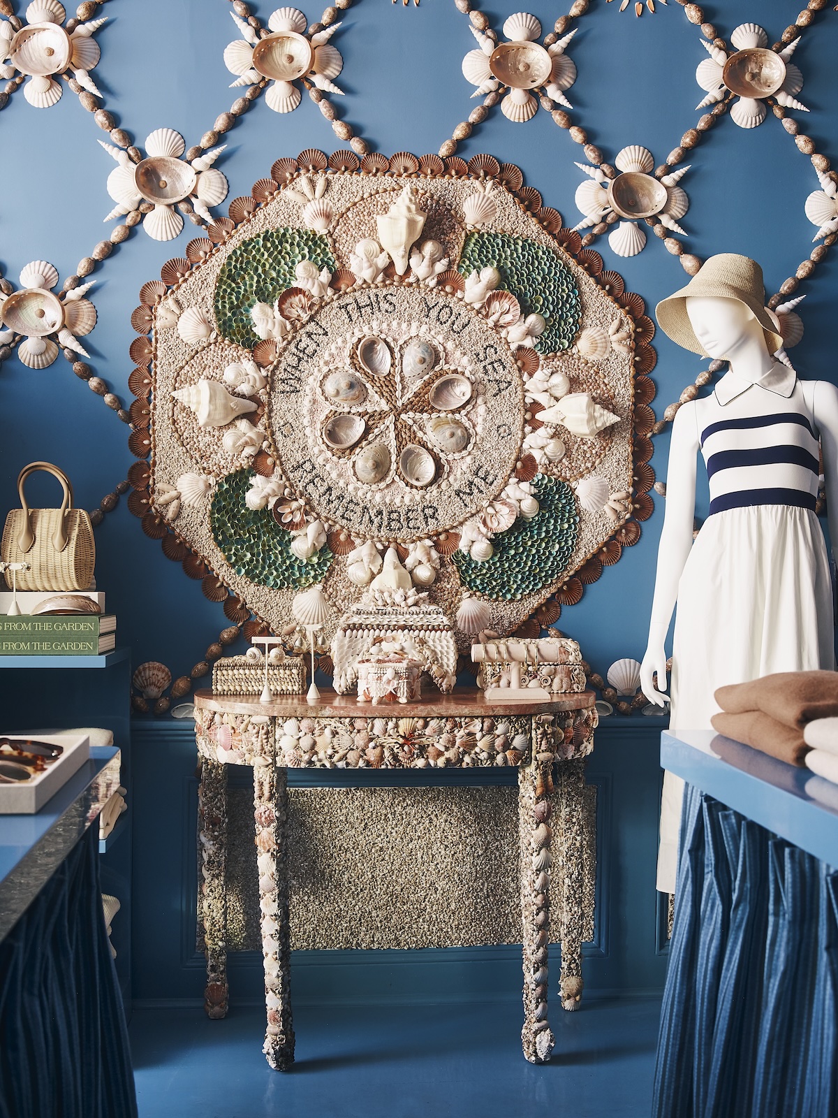
Rather than relying on the pared-back coastal aesthetic that has become so ubiquitous, A Sailor’s Valentine embraces ornament, color, and whimsy. It feels fresh, spirited, and distinctly Nantucket without slipping into cliché. The result is the sort of space that reminds us why we love interiors. It is immersive, joyful, and full of personality, with plenty of inspiration.
If you’re headed to Nantucket this summer, come for the shopping, but stay to admire the shells… and be sure to check out Tuckernuck’s Nantucket Travel Guide, with insider tips on where to stay, eat, and shop on Nantucket, according to Tuckernuck.
You can also shop Tuckernuck’s Summer Entertaining Collection online here!
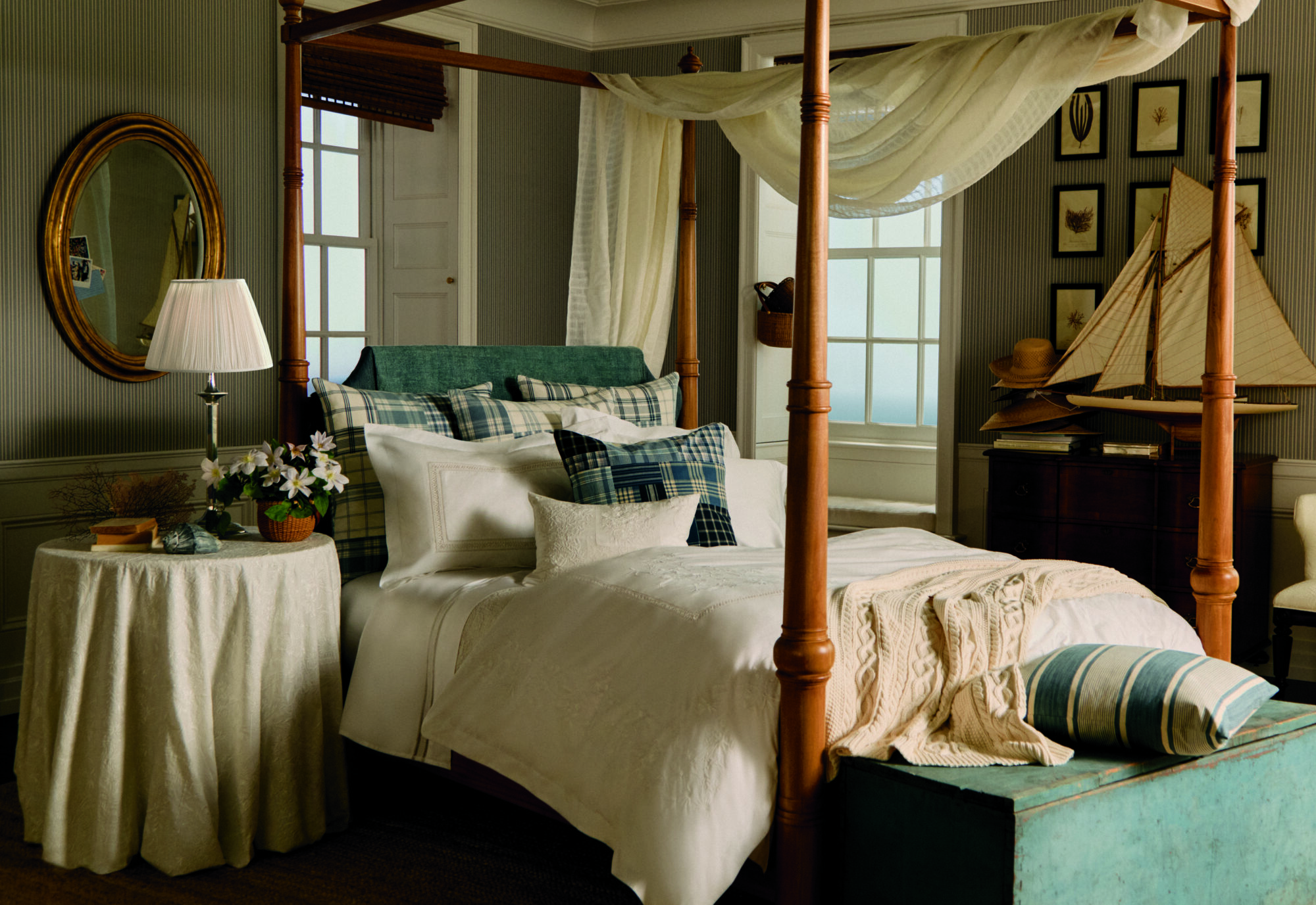
Ralph Lauren’s American Icons Stamps
Just when we thought Ralph Lauren had found every possible way to define American style, he has landed on postage stamps.
To celebrate the United States’ 250th anniversary, Ralph Lauren has curated American Icons, a collection of 13 commemorative Forever stamps for the U.S. Postal Service. The imagery reads like a visual mood board for the Ralph Lauren universe: a weathered pickup truck, a teddy bear, a baseball glove, wild horses, a lighthouse, a barn, the Empire State Building, and, naturally, an American flag sweater. The collection’s centerpiece is a special knit flag designed by Lauren himself, framed by a field of blue denim.
View this post on Instagram
What makes the project particularly noteworthy is that it marks the first time an individual has been invited to curate an entire collection of official USPS stamps. And it is difficult to imagine a more fitting choice. For nearly six decades, Ralph Lauren has built an empire on a romantic vision of America, transforming everything from Western ranches and East Coast prep schools to vintage sportswear and country estates into an enduring cultural touchstone.
![]()
![]()
Beyond the upcoming 250th celebrations, the collaboration arrives at a moment when stamp collecting seems to be making a resurgence. Perhaps it is nostalgia, perhaps it is the appeal of tangible objects in an increasingly digital world, or perhaps we are all looking for excuses to send more handwritten notes. Whatever the reason, we are firmly in favor. Longtime readers may recall our passion for stamp collecting, and we have a feeling these stamps may find their way into more than a few albums, desk drawers, and correspondence collections. The stamps can be found here!
View this post on Instagram
Hill House Home x Roller Rabbit
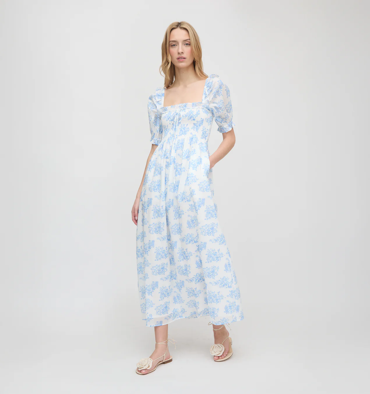
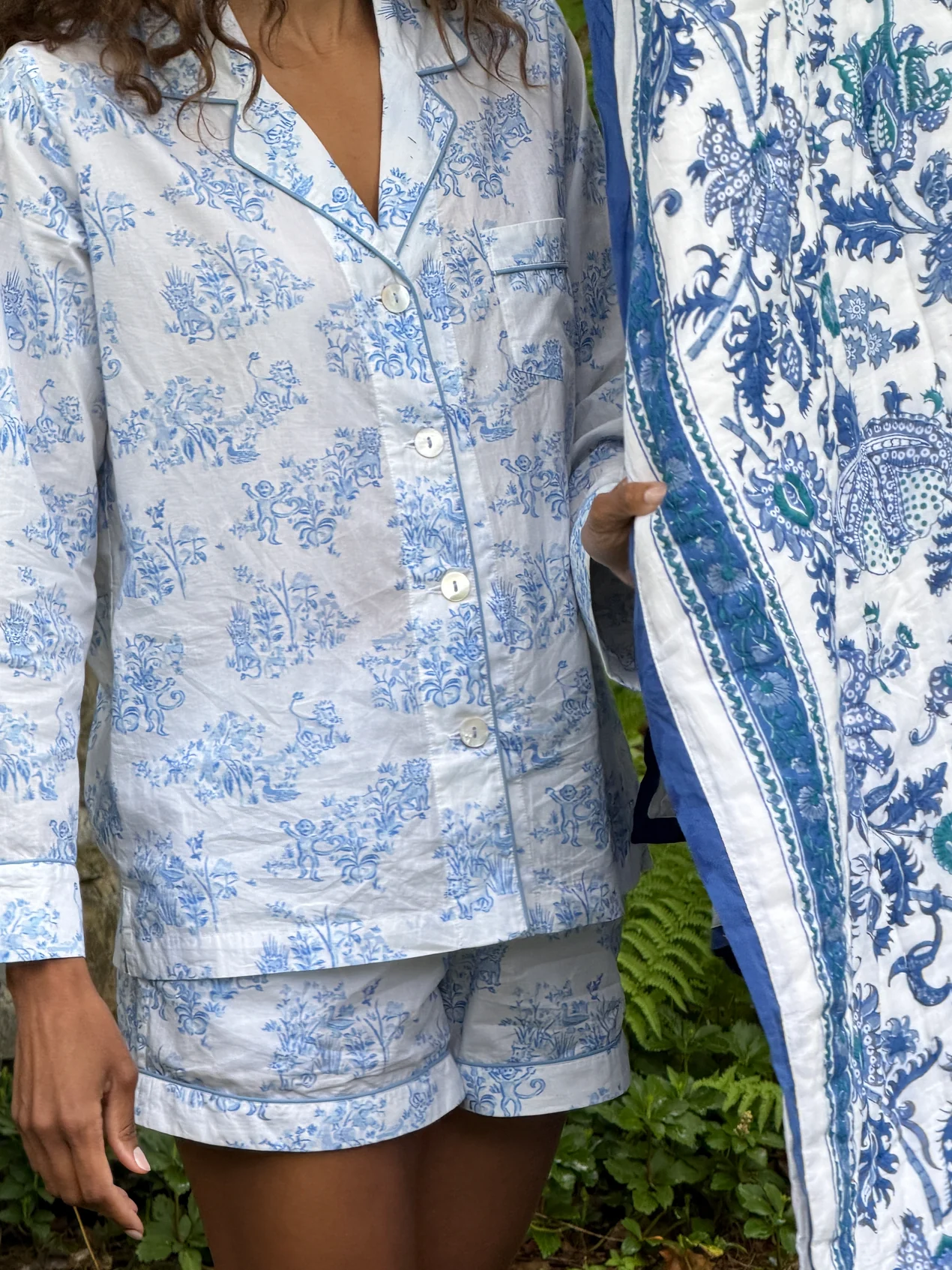
If there are any two brands that embody joy and playfulness, it would be Hill House Home and Roller Rabbit. And if you adore Roller Rabbit pajamas and own at least one Nap Dress, this collaboration was made for you. Hill House Home and Roller Rabbit have joined forces on a limited-edition collection that combines the best of both worlds. With iconic prints, easy summer dresses, and cheerful pajamas, the collection arrives just in time for the season’s beach weekends and summer escapes.
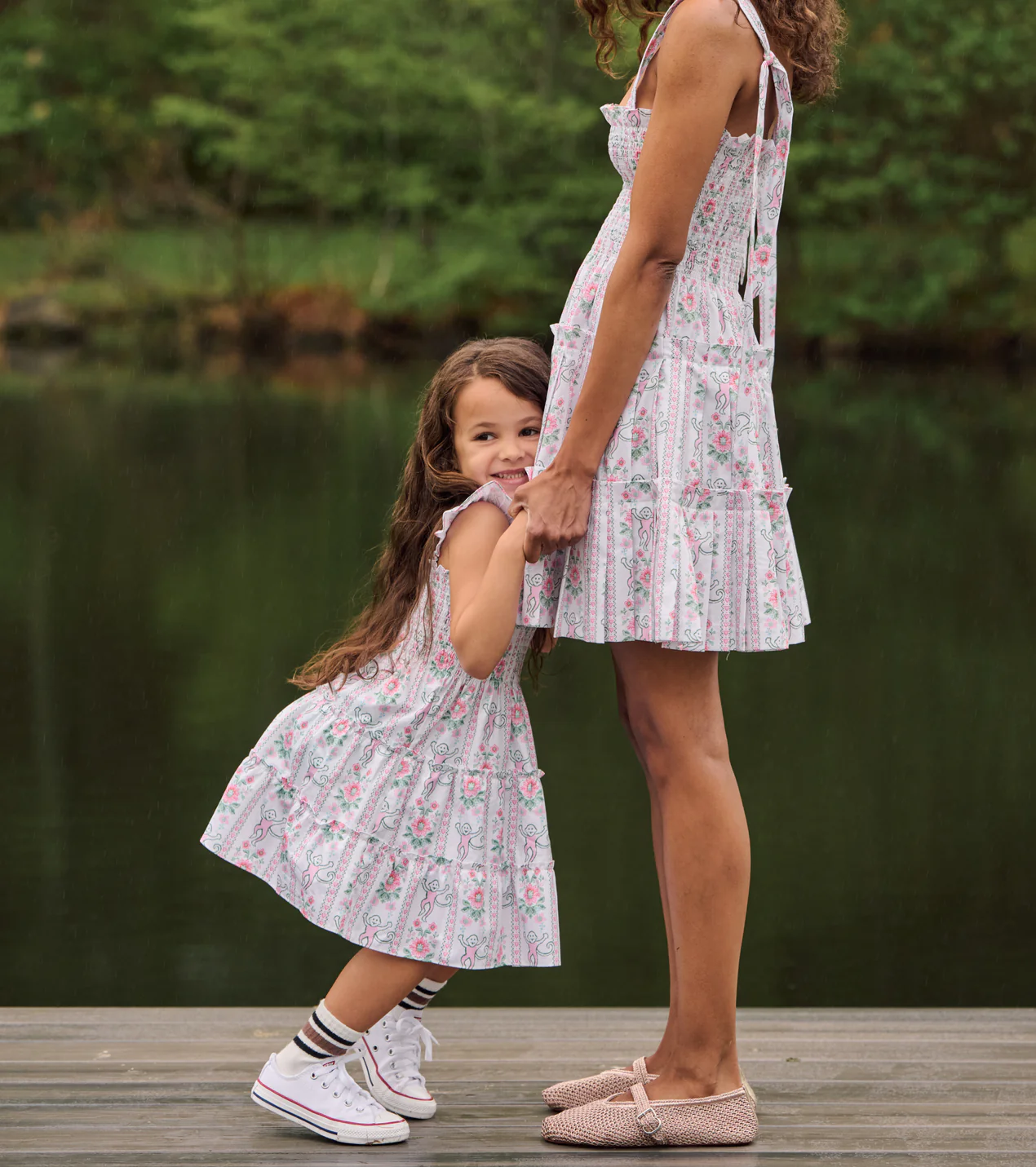
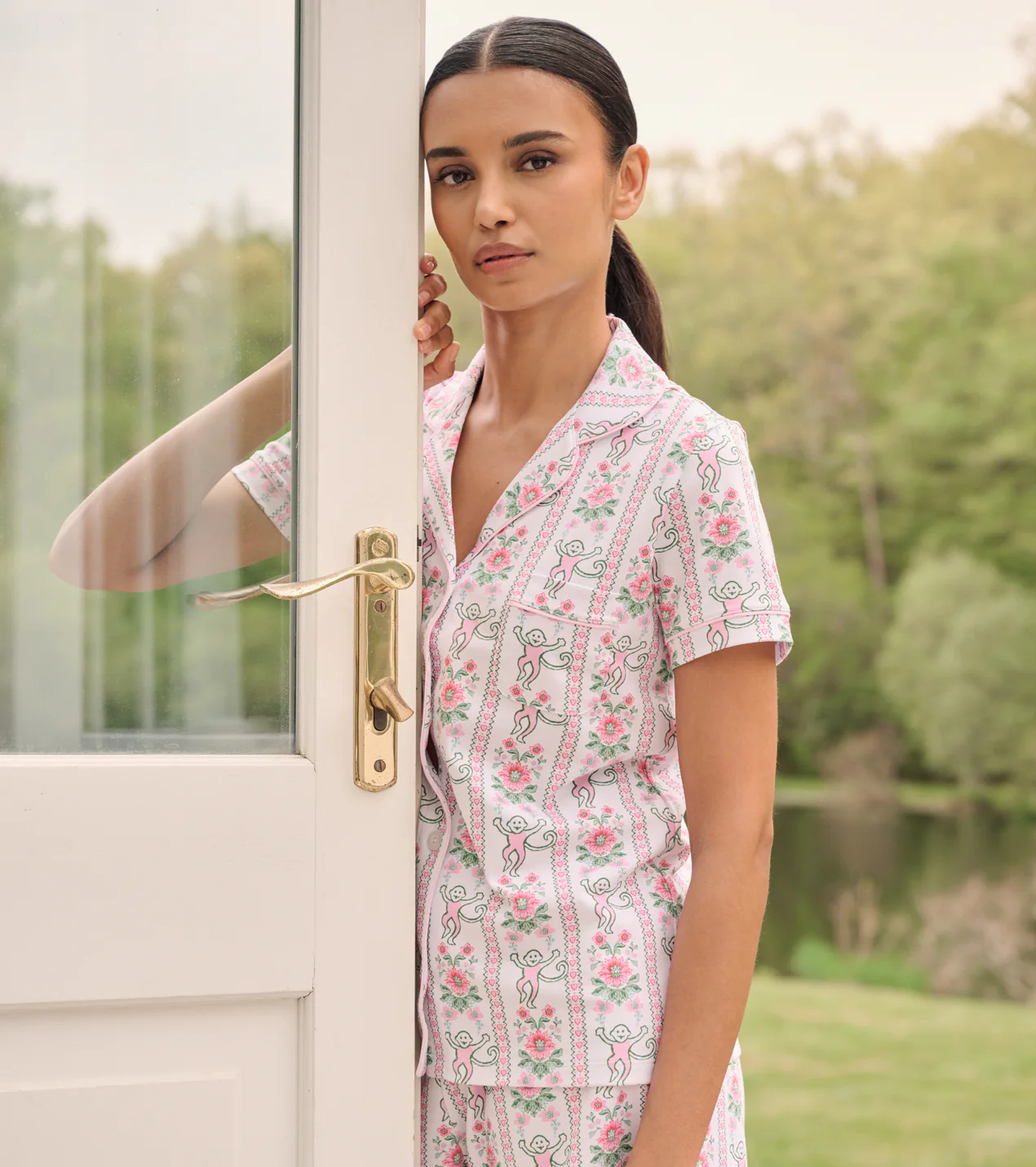
The collection feels wonderfully nostalgic without veering into costume. Roller Rabbit’s beloved monkey motif appears across Hill House’s signature silhouettes, creating pieces that feel equally suited to a beach vacation, a weekend at the lake, or a lazy morning spent lingering over coffee and the newspaper. Bright colors, charming prints, and a healthy dose of whimsy make the entire collection difficult to resist.
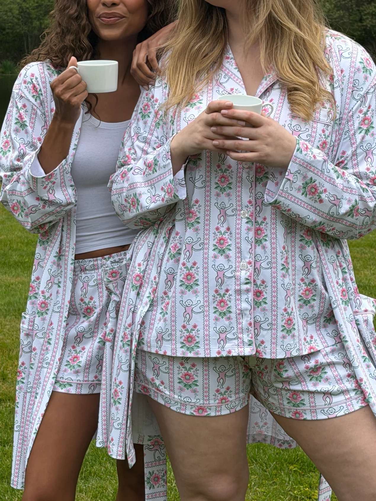
There is something refreshingly carefree about it all. In a sea of fashion launches that take themselves rather seriously, this one embraces a sense of lightheartedness. It calls to mind sleepaway camp trunks, family holidays, and the sort of summers that seem to stretch on forever. Shop the full collection here.
Read our favorite articles of the week!
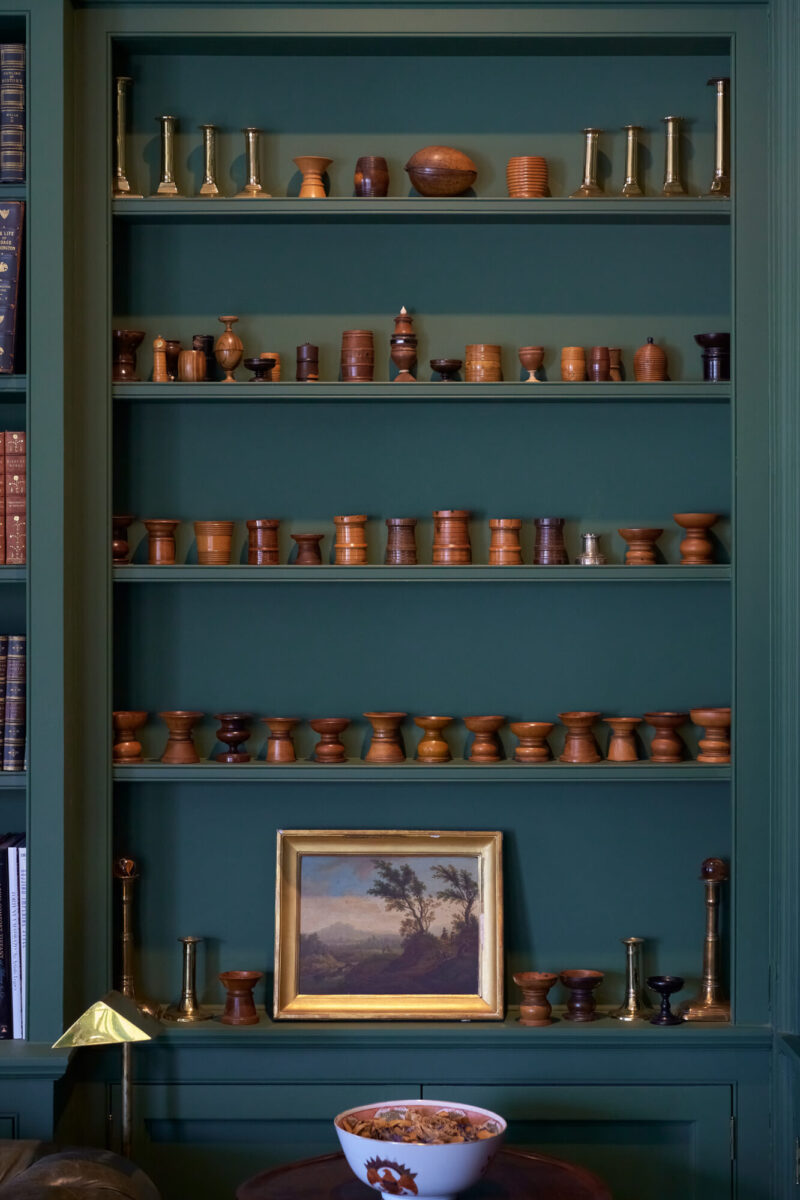
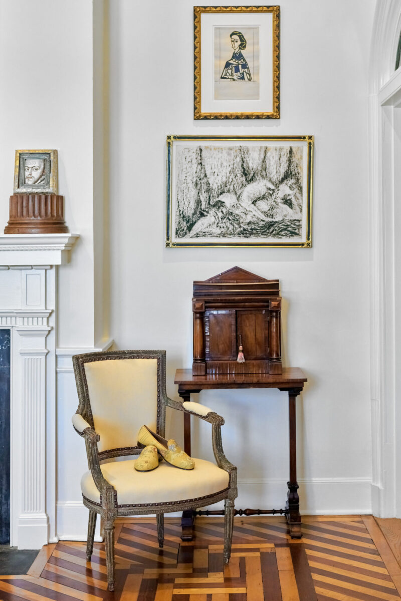
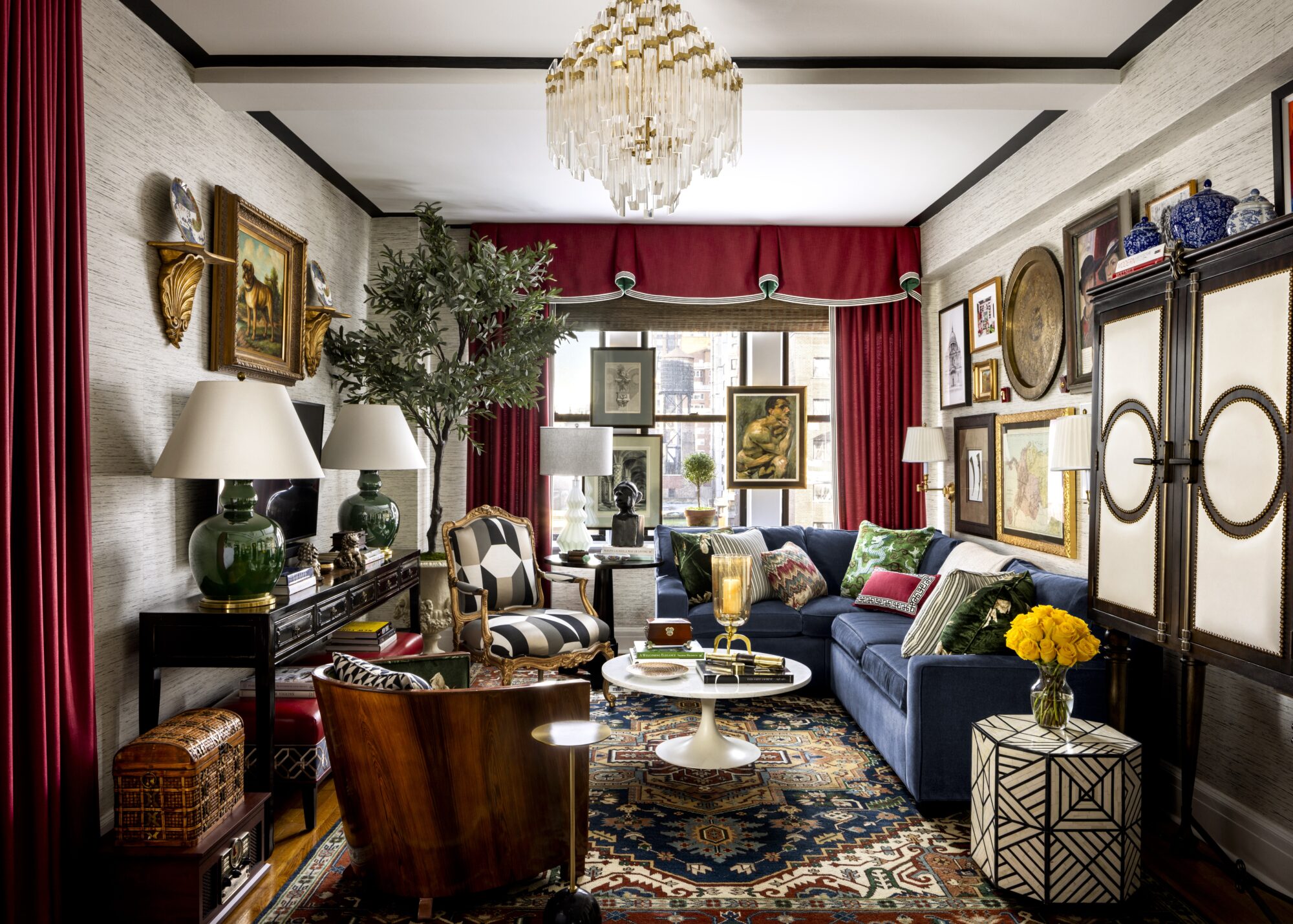
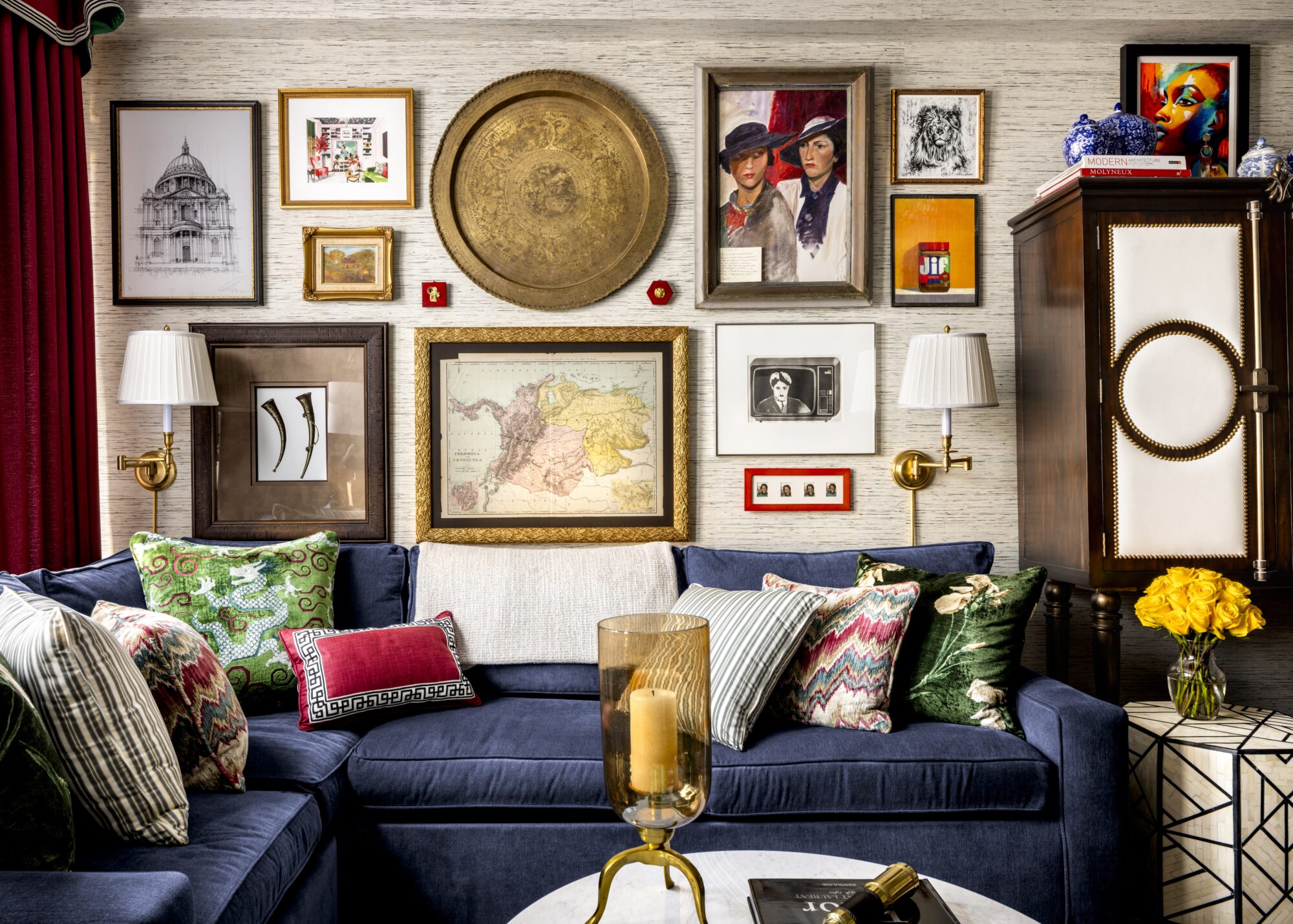
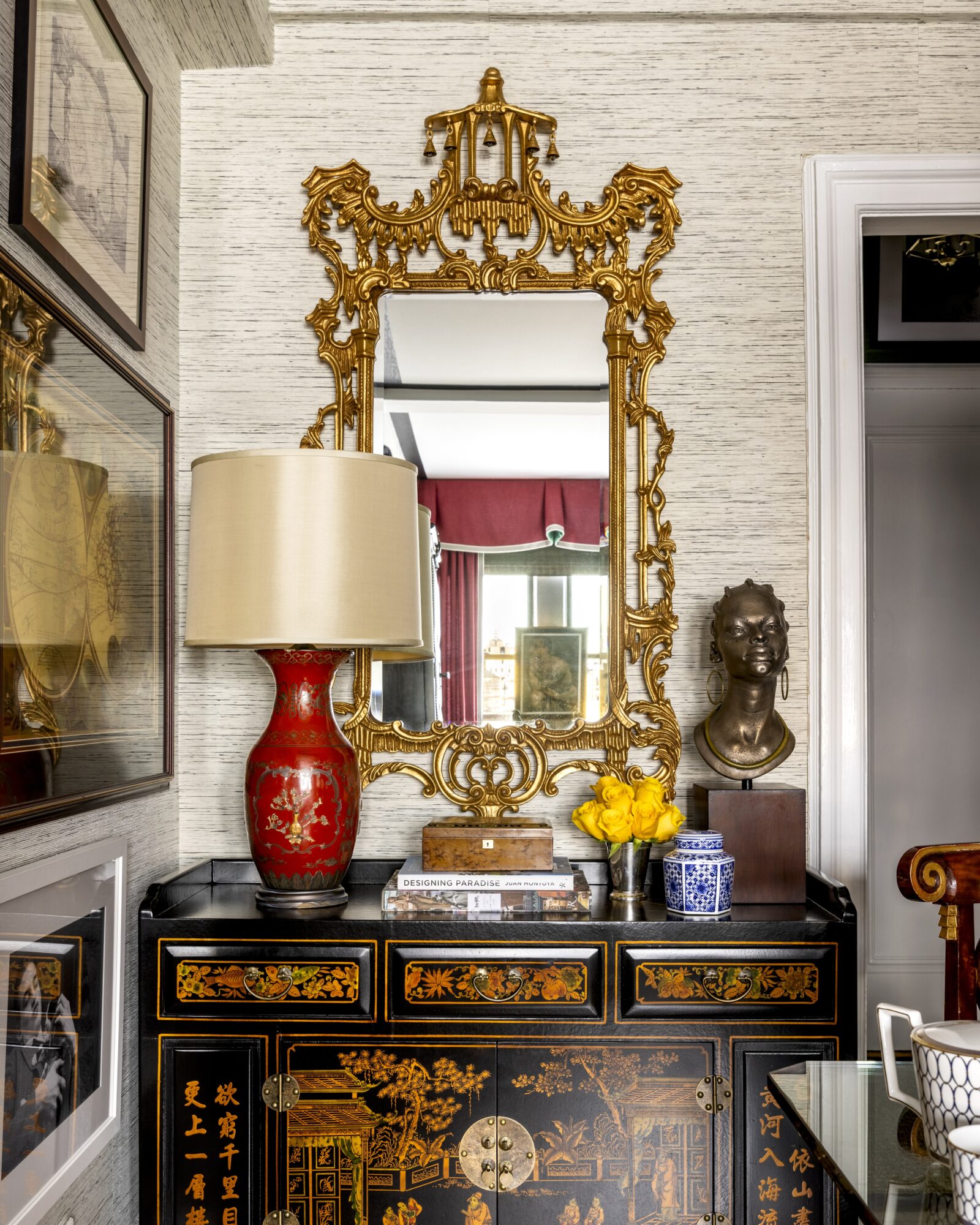
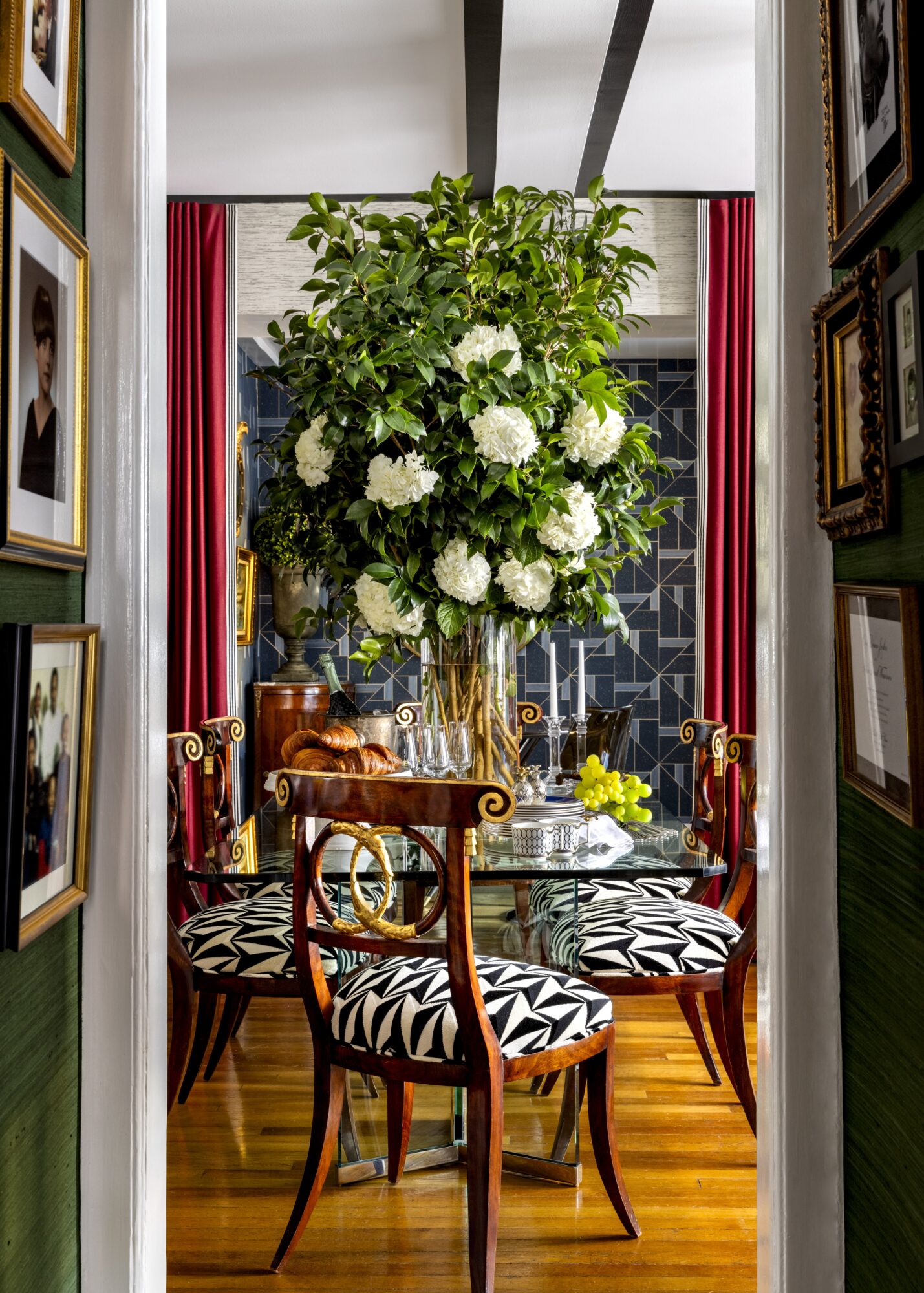
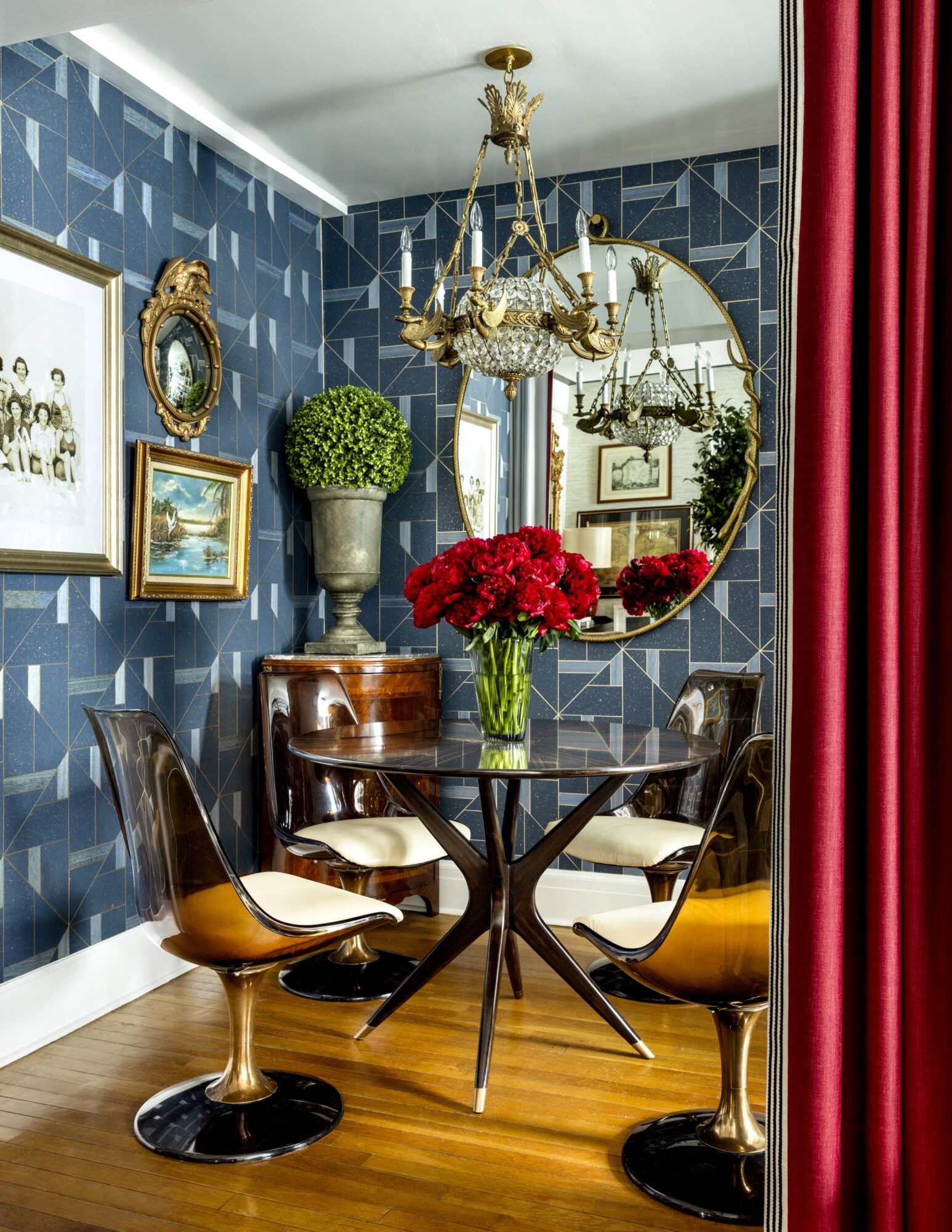
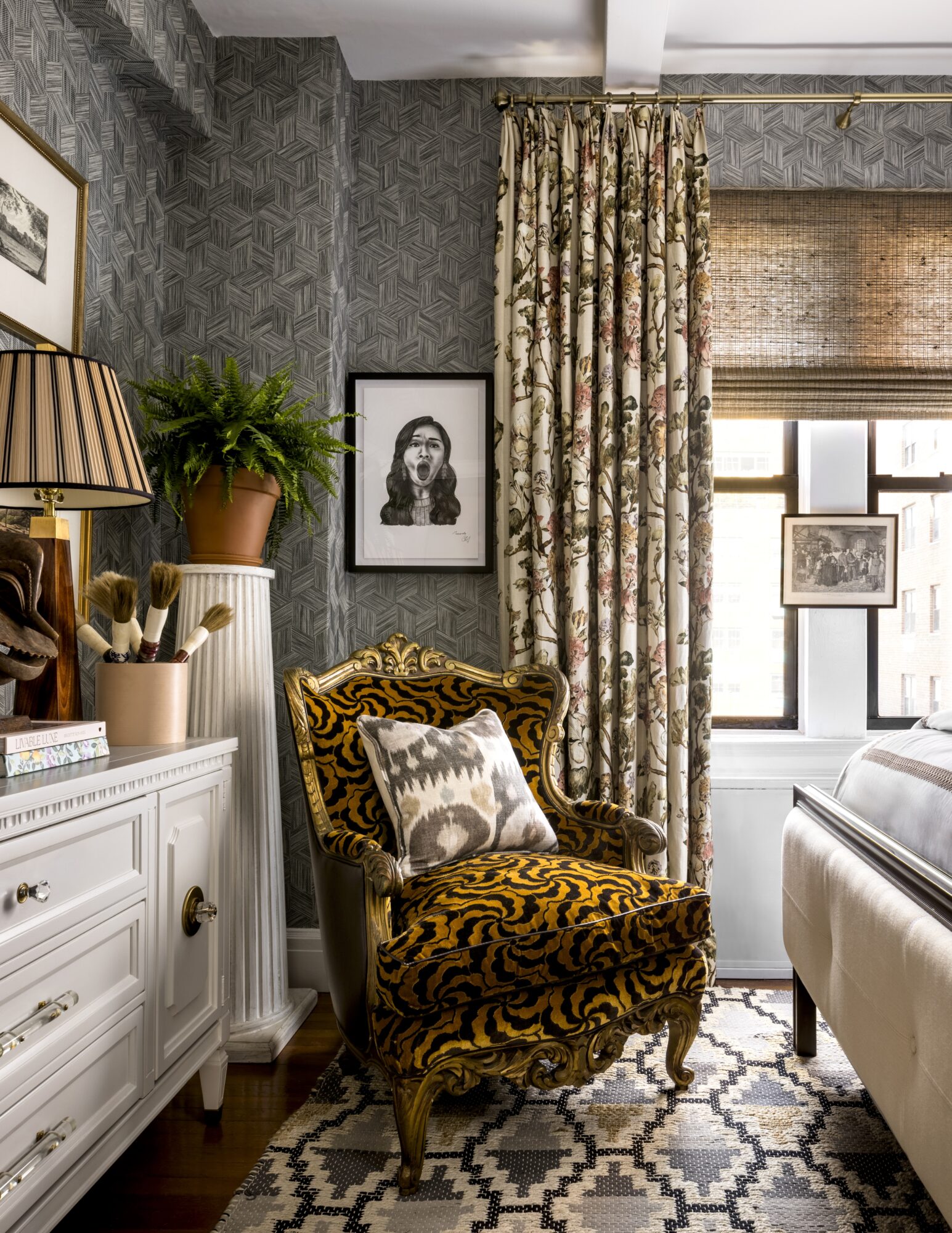
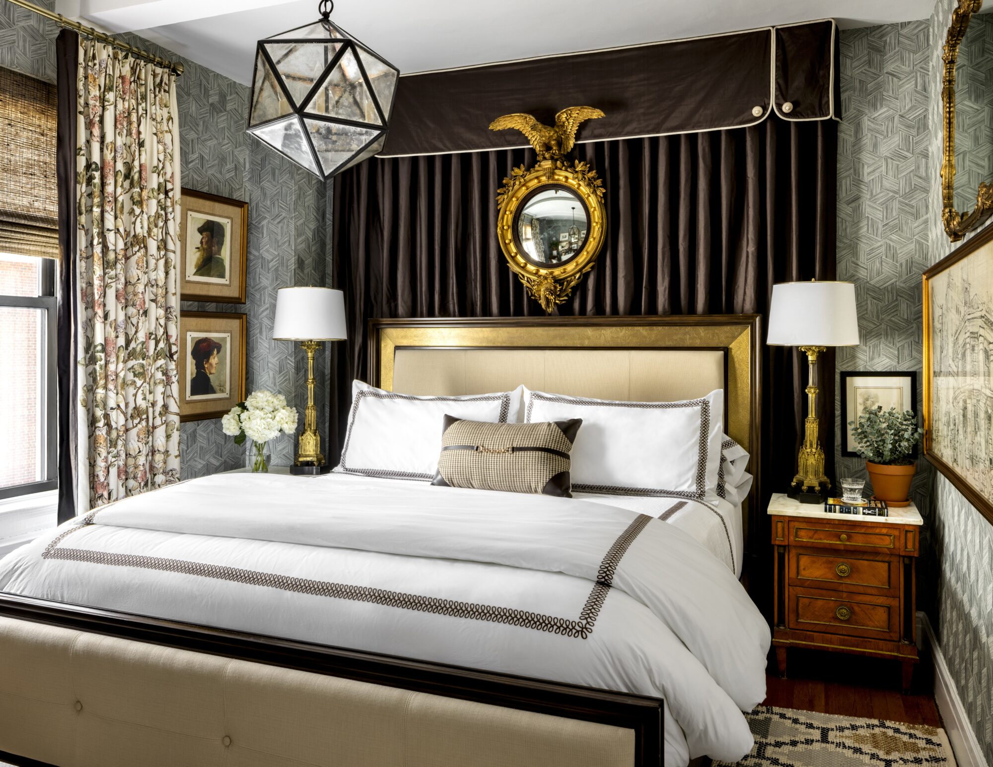
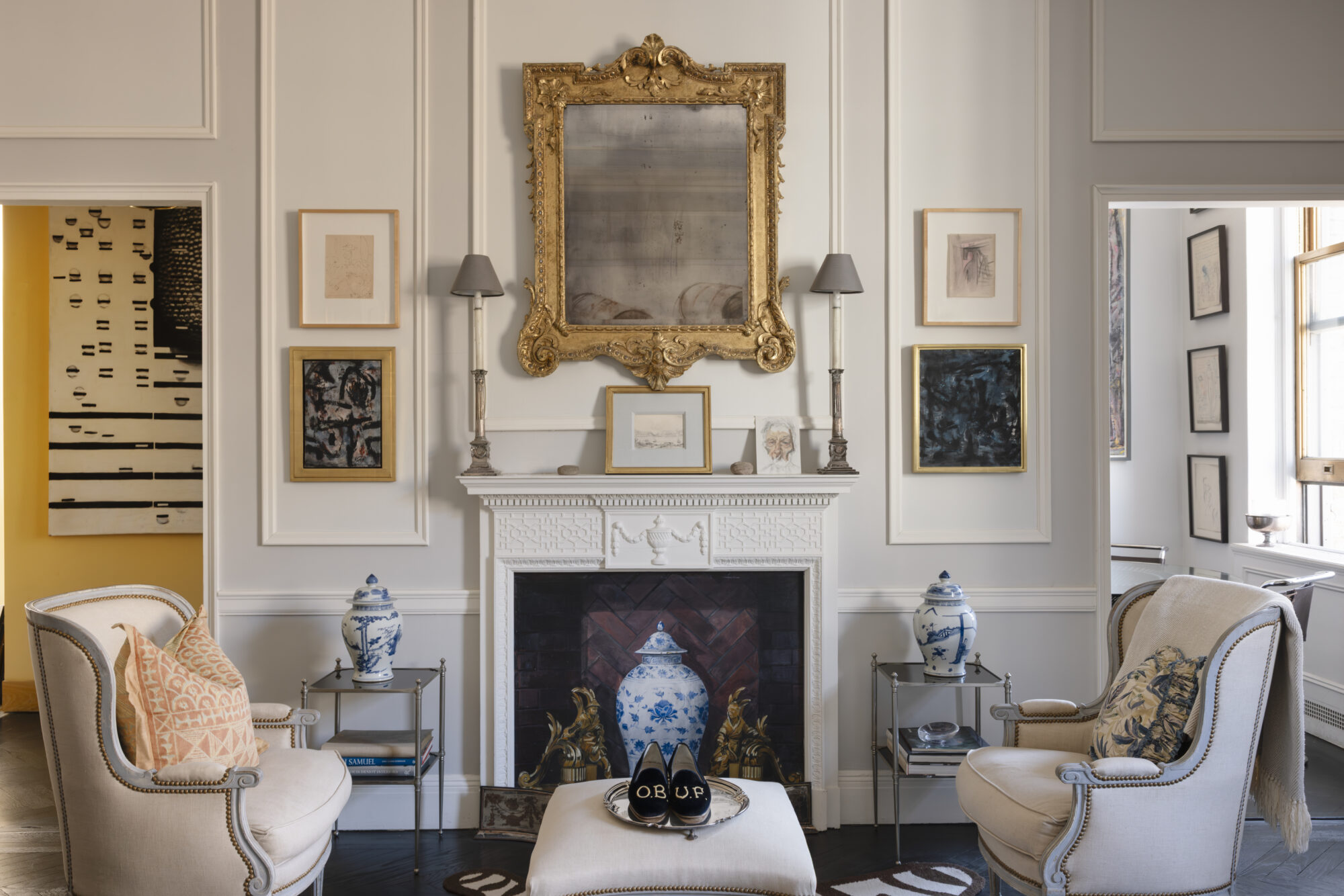
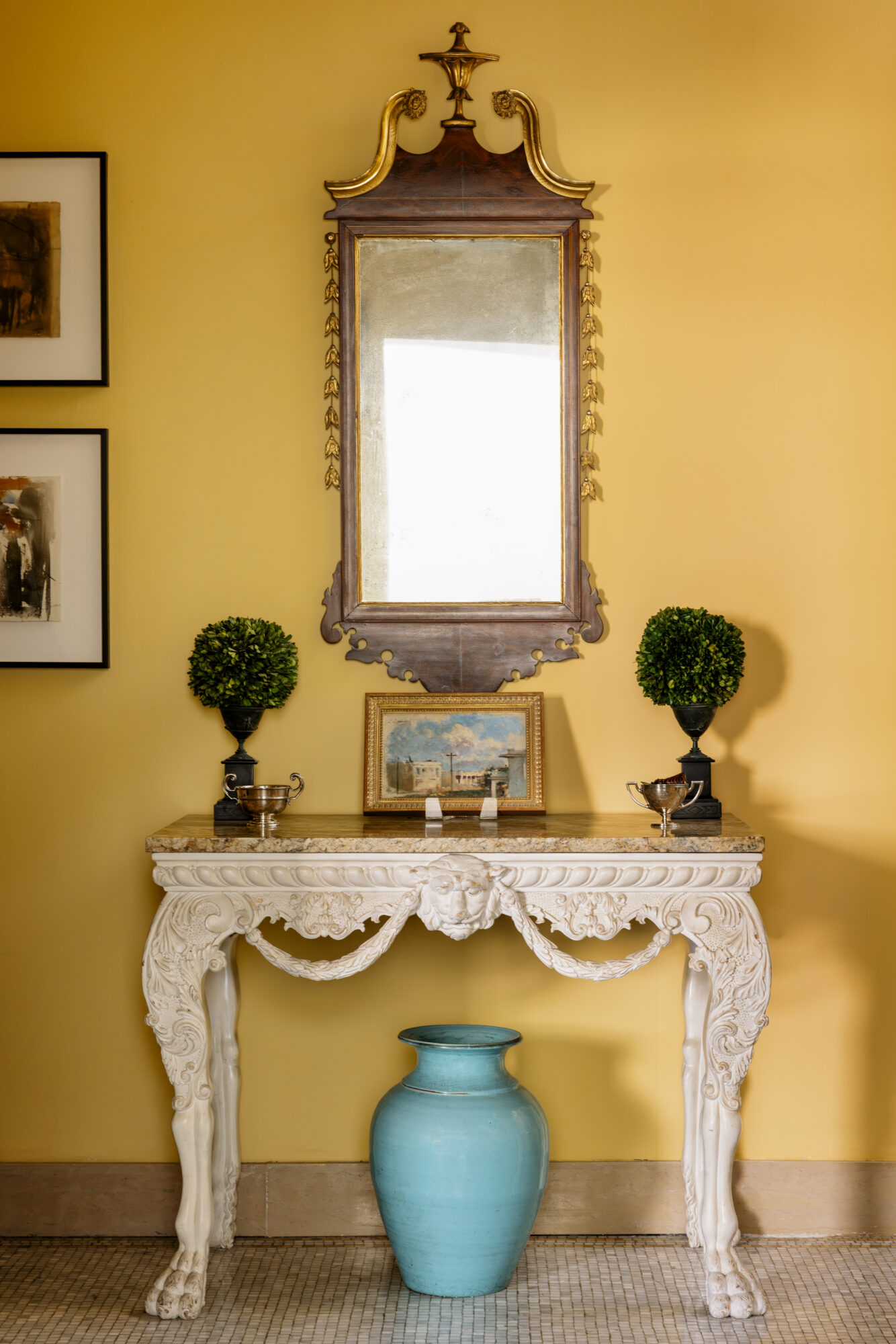
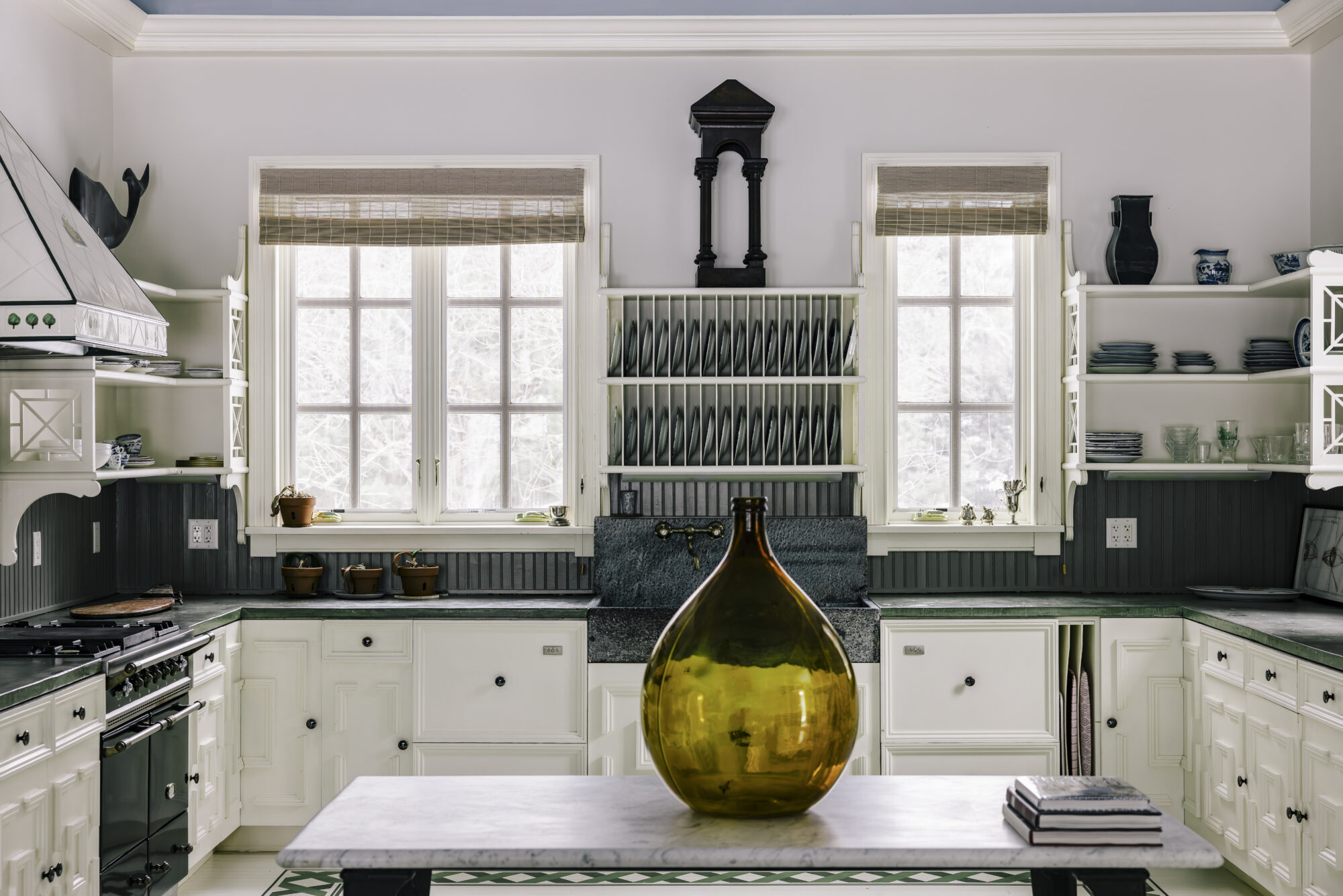
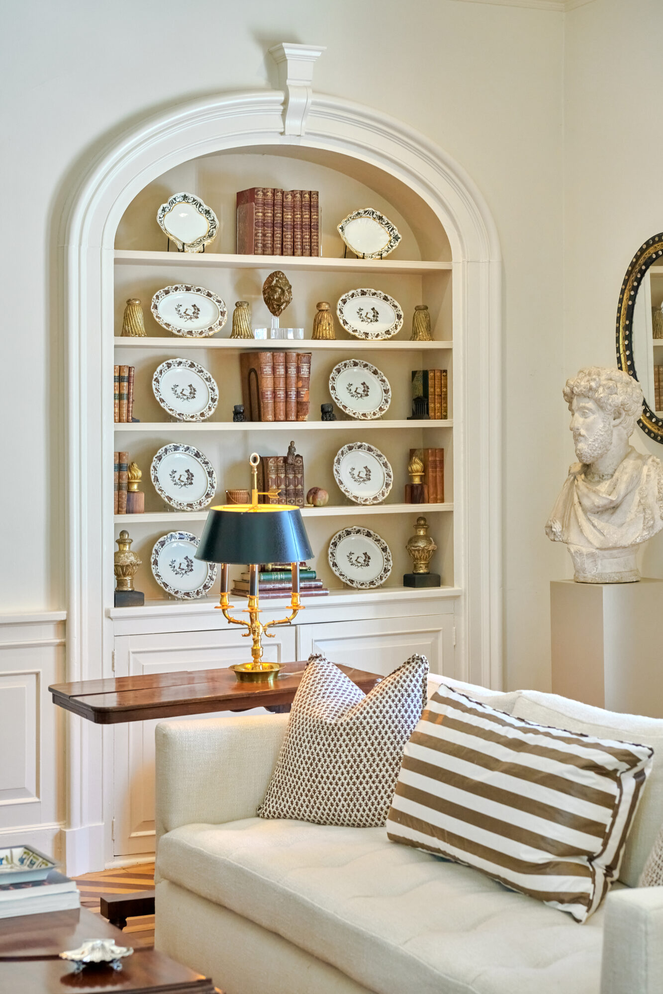
Step Inside an Anthony Baratta-Designed Manhattan Apartment Where Blue Is a Neutral written by Stephanie Hunt for Veranda.
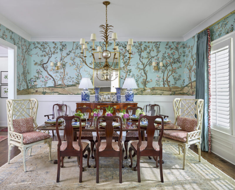
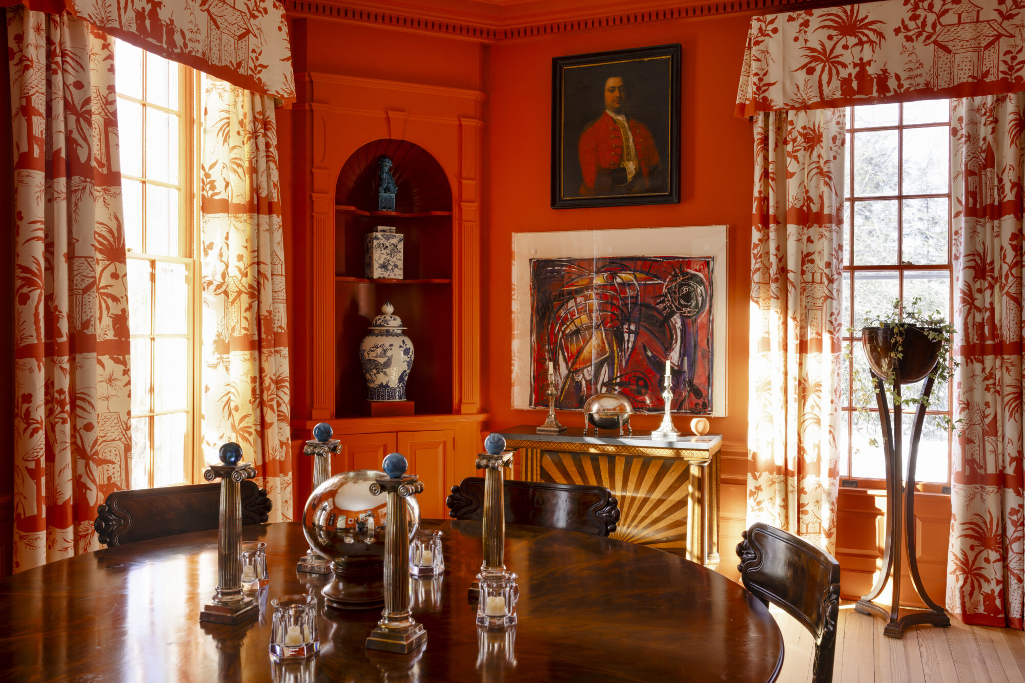
From the Archive: Inside Hubert de Givenchy’s French Castle, Le Jonchet, in the 1980s written by Amanda Sims Clifford and Carolyn Englefield for House Beautiful.
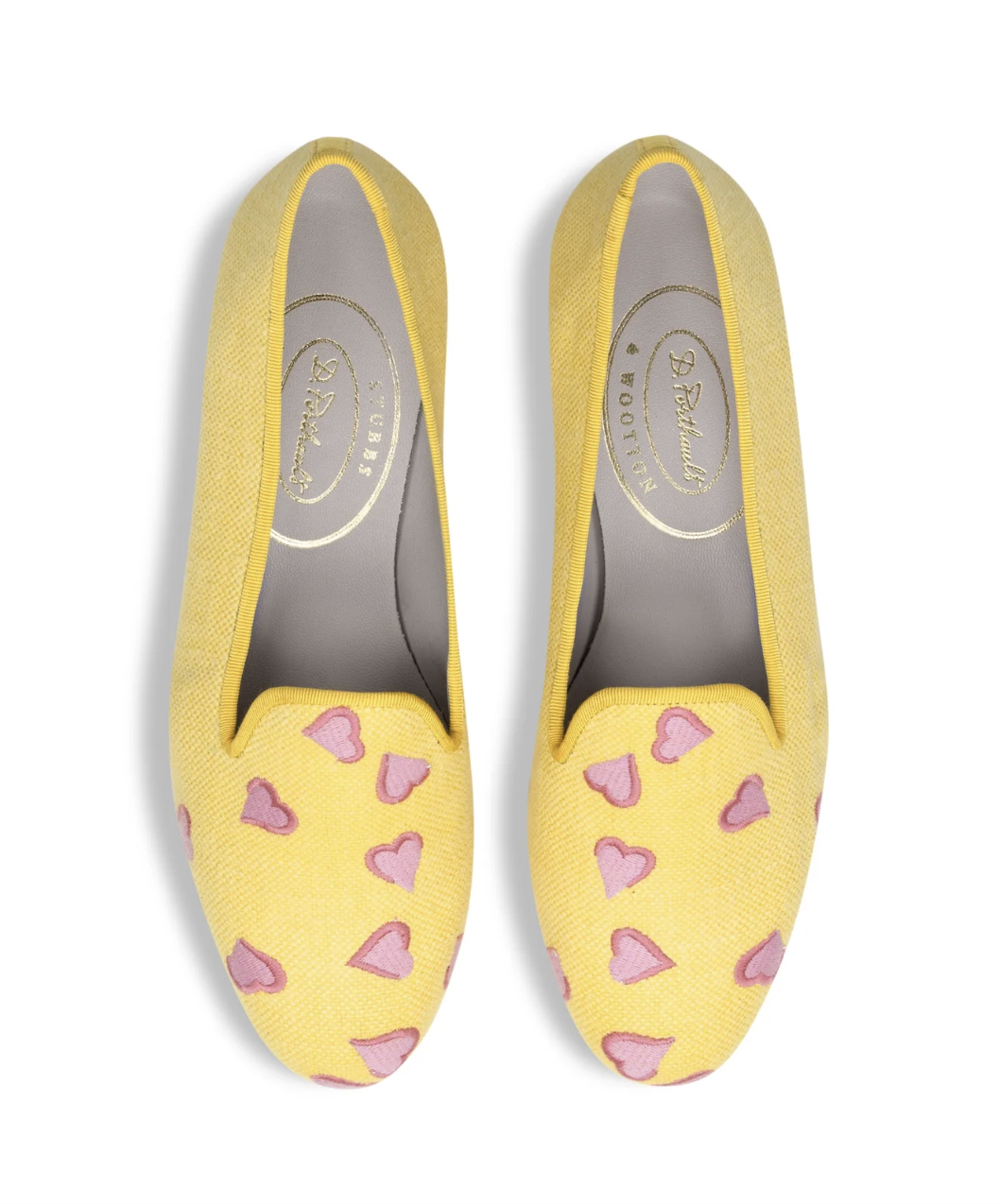
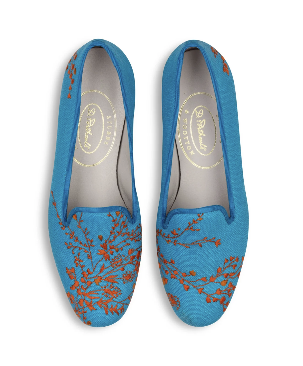
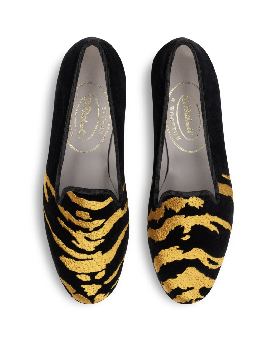
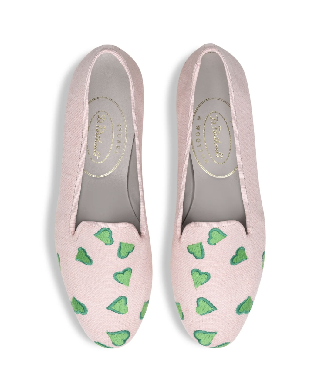
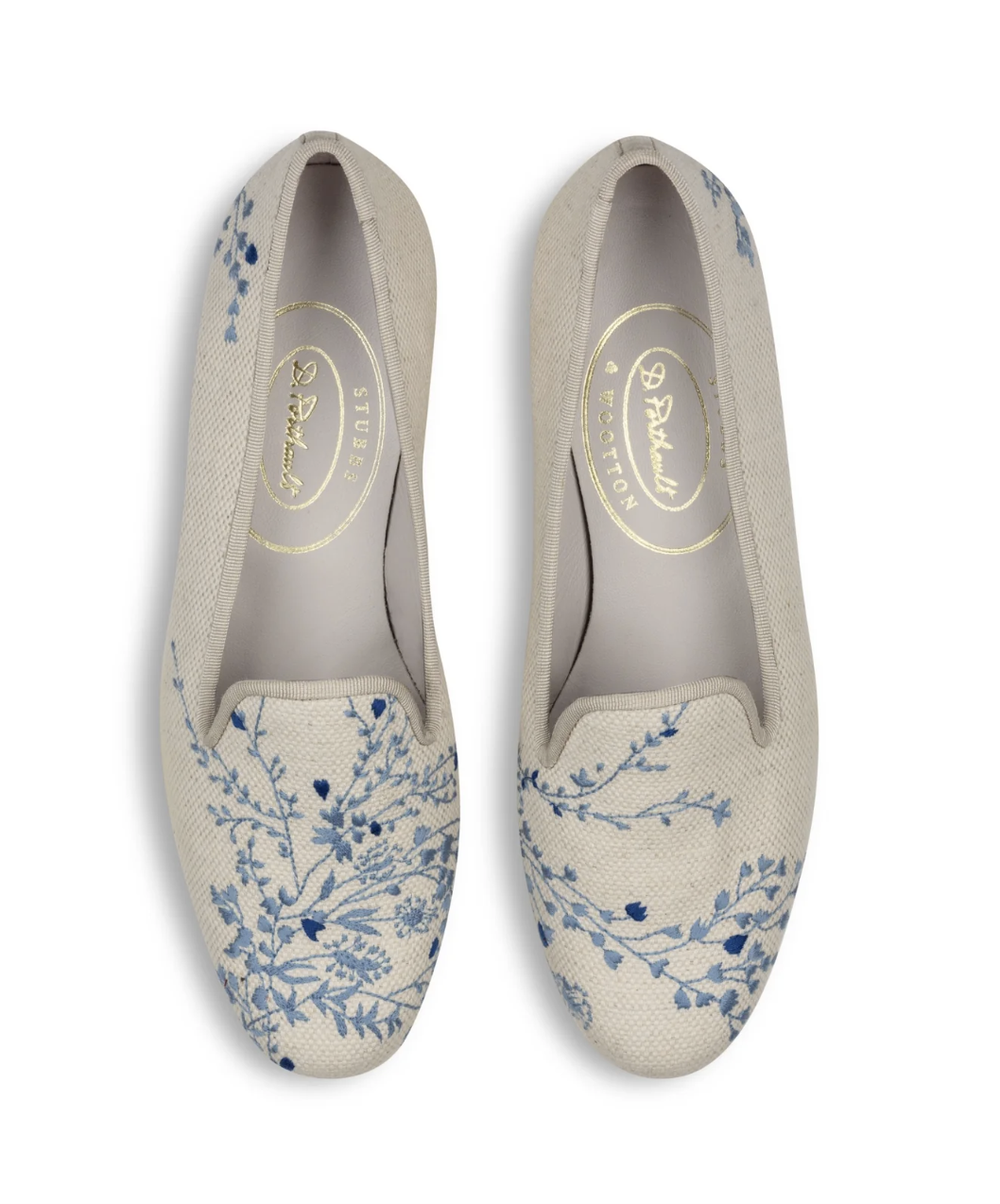
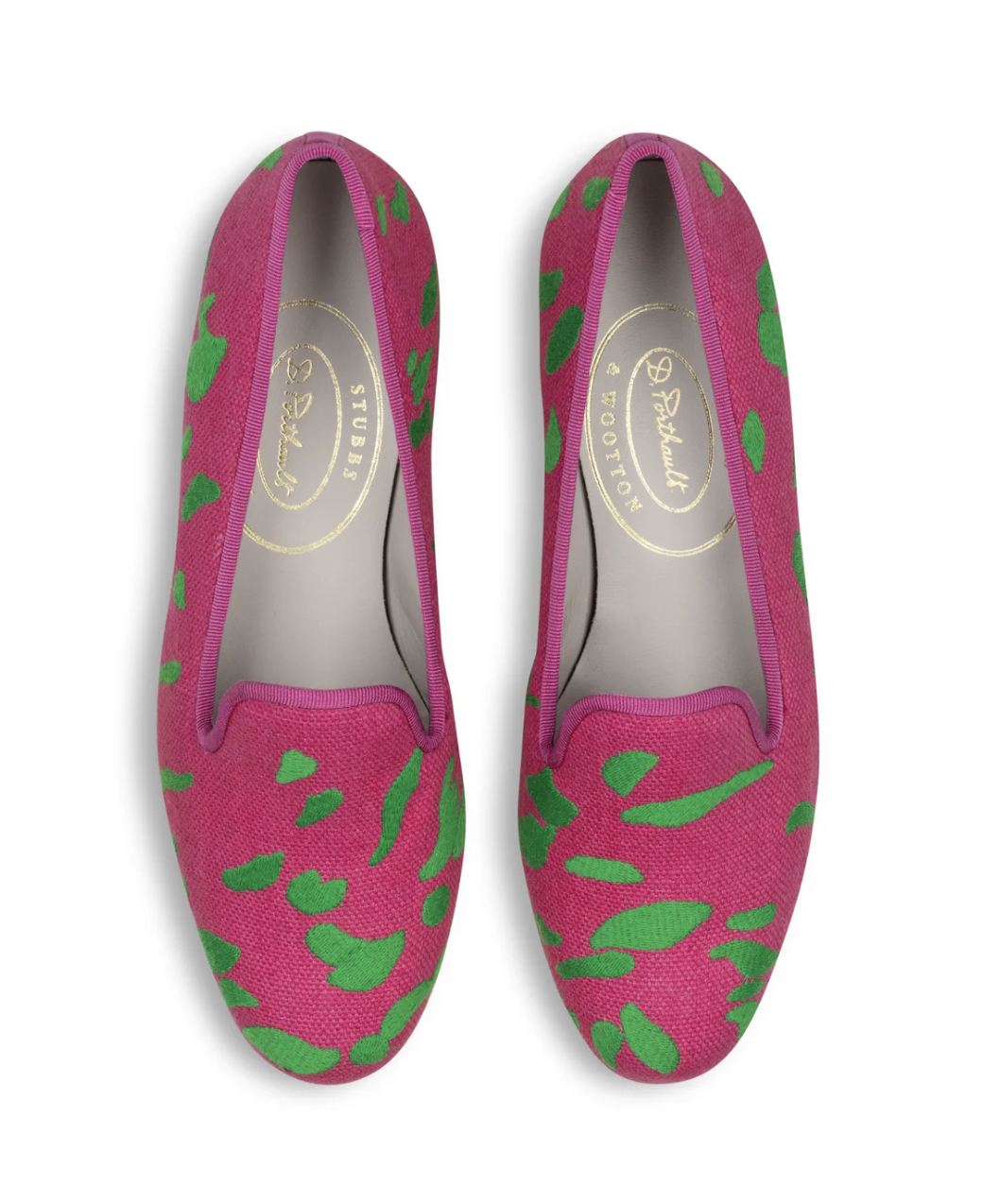
Shop this week’s inspired finds!

x Natalie
Follow TGP on Instagram: @theglampad
Follow Natalie on Instagram: @natalieealdridge