

Home Blog Page 5

Dorothy Draper & Company x The Beaufort Bonnet Company, David Flint Wood and India Hicks for Wallshoppe, and the Enchanting Interiors of Bunny Mellon

Welcome to TGP Tidbits where we round up the happenings and our musings of the design industry each week. This week we take a look at Dorothy Draper & Company x The Beaufort Bonnet Company, David Flint Wood and India Hicks for Wallshoppe, and the Enchanting Interiors of Bunny Mellon. Written by Natalie Aldridge.

Dorothy Draper & Company x The Beaufort Bonnet Company

There is something endlessly exciting about watching the Dorothy Draper legacy reappear in new places. The new collaboration between The Beaufort Bonnet Company and Dorothy Draper & Company feels like exactly that kind of surprise, a little bit polished, a little bit punchy, and entirely unafraid of color.

T.B.B.C. x Dorothy Draper

Dorothy Draper & Company has long stood for big florals, fearless palettes, graphic stripes, and a certain unapologetic glamour. Seeing that language translated into Beaufort Bonnet’s crisp, preppy universe feels perfectly natural. The prints feel lifted from a Palm Beach fantasia, all lively and classic, but grounded in silhouettes that are easy and wearable.

T.B.B.C. x Dorothy Draper

What makes it fun is the sense of lightheartedness. Nothing feels overly precious or overly styled. It is cheerful, yes, but also self-assured. The kind of pieces you imagine wearing on a sunny afternoon without overthinking it, perhaps while standing in front of a trellis wall Draper herself once made iconic.

T.B.B.C. x Dorothy Draper

More than anything, it is a reminder that great design legacies have range. They can live in architecture, interiors, textiles, and occasionally in your closet. And when they do, they should feel just as spirited as ever. The full collection is available here!

David Flint Wood and India Hicks for Wallshoppe

We have long loved India Hicks for her distinctly English roots paired with a chic island sensibility, so her latest collaboration with Wallshoppe, alongside her husband, David Flint Wood, immediately caught our attention. It feels entirely like a melding of minds, with both India and David represented so well. Polished but relaxed, rooted in tradition yet kissed by sea air.

Having lived on a small island for three decades, Hicks’ style lends itself to the tropical grit of island life, yet England remains her internal compass. That duality shapes the collection. Paradise here is not unruly or overly tropical. It is orderly, layered, and occasionally just slightly eccentric. There is symmetry, a tad bit of restraint, and the richness of island life.

Even when the palette drifts toward sun-washed hues, there is structure beneath it that feels distinctly English. The designs feel collected rather than contrived, textured rather than trendy. They are meant to be enjoyed daily, not admired nervously from across the room, which, if we are honest, is exactly how the best interiors should function.

We also love the spirit behind the collaboration, not only between David and India, but between the pair and Wallshoppe. India describes working with the Wallshoppe team as an ongoing conversation, and that ease shows. The collection does not feel overworked but easy and lived in. In short, it is India Hicks distilled. English discipline softened by island light. Launching on March 2nd, the collection will be available here.

The Enchanting Interiors of Bunny Mellon: Paintings by Snowy Campbell

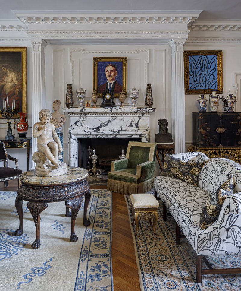
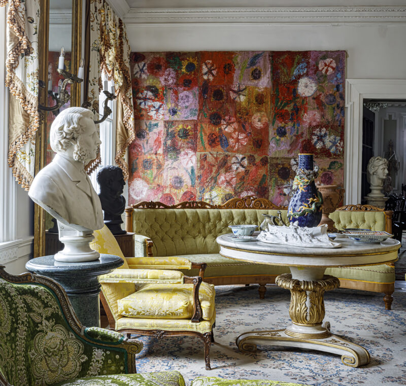
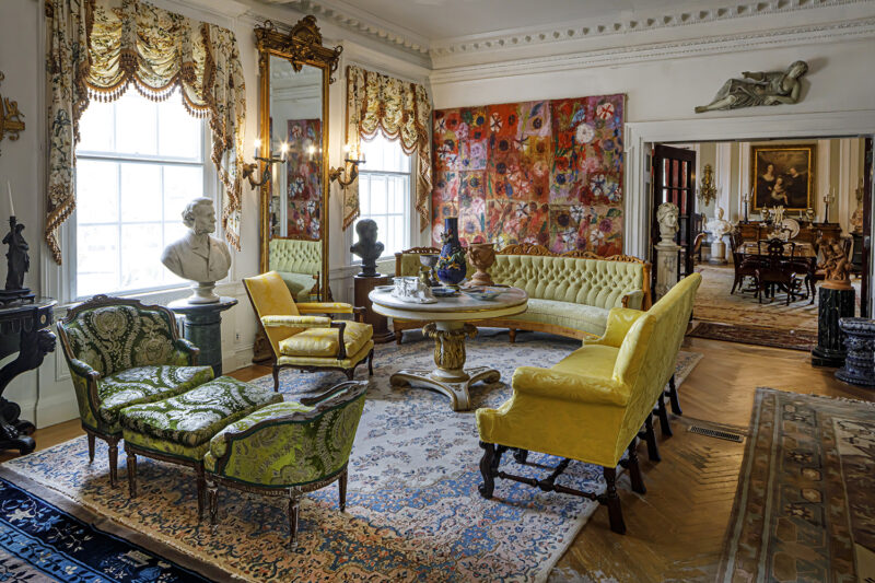
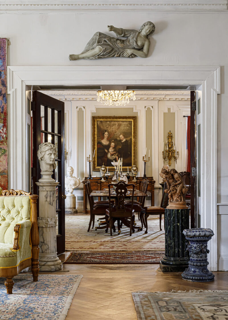
We have long admired and written about the inimitable style of Bunny Mellon, so the arrival of The Enchanting Interiors of Bunny Mellon: Paintings by Snowy Campbell feels especially meaningful to us. Published by Rizzoli, the book offers a rare and intimate glimpse into rooms that have become enduring benchmarks of American style.

The Enchanting Interiors of Bunny Mellon: Paintings by Snowy Campbell, Rizzoli, p.122
The Enchanting Interiors of Bunny Mellon: Paintings by Snowy Campbell, Rizzoli, p.6

Rather than presenting the interiors through glossy photography, the book features the watercolor paintings of Snowy Campbell, who was commissioned by Mellon in the 1970s to document several of her residences. The paintings capture not only color, furnishings, and arrangement, but also the light and rhythm of her interiors in a way that feels deeply personal. They’re remarkably transportive, fun, and a touch wacky.

The Enchanting Interiors of Bunny Mellon: Paintings by Snowy Campbell, Rizzoli, p.91
The Enchanting Interiors of Bunny Mellon: Paintings by Snowy Campbell, Rizzoli, p.50

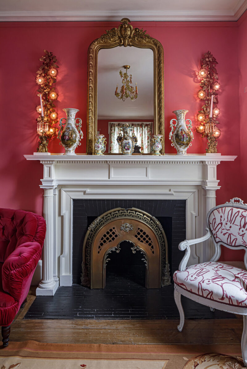
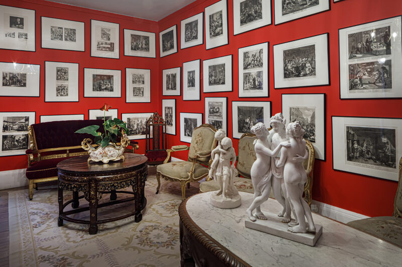
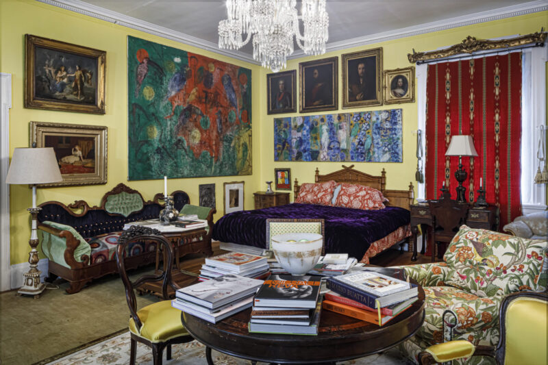
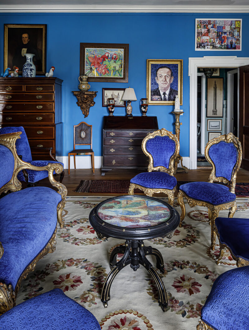
Mellon’s homes in New York, Washington, and Upperville have long been studied not only for their gardens, but for their effortless, traditional interiors with an unbelievable atmosphere. A masterpiece hung with restraint, a textile chosen for nuance rather than trend, a room that feels collected over decades. It is a way of decorating that values connoisseurship and ease in equal measure.

The Enchanting Interiors of Bunny Mellon: Paintings by Snowy Campbell, Rizzoli, p.45
The Enchanting Interiors of Bunny Mellon: Paintings by Snowy Campbell, Rizzoli, p.46

There is something especially meaningful about seeing these interiors translated through watercolor. The medium softens the edges and invites you to linger, reinforcing what we have always admired about Bunny Mellon. True elegance, deep consideration, and spaces that are meant to be lived in. Click here to purchase.

The Enchanting Interiors of Bunny Mellon: Paintings by Snowy Campbell, Rizzoli

Read our favorite articles of the week!

The Best Etsy Shops, Chosen by Interior Designers and Our Editors written by Christabel Chubb and Tilly Wheeler.

Tour a New York Apartment Where Uptown Sophistication Meets Fearless Decorating written by Kathleen Hackett for Frederic.

Shop this week’s inspired finds!

x Natalie

Follow TGP on Instagram: @theglampad
Follow Natalie on Instagram: @natalieealdridge

Inside the 9th Annual Kips Bay Decorator Show House Palm Beach

Written by Natalie Aldridge.

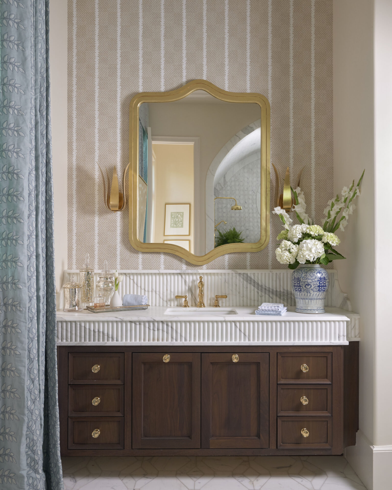
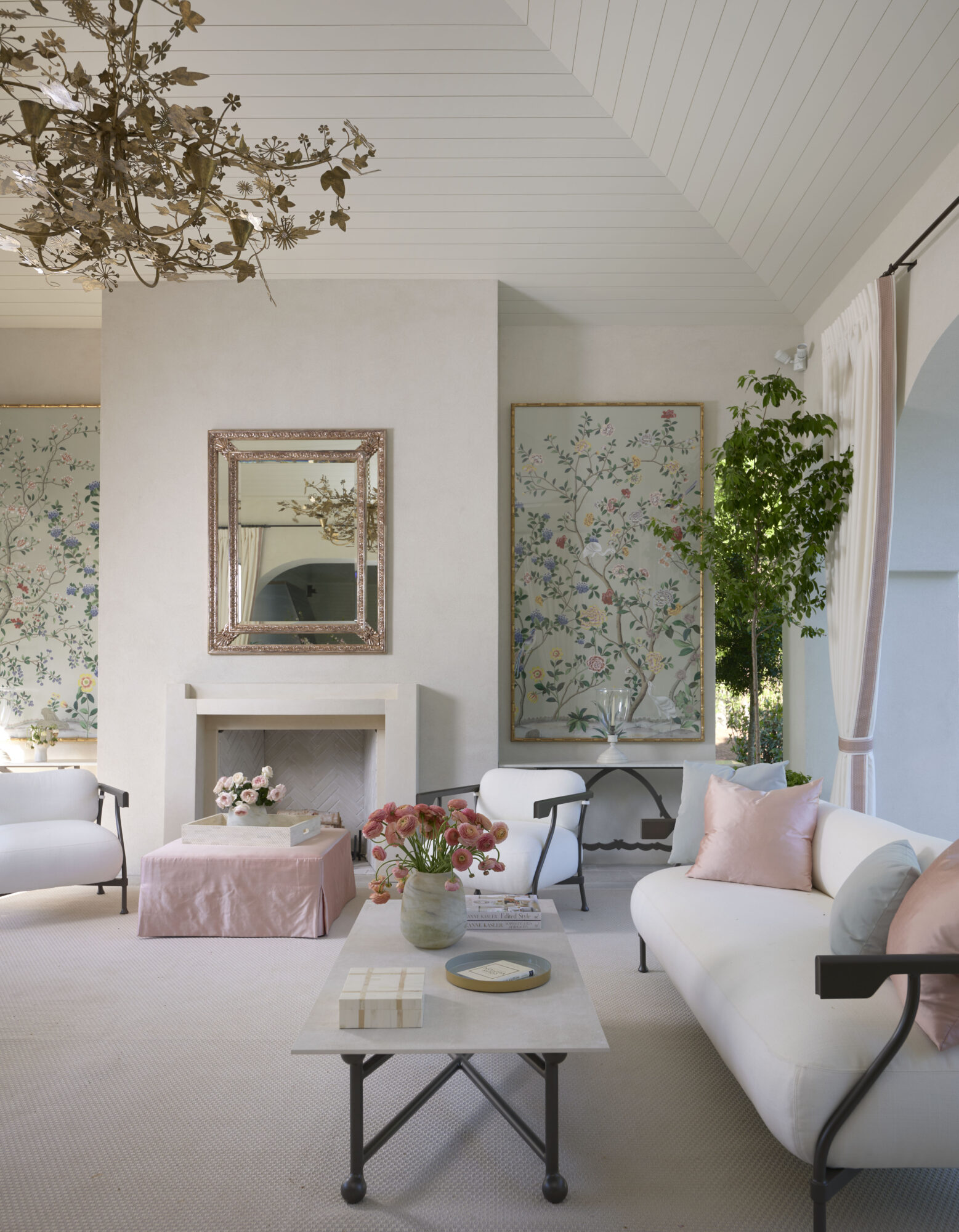
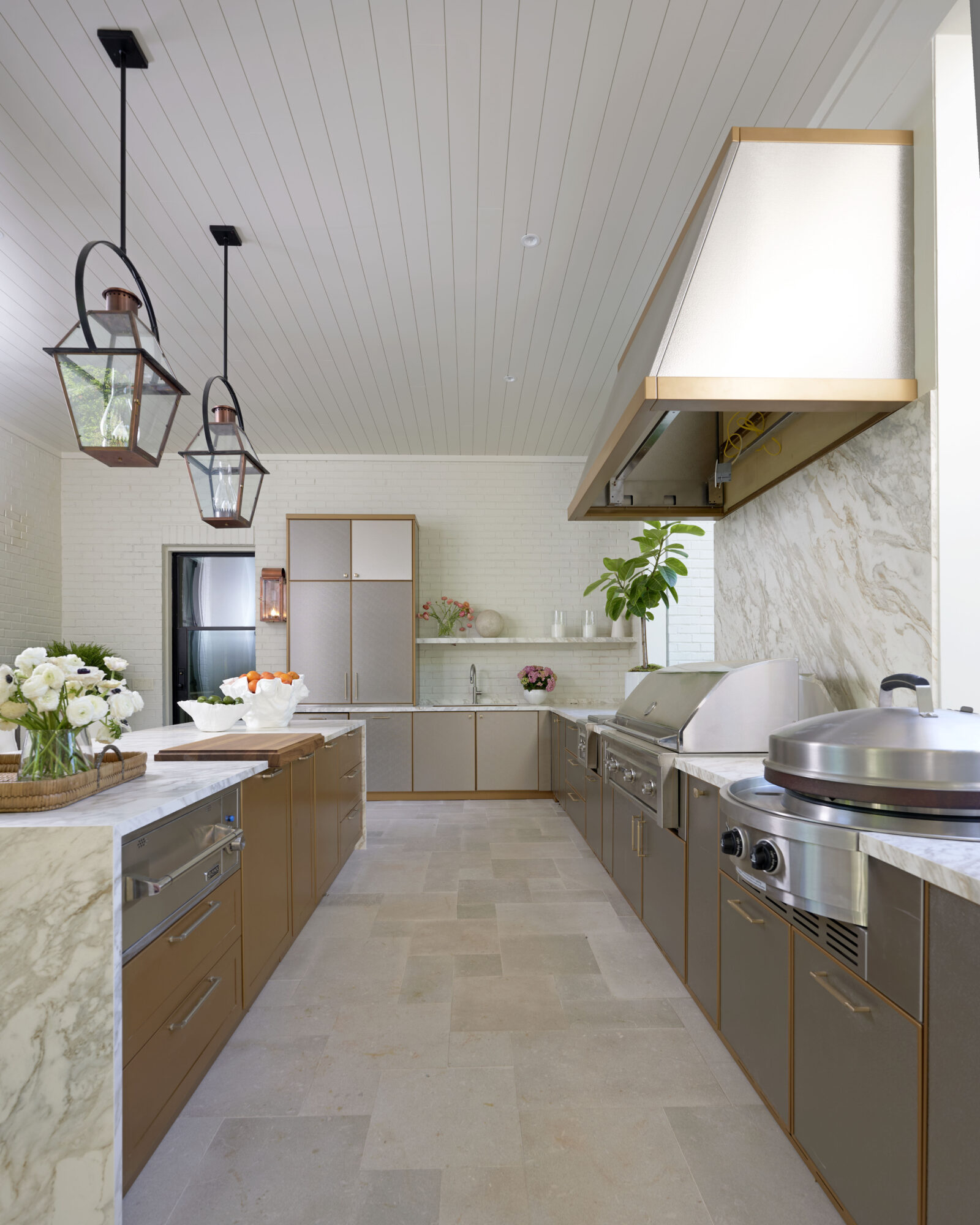
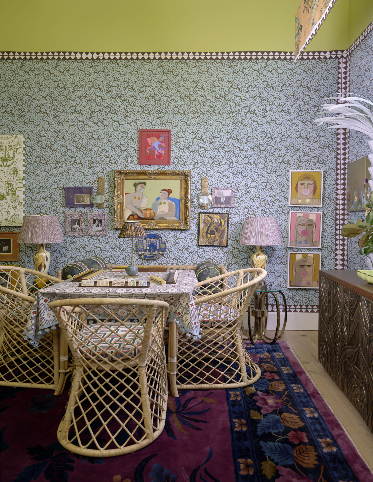
The doors are officially open to the 9th Annual Kips Bay Decorator Show House Palm Beach, and this year’s presentation feels more dazzling than ever. For the first time, twenty-three designers have transformed not one but two remarkable properties, the waterfront Intracoastal House and the charming Palm Cottage in Northwood Shores, into a layered showcase of creativity, craftsmanship, and unmistakable Palm Beach glamour.

Bell Design
Bell Design, Photograph by Carmel Brantley

Inside, each space becomes its own world, with every room telling a distinct story shaped by its designer and expressed through rich detail. Jewel-box sitting rooms, theatrical guest suites, serene indoor–outdoor entertainment spaces, and neoclassical passages lead from one transportive moment to the next. The result is a house that balances fantasy with livability, infused an elegance and refinement that feel inherently Palm Beach.

As always, the beauty serves a larger purpose. Proceeds from the show house benefit the Kips Bay Boys & Girls Club and the Boys & Girls Clubs of Palm Beach County, supporting essential educational and developmental programs for the youth, a philanthropic legacy that has defined the event for decades.

Open now through March 24th, this year’s show house features work by Alexander Interiors, Amy Young Designs, BAMO, Inc., Bell Design, Inc., Colleen Rosar Design, Danielle Balanis Design, EERDMANS, Firefinish Interiors, Justin P. Moreland Interiors, Kate Ives Design, Lisa Erdmann Interiors, Lopez Group Inc., Lori Morris Design, LTA Interiors, Pappas Miron Design, River Brook, Sherrill Canet Interiors, Sire Design, Steven Walsh Design, Tartan & Toile, The Lewis Gallo Design Group, Wecselman Design, and Yarn Design Associates, a remarkable roster proving once again that great design can inspire, delight, and give back in equal measure.

Take a peek inside! Photography courtesy of Nickolas Sargent, unless otherwise noted.

Alexander Interiors
Alexander Interiors
Colleen Rosar
Colleen Rosar
Colleen Rosar
Danielle Balanis Design
EERDMANS
EERDMANS
EERDMANS
Justin Moreland Interiors
Kate Ives Design
Kate Ives Design
Kate Ives Design
Lewis Gallo Design
Lewis Gallo Design
Lewis Gallo Design
Lisa Erdmann Interiors
Lisa Erdmann Interiors, Photograph courtesy of Carmel Brantley
Lori Morris
Lori Morris
LTA Interiors
LTA Interiors
River Brook
River Brook
River Brook
Sire Design
Sire Design
Tartan Toile
Tartan Toile
Tartan Toile
Tartan Toile
Bell Design

Be certain to visit the Kips Bay Decorator Show House Palm Beach. Tickets can be purchased here!

x Natalie

Follow TGP on Instagram: @theglampad
Follow Natalie on Instagram: @natalieealdridge

The 6th Annual Mark Hampton Lecture, John Derian Spring Decoupage Collection, and Paige Spearin for Lycette

Welcome to TGP Tidbits where we round up the happenings and our musings of the design industry each week. This week we take a look at the 6th Annual Mark Hampton Lecture, the John Derian Spring Decoupage collection, and Paige Spearin for Lycette. Written by Natalie Aldridge.

The 6th Annual Mark Hampton Lecture

The design calendar is never short on lectures, but the Mark Hampton Lecture remains one of the few that feels truly worth circling. Hosted by the Institute of Classical Architecture & Art, the 6th Annual Mark Hampton Lecture takes place February 25th at the General Society Library, honoring the legacy of the legendary decorator whose work helped define a distinctly American vision of elegance.


View this post on Instagram


A post shared by Alexa Hampton (@alexahamptoninc)

This year’s program brings together Steven Gambrel in conversation with Alexa Hampton, a pairing that feels especially fitting. Gambrel’s interiors are celebrated for their layered ease, while Hampton continues the classical tradition championed by her father, Mark Hampton, with a sensibility that balances rigor and livability.


View this post on Instagram


A post shared by Steven Gambrel (@stevengambrel)

What makes the evening particularly appealing is its focus. This is not nostalgia for tradition, but a conversation about proportion, craftsmanship, and why rooms grounded in classical principles are so important. For those who believe in timeless design and beauty, make sure to purchase your tickets here. It will be a fun night of discussion, mingling, and inspiration.

John Derian Spring Decoupage Collection

Few objects possess the charm of John Derian’s decoupage, and the new Spring 2026 collection reminds us why his work has become such a beloved presence in well-layered homes. Rooted in antique prints and ephemera, his pieces carry a sense of history that we so cherish at The Glam Pad. This collection leans into the poetic and the curious, with botanical studies, insects, maritime imagery, animals, and fragments of 18th and 19th century illustrations translated onto trays, plates, paperweights, and small tabletop objects. The imagery feels both archival and playful, the sort of visual language that feels collected, meaningful, and deeply personal.

John Derian’s process remains central to the appeal. Each piece begins with antique imagery sourced from his vast personal archive, then layered by hand under glass by artisans in his New York studio. The result is something that sits between object and artifact, familiar yet transportive to another time. What makes the spring collection especially delightful is its sense of discovery. A butterfly study might sit comfortably beside a floral plate, while a tiny tray featuring a ship or trade card feels like a small treasure uncovered in a curiosity cabinet. These are objects that encourage collecting rather than decorating, layering rather than matching.

At The Glam Pad, we have always believed that the most interesting interiors are collected over time, built from pieces that carry narrative and memory. This spring decoupage collection fits effortlessly into that philosophy and we cannot wait to get our hands on a piece or two. The full collection can be shopped here. And click here to read our Style Profile Q&A with John Derian to learn more about his delightful world of whimsey.

Paige Spearin x Lycette

We are so excited about the new Lycette needlepoint collection created in collaboration with artist Paige Spearin! Known for her whimsical hand, bunny characters, and punchy sense of color, Paige brings a playful sophistication to Lycette Designs’ beloved canvases that feel timely, collectible, and so much fun.

The collection is a joyful mix of motifs that nod to coastal living, sport, culture, and a touch of cheeky glamour. Think skiing bunnies, Honey Duces, mermaids, Palm Beach-ready scenes, and much more all with Paige’s iconic painterly lightness. These are not your grandmother’s needlepoint canvases, though they carry the same sense of tradition and care.

What makes the collaboration especially appealing is how it bridges craft and personality. Needlepoint has long been associated with patience and tradition, yet Paige’s designs introduce wit and a contemporary sensibility, meaning the finished pieces feel perfectly at home in a layered interior or tucked into a beach house bar.

There is something particularly satisfying about a craft that asks you to slow down while producing something joyful. Whether worked stitch by stitch or simply admired for their charm, these designs bring a welcome sense of levity to the world and are a must have. Shop the full collection here.

Read our favorite articles of the week!

Almost Every Piece in This Layered Arkansas Home Was a Lucky Antique Find written by Alyssa Longobucco of House Beautiful.

Queen Elizabeth’s Childhood Doodles and Handwritten Letter Are Headed to Auction written by Alexandria Sillo for Galerie Magazine.

Shop this week’s inspired finds!

x Natalie

Follow TGP on Instagram: @theglampad
Follow Natalie on Instagram: @natalieealdridge

Classic Country Style in Bedford, New York

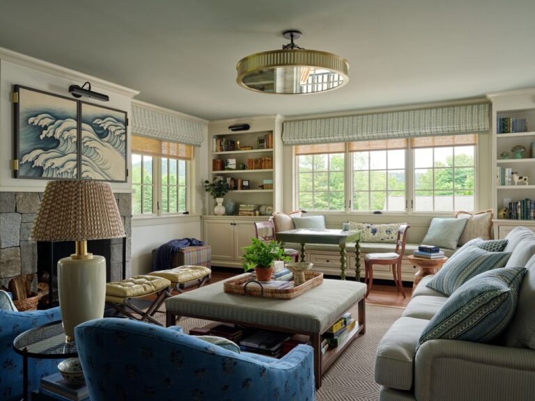
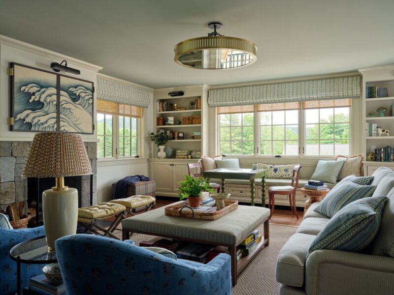
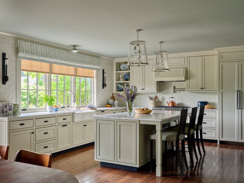
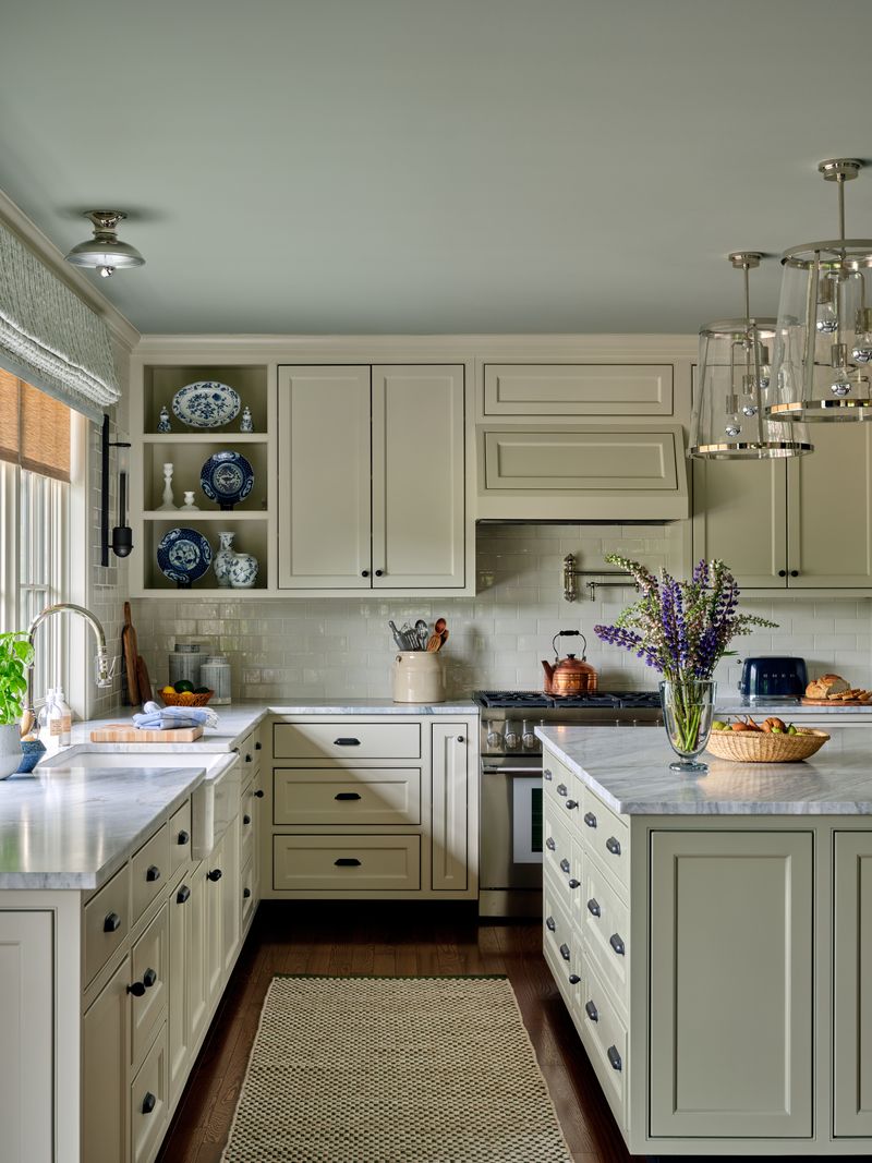
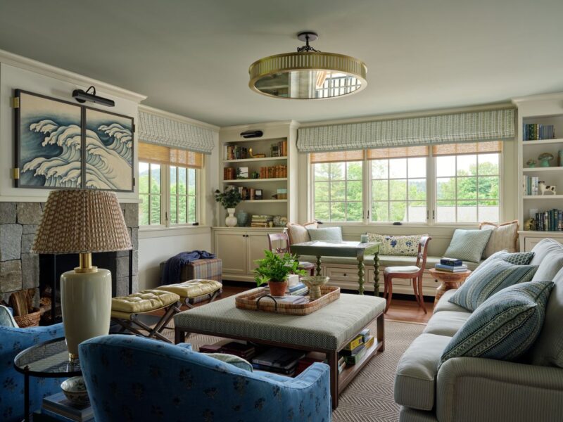
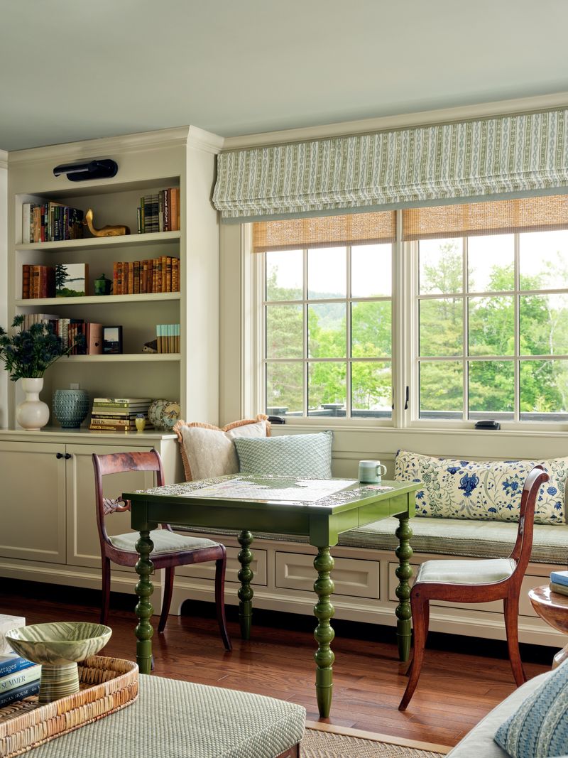
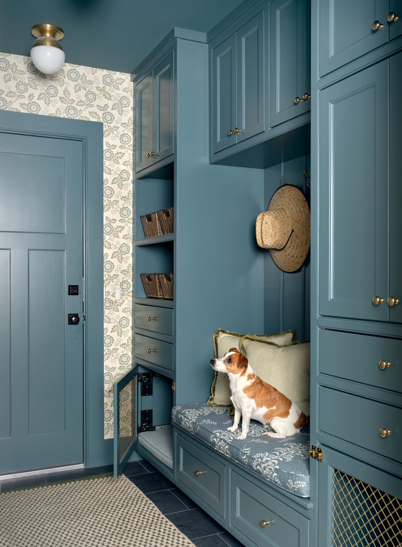
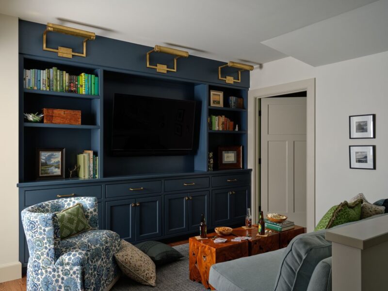
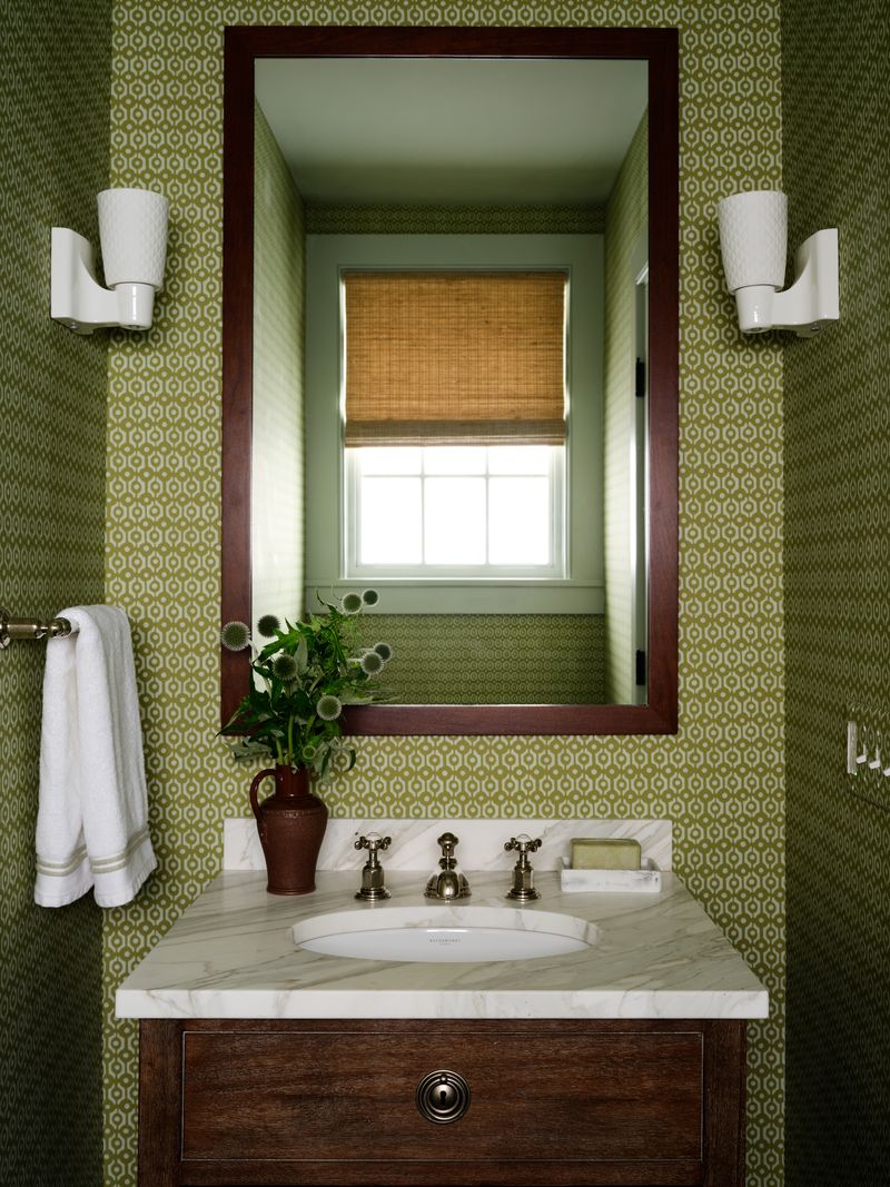
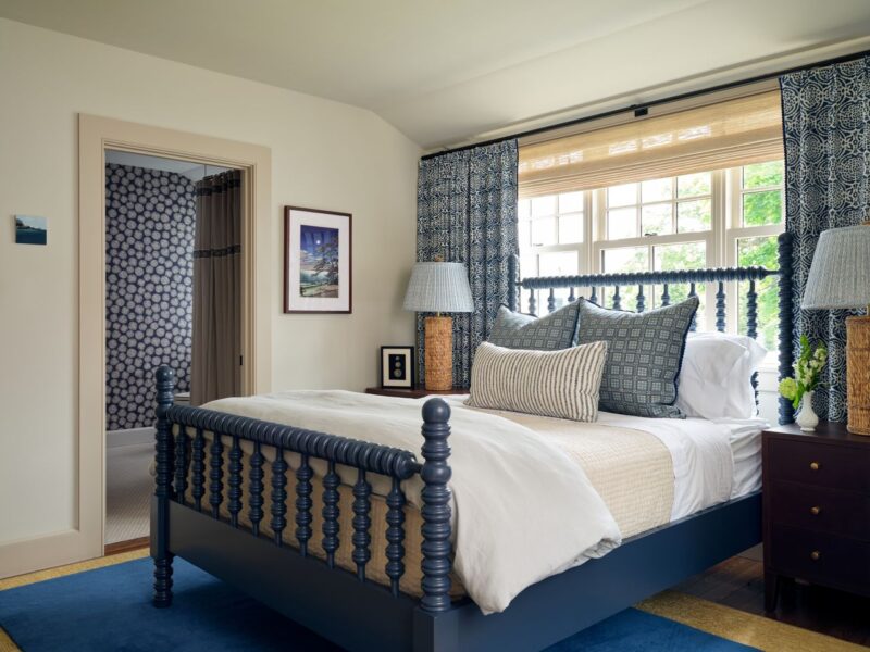
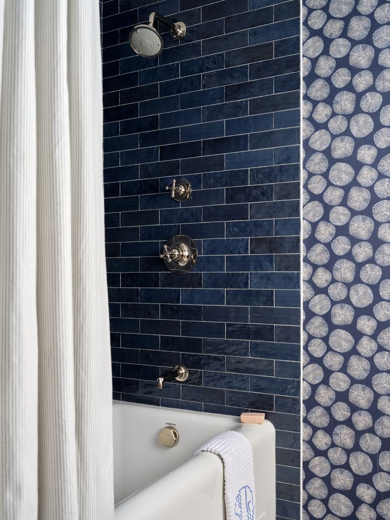
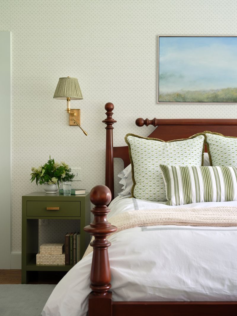
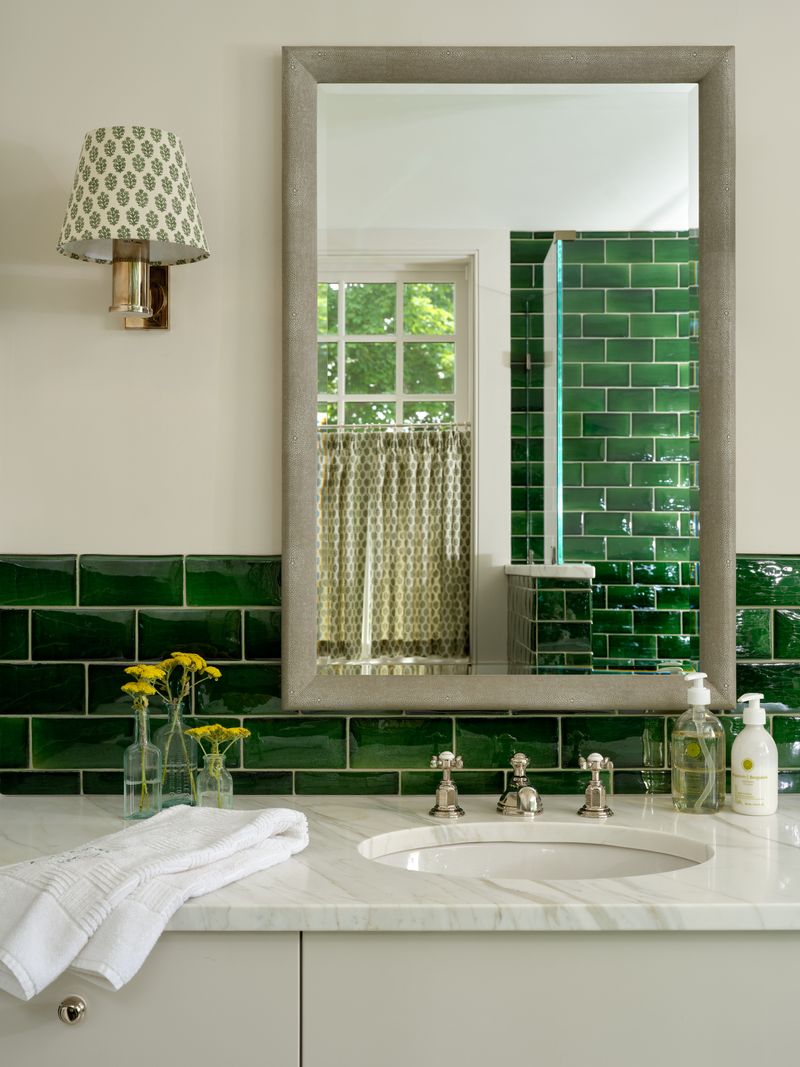
Nestled in the picturesque town of Bedford, New York, Jennifer Hunter Design was tasked with designing a country home that blends family-friendly functionality with timeless, traditional style. The 4,100-square-foot home (plus a small stable) serves as a serene country retreat for a young family seeking an escape from the fast pace of city life. The vision came to life through the thoughtful layering of classic furnishings, playful patterns, and pops of color. Natural textures, such as warm woods, washed linens, and woven accents anchor the spaces, adding richness, classic country style, and a sense of ease throughout.

The result is a home that feels elevated yet welcoming, perfectly suited for laid-back weekends, family gatherings, and memory-making for years to come. Let’s take a peek inside with photography by Kirsten Francis and styling by Frances Bailey.

“My team and I worked closely with the client to bring to life a charming, family-friendly retreat that captures the warmth and ease of country living,” said Jennifer. “Infused with pops of color, artful wallpaper, and richly layered textures and patterns, the home strikes a balance between timeless tradition and effortless livability. While the overall aesthetic leans elevated and classic, every detail was thoughtfully chosen to feel approachable, not too precious, always inviting, and perfectly suited for relaxed family life in the country.”

To see more of Jennifer’s work, please visit Jennifer Hunter Design and follow @jenniferbeekhunter on Instagram for ongoing inspiration. You can also learn more about here via our Style Profile Q&A and tour the delightful New York City rental Jennifer customized with English Charm for photographer Jacqueline Clair here.

Kips Bay Decorator Show House Palm Beach, Dorothy Draper x Stubbs & Wootton, and Gainsborough: The Fashion of Portraiture

Welcome to TGP Tidbits where we round up the happenings and our musings of the design industry each week. This week we take a look at Dorothy Draper x Stubbs & Wootton, Kips Bay Decorator Show House Palm Beach, and Gainsborough: The Fashion of Portraiture. Written by Natalie Aldridge.

Dorothy Draper x Stubbs & Wootton

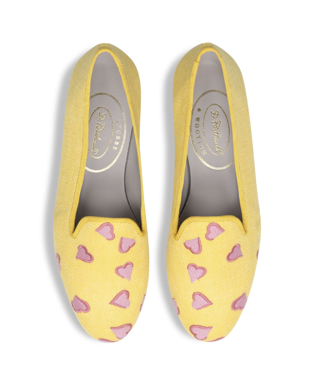
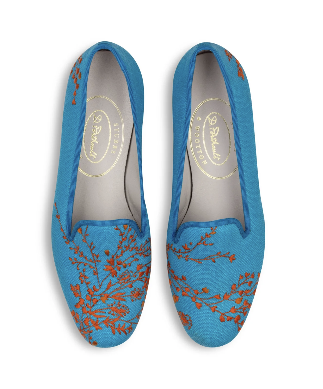
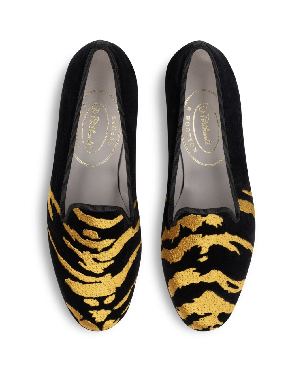
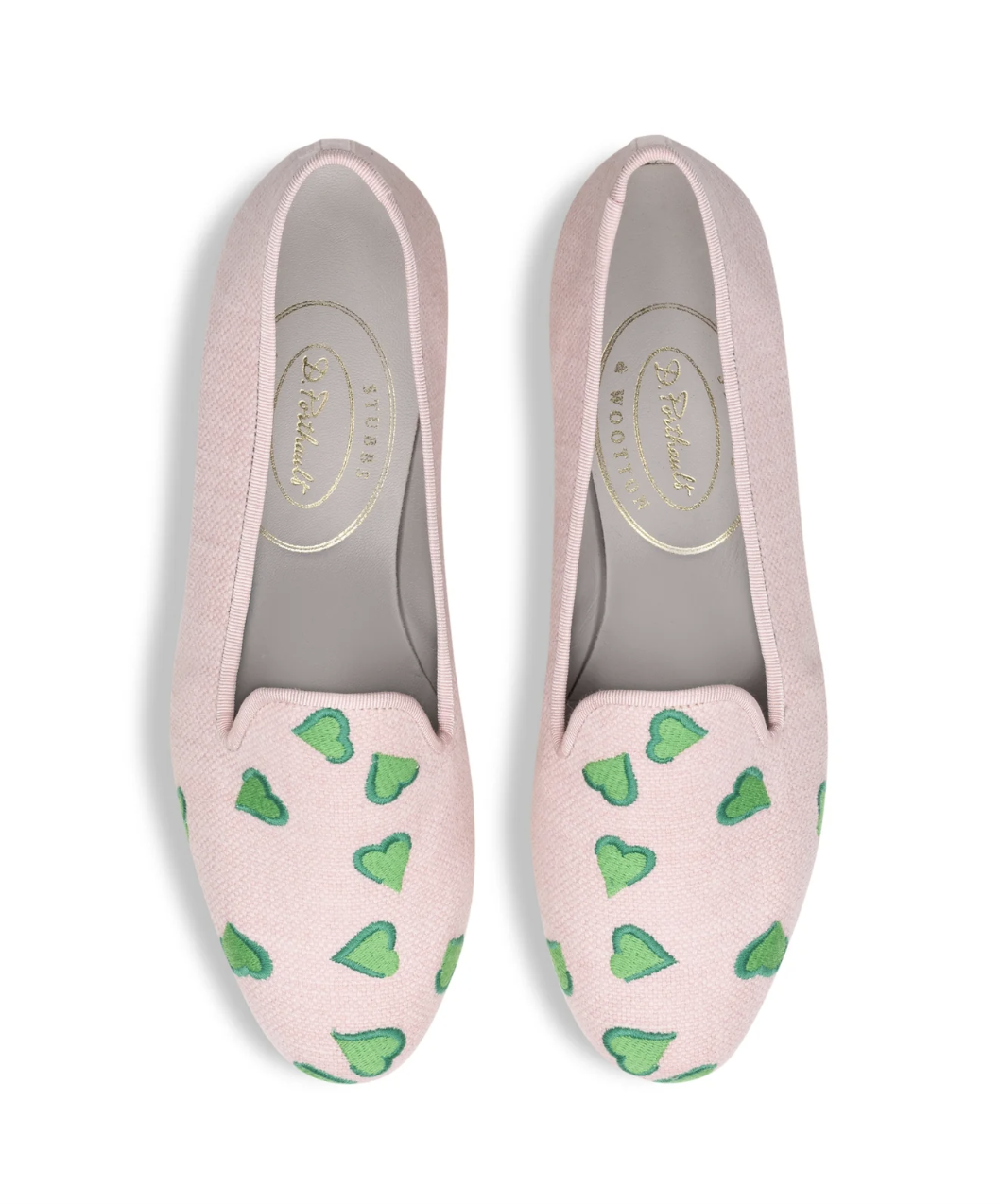
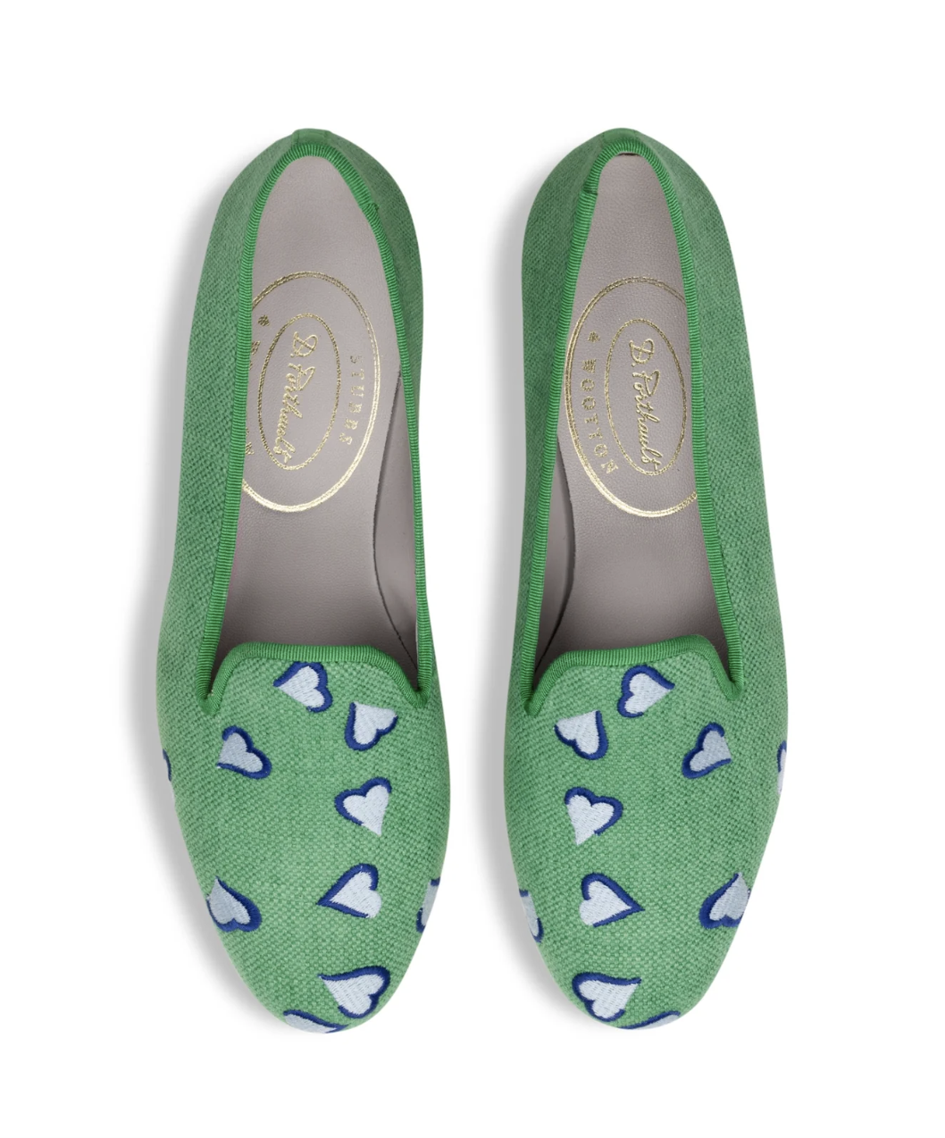
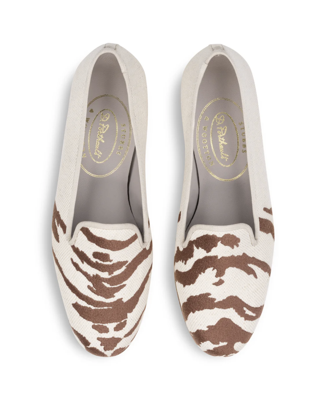
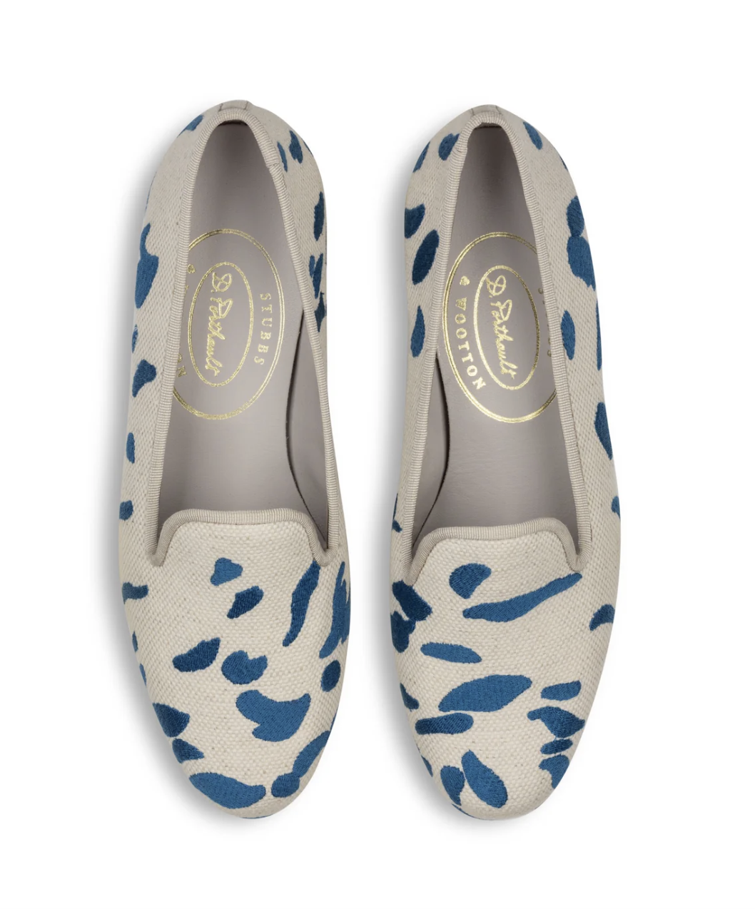
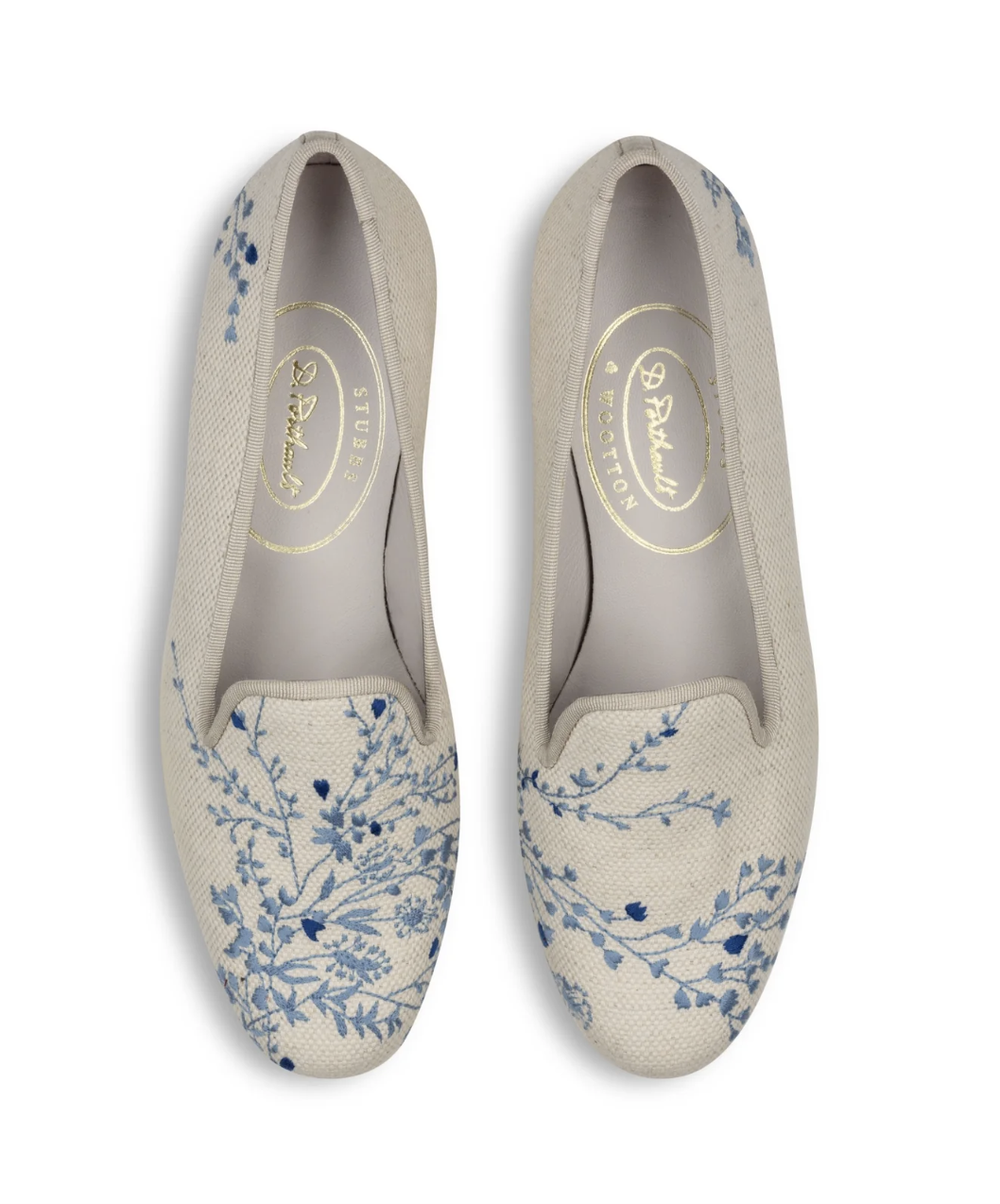
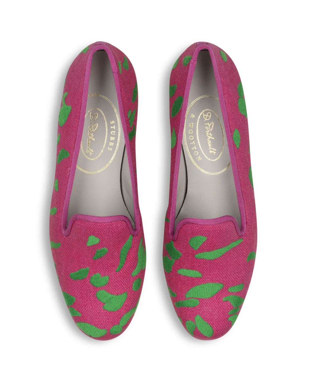
There are certain names in American design that need little introduction, and Dorothy Draper is undoubtedly one of them. Known for her fearless use of color, theatrical scale, and unapologetic glamour, Draper helped define a distinctly optimistic vision of decorating that continues to influence interiors today. Debuting February 16th, Dorothy Draper & Company unveils an exclusive collaboration with Stubbs & Wootton, the beloved loafer house long associated with polished, personality-driven dressing. The collection feels like a natural meeting of minds, bringing together Draper’s iconic decorative language with Stubbs & Wootton’s classic silhouettes.

Dorothy Draper x Stubbs & Wootton

The result is a lineup that feels equally suited to Park Avenue as it does to Palm Beach. There is a sense of ease paired with a touch of glamour, the kind that suggests confidence rather than excess. Much like Draper’s interiors, the designs understand that tradition need not be quiet and that elegance is often at its best when it carries a bit of wit.

Dorothy Draper x Stubbs & Wootton

The collection reads exactly as one might hope. Polished but not rigid, expressive without feeling overdone, and equally at home on Park Avenue or in Palm Beach. It carries that particular kind of American glamour that feels effortless. Much like the interiors of Dorothy Draper & Company, the designs understand that tradition need not be quiet and that elegance is often at its best when it carries a bit of wit and a lot of color.

Dorothy Draper x Stubbs & Wootton

At a moment when fashion and interiors continue to borrow from one another, this collaboration serves as a reminder that great style transcends category. Whether worn in the city or seaside, these loafers channel a spirit that is unmistakably Dorothy Draper. Make sure to snag a pair here on Monday when they drop!

Kips Bay Decorator Show House Palm Beach

Anticipation is building for the Kips Bay Decorator Show House Palm Beach, opening on February 24. Newly released renderings provide an early look inside, hinting at the layered interiors and distinct perspectives we have come to look forward to each year.

Renderings always carry a particular kind of excitement. They offer just enough to spark curiosity while leaving room for imagination, hinting at material palettes, and the moods each designer hopes to create. If these early previews are any indication, this year’s rooms point to an intriguing blend of classic Palm Beach sensibility and new ideas, balancing tradition with a more current perspective.

At The Glam Pad, we always relish this moment of preview, when ideas begin to take shape and the creative direction of the house starts to reveal itself. Today, we are sharing a sneak peek at a few of the rooms we are especially excited to see come to life once the doors officially open.

Lewis Design Group
Colleen Rosar Design
Danielle Balanis
Emily Eerdmans
Kate Ives Design
Justin P. Moreland Interiors

Gainsborough: The Fashion of Portraiture

This past Tuesday evening, The Glam Pad had the pleasure of attending the opening of Gainsborough: The Fashion of Portraiture at The Frick Collection, a show that feels both impeccably timed and revelatory. The exhibition, the first in New York devoted entirely to Thomas Gainsborough’s portraiture, brings together more than two dozen paintings from the Frick’s collection alongside important loans from across North America and the United Kingdom.

What makes the presentation particularly compelling is its focus on the relationship between portraiture and fashion in eighteenth-century Britain. Clothing was far more than adornment; it was deeply tied to ideas of identity and status. For Gainsborough, painting a silk gown, lace cuff, or embroidered coat was never merely decorative. It was integral to the narrative each sitter wished to project. His signature, featherlight brushwork give fabrics a remarkable luminosity, while pose and gesture reveal the subtleties of personality. Together, the works trace the shifting social landscape of Georgian Britain.

The intimate setting of the Frick only heightens the experience of these incredible portraits. It was an elegant evening and a fitting debut for an exhibition that reminds us how closely art, fashion, and identity have always been intertwined. Gainsborough understood this instinct intuitively, capturing not only likeness but presence, and in doing so, created paintings that continue to feel remarkably alive. On view on through May 25th, make sure to book a time to see this thought provoking exhibition.

Read our favorite articles of the week!

7 Style Icons Who Shaped the Face of Interior Design—and How to Get the Look written by Rachael Burrow Rummel, Catherine Smith and Susan Hall Mahon for Veranda.

Visit an Anglophile’s Charm-Steeped, Collection-Filled Texas Home written by Fiona McCarthy for Veranda.

Shop this week’s inspired finds!

x Natalie

Follow TGP on Instagram: @theglampad
Follow Natalie on Instagram: @natalieealdridge

Step Inside A Beautiful Home Studio and Journaling Ministry

Each January, The Glam Pad enjoys exploring “anti-trends” for the coming year… classic timeless design and societal principles that are happily making a comeback. For the past two years, we have been delighted to see a rise in home office decor, analogue journaling of all forms, and Bible sales, and Nanda Anderson’s “Paper Ministry” – The Apple of His Eye – embraces all three of these things!

As a teen facing fear and panic, Nanda struggled to find her purpose. God met her through the words of Psalm 17:8, “Keep me as the apple of Your eye; hide me under the shadow of Your wings.” This verse wrapped around her heart like a warm embrace, and is the inspiration behind her Paper Ministry, which is available to shop on Etsy and via ongoing freebies through her Instagram account. Everything Nanda designs flows from Scripture, prayer, and the quiet moments inspired by God’s peace and inspiration. Her journals, tags, pockets, florals, and vintage papers are more than just supplies, they are reflections of His tenderness, His beauty, and His presence in my story.

Nanda Anderson, Apple of His Eye Paper Ministry

Nanda also shares tours and inspiration from her beautiful home studio, which is currently featured in the Spring 2026 issue of In Her Studio Magazine. Nanda lovingly describes her studio as “a cozy, peaceful refuge, where cottage charm meets Scripture, where floral textures and soft pastels remind you of His goodness, and where creativity becomes worship,” and we couldn’t agree more.

We are delighted to welcome Nanda today for a Q&A and a peek inside her studio and creations! Welcome, Nanda!

Q: HOW DID YOU GET STARTED IN PAPER CRAFTING AND FAITH JOURNALING?

A: For as long as I can remember, I’ve loved crafting—especially anything involving paper. Even when I was very young, I was drawn to creating and collecting. I still have pen-pal letters from friends all the way back to first grade, so the love for paper and handwriting has always been there.

My teenage years were a rough path for me. I drifted away from my Lord, and in the middle of my despair and the desperation of struggling with panic attacks (and of course, there’s so much more to that story of salvation and deliverance), God gently reminded me of this talent He had placed in me long ago. In His mercy, God brought that gift back to my attention. It was as if He reminded me of the talent He placed in me when I was just a little girl.

That’s really when faith journaling began for me. I remember specifically praying and telling the Lord that I wanted to serve Him in some way. In that moment, He reminded me how much joy crafting had always brought me. Since then, I truly believe He’s the one who gives me the ideas. Every layout, every page, every creative thought feels like something He placed there. When it comes alive on paper, I’m reminded that He is the true Creator. I’m simply using the gifts He planted in me to honor Him.

Q: WHAT INSPIRED YOU TO START YOUR ETSY SHOP, THE APPLE OF HIS EYE PAPER MINISTRY? CAN YOU TELL US ABOUT YOUR MOST POPULAR JOURNALING PROJECTS AND HOW YOU CREATE YOUR DESIGNS?

A: What many people don’t know is that I actually had my Etsy shop years ago—long before I ever imagined doing paper ministry work. Back then, I made jewelry and sold it through the same shop. Eventually, I closed it for several years as life shifted and seasons changed.

When the Lord restored my love for paper crafting, He also stirred something new in my heart. I felt led to reopen my shop, not for jewelry this time, but for what I truly love creating: paper designs that can be used for journaling, reflection, and time with the Lord. That desire to share the gift He placed in me and to encourage others in their walk with Him is what inspired me to bring The Apple of His Eye Paper Ministry to life.

Interestingly, my most popular designs aren’t even in my shop. The Lord placed a very specific assignment on my heart: to create SWP (Scripture Writing Plan) pages completely free for anyone who wants to write scripture. It’s a ministry, not a product. I often remind everyone who joins an SWP that we don’t need fancy paper, fancy pens, or a Pinterest-perfect studio. The Word of God is more than enough.

My design process is very prayerful. Every idea, every pattern, color palette, or layout—I genuinely believe He places it in my heart. I simply bring it to life on paper.

Q: WE ARE FINDING THAT PEOPLE ARE INCREASINGLY HUNGRY TO PHYSICALLY CONNECT WITH LIKE-MINDED INDIVIDUALS. CAN YOU TELL US MORE ABOUT THE WOMEN’S RETREAT YOU HOST OUTSIDE OF HOUSTON?

A: I completely agree—people are craving real, face-to-face connection more than ever, especially within faith and creative communities. The women’s retreat I helped host outside Houston is a beautiful example of that.

I was asked by my church to serve in this way, and I couldn’t say no. It became one of the most meaningful experiences I’ve been part of. At the retreat, we gathered together and created a journal that I designed specifically for the event. Watching the women write, reflect, pray, and create was incredibly moving—a reminder of how powerful community can be.

Even before this retreat, I had been hosting craft gatherings in my home. What started as a small group of women coming together to create, talk, and share quickly grew. I’m now transforming our living room into a dedicated space for hosting so we can welcome even more women for fellowship, creativity, and time spent in God’s Word. There is something powerful about women sitting side by side, crafting, encouraging one another, and simply being together.

Q: YOUR HOME STUDIO IS ABSOLUTELY STUNNING! WHERE DID YOU FIND THE INSPIRATION FOR THE SPACE AND THE DESIGN?

A: Thank you so much. This room has gone through countless changes over time. My inspiration shifts and grows almost daily, so the space evolves right along with me. It’s fun, and sometimes a little frustrating, because the vision in my heart is always expanding.

What inspires me most is paper—different textures, colors, patterns, old pages, and vintage scraps. I also draw so much inspiration from my vintage finds. Thrifting old postcards, handwritten letters, vintage Bibles, and worn books fills my studio with character and meaning. Each piece carries history and contributes to a space that feels deeply personal and endlessly inspiring.

Q: WHAT TIPS DO YOU HAVE FOR OTHER JOURNALERS AND CRAFTERS ON HOW TO BEST ORGANIZE THEIR MATERIALS?

A: Honestly, my studio is not always perfect. There are days when paper and tools are scattered everywhere, and I’ve learned to embrace that as part of the creative process.

One habit that helps tremendously is giving everything a “little home.” Writing supplies stay at my writing desk, and design tools stay at my computer desk. I also try to put things back in their place as soon as I’m done using them. Small bins, trays, and baskets make supplies feel intentional and easy to navigate.

Most importantly, don’t pressure yourself to have a perfect studio. Creativity can be messy, and that’s okay.

Q: WHAT ADVICE WOULD YOU GIVE TO SOMEONE INTERESTED IN BEGINNING FAITH JOURNALING?

A: My biggest piece of advice is simple: just start writing. You don’t need beautiful paper, expensive pens, or a perfectly set-up studio. I began with a basic composition notebook and a desire to draw closer to God.

Start where you are. Write small notes in your Bible, jot down a verse, or keep a simple notebook for conversations with God. This is a heart practice before it is a creative one.

Q: FOR THE SECOND YEAR IN A ROW, WE ARE SEEING RECORD INCREASES IN BIBLE SALES THROUGHOUT THE U.S. HOW CAN THE APPLE OF HIS EYE PAPER MINISTRY BLESS NEWCOMERS AND SEASONED CHRISTIANS ALIKE?

A: It’s beautiful to see so many people turning to God’s Word. One way The Apple of His Eye Paper Ministry hopes to bless both newcomers and seasoned believers is through the free SWP (Scripture Writing Plan) pages the Lord placed on my heart to create.

Writing scripture is a gentle way for newcomers to begin spending time in the Bible and a meaningful way for seasoned believers to slow down and meditate on God’s truth. Being able to offer these pages at no cost allows me to honor Jesus Christ by using the gifts He placed in me to serve others.

Q: FROM JOURNALING AND PAPER CRAFTING TO INTERIOR DESIGN, HOW DO YOU DESCRIBE YOUR AESTHETIC AND WHERE DO YOU GO FOR INSPIRATION?

A: My studio blends many eras and styles. I’m deeply drawn to vintage books, handwritten letters, antique décor, and soft, worn textures. I love mixing those elements with modern finds and a touch of whimsy.

I’m inspired by Little Women, Pride & Prejudice, thrift stores, vintage paper, and ephemera. Sometimes a single postcard or book cover sparks an entirely new idea. My aesthetic evolves naturally, just like my creativity.

Q: WHEN YOU AREN’T BUSY DESIGNING AND JOURNALING, HOW DO YOU ENJOY SPENDING YOUR TIME?

A: When I’m not creating, I’m a stay-at-home wife, and I truly love homemaking. DIY projects, decorating with handmade and thrifted pieces, and giving old items new life bring me so much joy.

My husband and I also love traveling together. Exploring new places gives us time to reconnect and appreciate the world God created.

Q: ANYTHING ELSE YOU WOULD LIKE TO ADD?

A: Thank you for this opportunity. The SWP pages are completely free—no limitations or requirements, just a willing heart. Writing scripture has brought peace, clarity, and transformation into my life, and my hope is that these resources encourage others to begin their own journey with God’s Word.

Thank you, Nanda for joining us today! You are such an inspiration to us in so many ways.

To learn more about Nanda Anderson, please follow @theappleofhiseyebynanda on Instagram, Facebook, YouTube, Patreon, and shop The Apple of His Eye Paper Ministry on Etsy. You can also download her latest Scripture Writing Plan here and other freebies here!

Charleston by Design, Thursday Morning at STAIR Auction, and Dôen x Bernard 

Welcome to TGP Tidbits where we round up the happenings and our musings of the design industry each week. This week we take a look at Charleston by Design, Thursday Morning at STAIR Auction, and Dôen x Bernard. Written by Natalie Aldridge.

Charleston by Design

Mark your calendars and start planning your spring travel accordingly, because Charleston by Design will return March 12th to the 15th. Hosted by the Historic Charleston Foundation, the event brings together designers, architects, and tastemakers for a thoughtful weekend centered on craftsmanship, preservation, and the enduring influence of place.

Charleston by Design 2024, Stephanie Molster Interiors. Photography by Julia Lynn.

Charleston has long been a magical city where historic architecture and contemporary life coexist. This weekend leans into that idea, inviting guests to consider how tradition continues to shape the way we design now. The festivities begin at the storied Aiken-Rhett House with an opening night celebration set within the preserved interiors of the circa-1820 house museum. Atmospheric, layered, and impossible to replicate elsewhere, it is the sort of setting that is quintessentially Charleston.

A highlight of the weekend is the Design in Mind speaker series, welcoming an impressive roster that includes Douglas Friedman in conversation with Stellene Volandes, alongside Nina Campbell, Nickey Kehoe, and Michael S. Smith. The Home & Design Tour opens the doors to private residences known for exceptional architecture and craftsmanship, while visits to the American College of the Building Arts offer insight into the future of traditional trades. Guided walks through the city’s pastel façades, ironwork, and hidden gardens serve as a reminder that Charleston itself is often the most compelling design lesson.

For those inclined toward a well-planned weekend, Insider events add another layer of charm, from a rooftop luncheon hosted by The Indigo Road Hospitality Group to cocktails at designer Michael Mitchell’s private residence. The program concludes with Art + Mimosas at the Aiken-Rhett House, a cheerful sendoff to what promises to be a memorable few days. Be sure to purchase your tickets here.

Thursday Morning at STAIR Auction

We love an auction! Beyond the thrill of discovering incredible pieces, there is the rare opportunity to own something with real history, objects that have lived full lives before finding their next home. The upcoming February edition of Thursday Morning at STAIR, hosted by STAIR Galleries, is exactly the kind of sale we’ve been itching for.

This auction includes items from the personal collection of architect Gil Schafer, whose work has come to define a gracious, enduring vision of the classic American home. The pieces are deeply aligned with the sensibility seen throughout his Hudson Valley residence, Middlefield, which Schafer shared with his wife, designer Courtnay Daniels Haden, and sold last year.

Gil Schafer’s former Middlefield estate

Schafer has often said he designs houses to be comfortable, understated, and built to stand the test of time, and that philosophy is unmistakable here. These are not static artifacts, but furnishings meant to be lived with, loved, and layered into evolving interiors.

The sale itself strikes an interesting balance between traditional and modern, pairing contemporary art with English and Continental furniture, Asian works of art, and silver. Provenance only adds to the intrigue, with lots tied to legendary tastemaker Jayne Wrightsman alongside club chairs designed by Markham Roberts and lots from other grand estates.

We have always believed that the most memorable rooms are collected rather than decorated, shaped over time with pieces that carry both character and story. If you admire Gil Schafer’s layered approach to design or the opulence associated with the legendary Jayne Wrightsman, this is the kind of catalog worth settling into. Consider it equal parts inspiration and temptation. The full catalog can be viewed here.

The Romance of DÔEN & BERNARD

We are huge fans of the romantic and timeless collections from DÔEN, a women-run business in California offering clothing and accessories inspired by a nostalgia of decades past. And the new fragrance from DÔEN & BERNARD is grounded in a shared sensibility that has long favored restraint, romance, and the beauty of the everyday.

Indra candle from DÔEN & BERNARD
DÔEN’s Albertine blouse features Victorian-era details such as hand-stitched pintuck clusters
Indra candle from DÔEN & BERNARD
The Hillock Top finished with Edwardian-inspired details throughout, like clustered pintucks, delicate ladder trim, and scallop eyelets

The limited-edition DÔEN & BERNARD scent, Indra, offered as both a candle and a porcelain diffuser, draws inspiration from Los Angeles in bloom. Meant to evoke warm air drifting through open windows, bare feet on grass, and the kind of quiet domestic moments that are often the most beautiful, jasmine is the fragrance’s central note.

Indra candle from DÔEN & BERNARD
DÔEN’s Quince Pouch, crafted from lustrous silk satin in a Bouquet de Chamonix print. Fully lined in silk with tasseled zipper
The Emerence Dress is crafted from buttery silk-viscose twill and adorned with nostalgic burgundy polka dots scattered across cream.

There is a natural ease to this collaboration that feels particularly appealing right now. Nothing is overstated. Nothing is trying too hard. Much like the best interiors, it suggests rather than declares. It is fragrance as atmosphere, subtle enough to live with daily and elegant enough to shape the mood of a room without overtaking it. And the package design truly stole our hearts, too.

Indra candle from DÔEN & BERNARD

In a moment when so much feels over-designed and over-announced, the DÔEN & BERNARD collaboration is a study in restraint. It is the kind of object that slips effortlessly into a home and a we always love a great candle moment. Click here to purchase the Indra candle and shop the rest of the exquisite DÔEN collection.

The DÔEN Sebastiane Skirt, inspired by an Edwardian-era trousseau

Read our favorite articles of the week!

This Historic Massachusetts Home Gets a Second Life with Interiors Inspired by Fashion written by Lauren Wicks for Veranda.

A Grand House in Sussex that Captures the Spirit of English Country Decorating written by Olivia Lidbury for House & Garden.

Shop this week’s inspired finds!

x Natalie

Follow TGP on Instagram: @theglampad
Follow Natalie on Instagram: @natalieealdridge
Timeless and Traditional in Palm Beach

If you spend any time on social media, you inevitably noticed the “2026 is the new 2016” movement, a nostalgic embrace of people sharing photos, videos, and other posts that showcase the fashion, music, and online trends of that year. According to Wikipedia, “the phrase reflects nostalgia for a time predating the COVID-19 pandemic, widespread online misinformation, and the increasing ubiquity of artificial intelligence (AI)–generated content.”

The beauty of embracing traditional interior design is that no matter the year or the decade, your home will remain timeless and elegant, a respite from the whim of changing trends. Today we revisit a favorite home featured by The Glam Pad in 2016… It remains as fresh and beautiful as the day it was originally published.

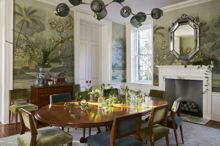
Paneling by Woolems with trim by Child Brothers channels Regency-style architecture. The loveseats are upholstered in Brunschwig & Fils fabric. The brass cocktail table is vintage Maison Jansen. The sisal rug is Stark.

Although it was newly constructed, the interior designer, Suzy Moran, worked diligently with the architects and builder to create a home that would blend seamlessly with the surrounding “old Palm Beach” homes in the neighborhood. Honoring aspects of British Colonial and Regency architecture, the 7,000 square foot home looks as though it has been among the old estates for years. It also provides the perfect backdrop to antiques, collectibles, art, and family treasures.

“The interior is meant to be comfortable, elegantly sophisticated, not trendy and, most importantly, a home where family and friends can truly relax…” said Suzy.

Let’s take a tour! Photography provided by Brantley Photography.

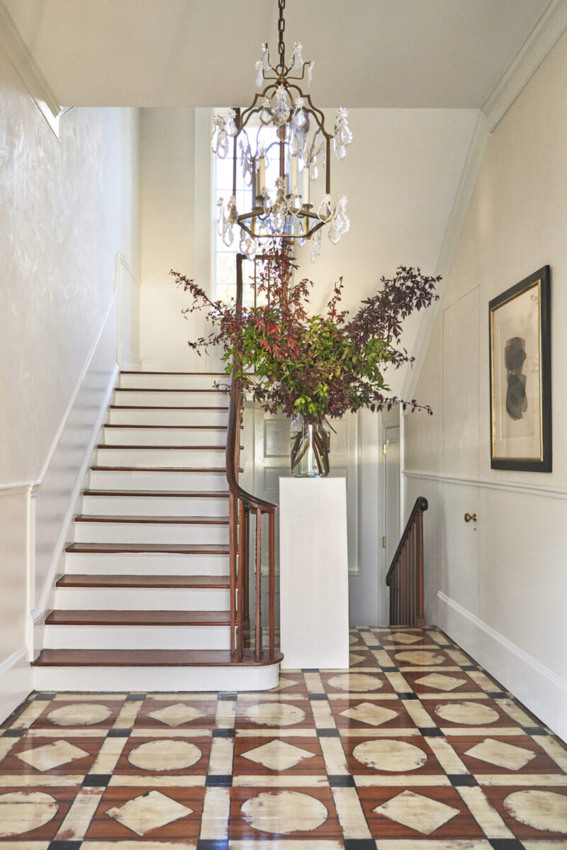
A Vaughan chandelier lights the entry, and the walls are hand-painted by Maria Gugliuzza in a leafy design. The doors were custom-fabricated by Child Brothers.
The living room sofa is upholstered in Scalamandré and is flanked by chairs in Brunschwig & Fils… the pattern matches the fabric of the nearby love seats. Green garden seats from Mecox, a black lacquered Chinoiserie coffee, and an antique French landscape painting complete the elegant look.
The accent pillows on the Scalamandré sofa were custom made using Braquenié fabrics.
Corian countertops provide durability in the classic white kitchen.

Built-in benches serve as storage and feature cushions in a Brunschwig & Fils fabric. The custom-painted green lanterns are by Coleen & Company.
Woodwork by Artistry Masters of Woodcraft and trim by Child Brothers. The curtains, shades, and chairs feature Old World Weavers fabric.
A Brunschwig & Fils chintz graces the master bedroom.

Whitecraft by Woodard chaises covered in Sunbrella surround the pool.

We simply could not love this house more! It is such a timeless classic, designed to last a lifetime. Click here to read more in Luxe.

Interior design: Suzy Moran, Greenfield Grange, Inc.
Architecture: Mark Finlay and Jay Valade, Mark P. Finlay Architects, AIA.
Home Builder: Jim Woolems, Woolems Inc.
Landscape Architecture: John E. Lang, Lang Design Group
Photography: Brantley Photography (follow on Instagram)

Schiaparelli at the V&A, Ruggable x Scalamandré Rugs, and James Showroom Palm Beach Pop-Up

Welcome to TGP Tidbits where we round up the happenings and our musings of the design industry each week. This week we take a look at Schiaparelli at the V&A, Ruggable x Scalamandré Rugs, and the James Showroom Palm Beach Pop-Up. Written by Natalie Aldridge.

Schiaparelli at the V&A

London is gearing up for a fashion exhibition that will be a must see. In spring 2026, the Victoria and Albert Museum will open Schiaparelli: Fashion Becomes Art, the UK’s first major exhibition dedicated to the great Elsa Schiaparelli, one of the 20th century’s most visionary designers. Running from March 28th through November 1st, the show will follow the extraordinary legacy of Elsa Schiaparelli, from her Surrealist beginnings in the 1920s to the house’s present-day direction.

V&A exhibitions are always a favorite, consistently immersive and impeccably executed, and this promises to be no exception. Schiaparelli’s world lends itself naturally to spectacle and storytelling, where fashion, art, theater, and fantasy all come together. Long before “fashion as art” became a familiar phrase, she was blurring those boundaries through outlandish silhouettes, unexpected materials, and collaborations with artists including Salvador Dalí and Jean Cocteau.

The exhibition will present more than 200 objects, from couture garments and jewelry to paintings, photographs, perfumes, and archival material, positioning Schiaparelli not simply as a couturier but as a creative force whose influence extended far beyond the runway. Rather than a traditional retrospective, the show will be a richly layered exploration of how imagination, craftsmanship, and cultural converge.

Victoria and Albert Museum

For anyone drawn to the intersection of fashion, art, and design history, Schiaparelli: Fashion Becomes Art feels destined to become one of the standout exhibitions on the 2026 cultural calendar. Tickets go on sale here February 3rd. We cannot wait to visit! Schiaparelli at the V&A!

Ruggable x Scalamandré Rugs

There are few names in American decoration that carry as much visual memory as Scalamandré, which is why its new collaboration with Ruggable feels genuinely interesting and timely. Not because it’s loud, but because it’s clever and perfectly bold.

Ruggable x Scalamandré

Scalamandré patterns have long lived in the margins of our cultural imagination. They show up in rooms you remember long after you’ve left them. Translating those storied motifs into rugs feels like a natural evolution, especially when done in a way that doesn’t ask you to treat them like museum pieces. The iconic Zebras, cheetahs, and a tigers feel familiar here, but softened, grounded, and meant to be lived with.

Ruggable x Scalamandré

What’s appealing is the lack of fuss. These rugs don’t demand a room be designed around them. They simply take their place and do the work. They’re an instant character builder. It’s heritage design that understands modern life. At The Glam Pad, we’re always drawn to moments where classic pieces adapt without losing their point of view. This collection manages exactly that. It’s not about reinvention but a modern take on a classic . Shop the full collection here!

JAMES Showroom Palm Beach Pop-Up

The JAMES Showroom is heading to Palm Beach! Beginning February 18th, the beloved multi-line showroom will pop up in the Casa Branca Atelier & Showroom, bringing more than 20 artisanal lines to the Palm Beach design community.


View this post on Instagram


A post shared by JAMES Showroom (@jamesshowroom)

Known for its thoughtfully curated roster of textiles, lighting, furniture, rugs, and decorative objects, JAMES Showroom has become a trusted source for designers who value craftsmanship, character, and pieces with a point of view. The Palm Beach pop-up will be a rare opportunity to see a wide range of makers in one place within the inspiring environment of Casa Branca.


View this post on Instagram


A post shared by JAMES Showroom (@jamesshowroom)

The pairing feels particularly fitting as the Casa Branca Atelier has quickly become a creative hub, celebrated for its bold patterns and spirited approach to interiors. With JAMES joining the mix, it will be a lively exchange of ideas, materials, and inspiration. If you find yourself in Palm Beach this February, plan a visit and stop in. It is the kind of pop-up that that will be especially worth the trip.

You can read more about Meredith Ellis, founder and owner of JAMES via our Style Profile and Design Crush.

Meredith Ellis
Meredith Ellis
Meredith Ellis
Meredith Ellis
Meredith Ellis

Read our favorite articles of the week!

This Waterfront Caribbean Villa Doubles as a Global Gallery Filled with Rare Art and Timeless Treasures written by Celia Barbour for Veranda.

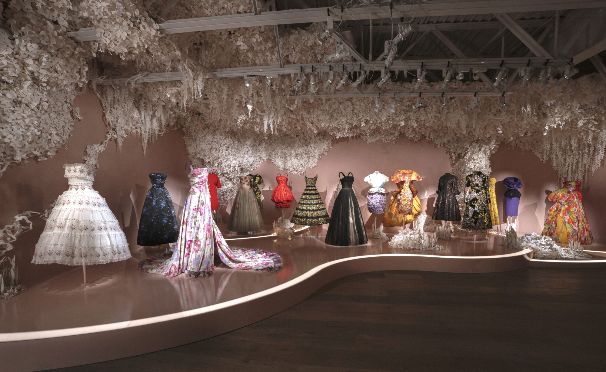
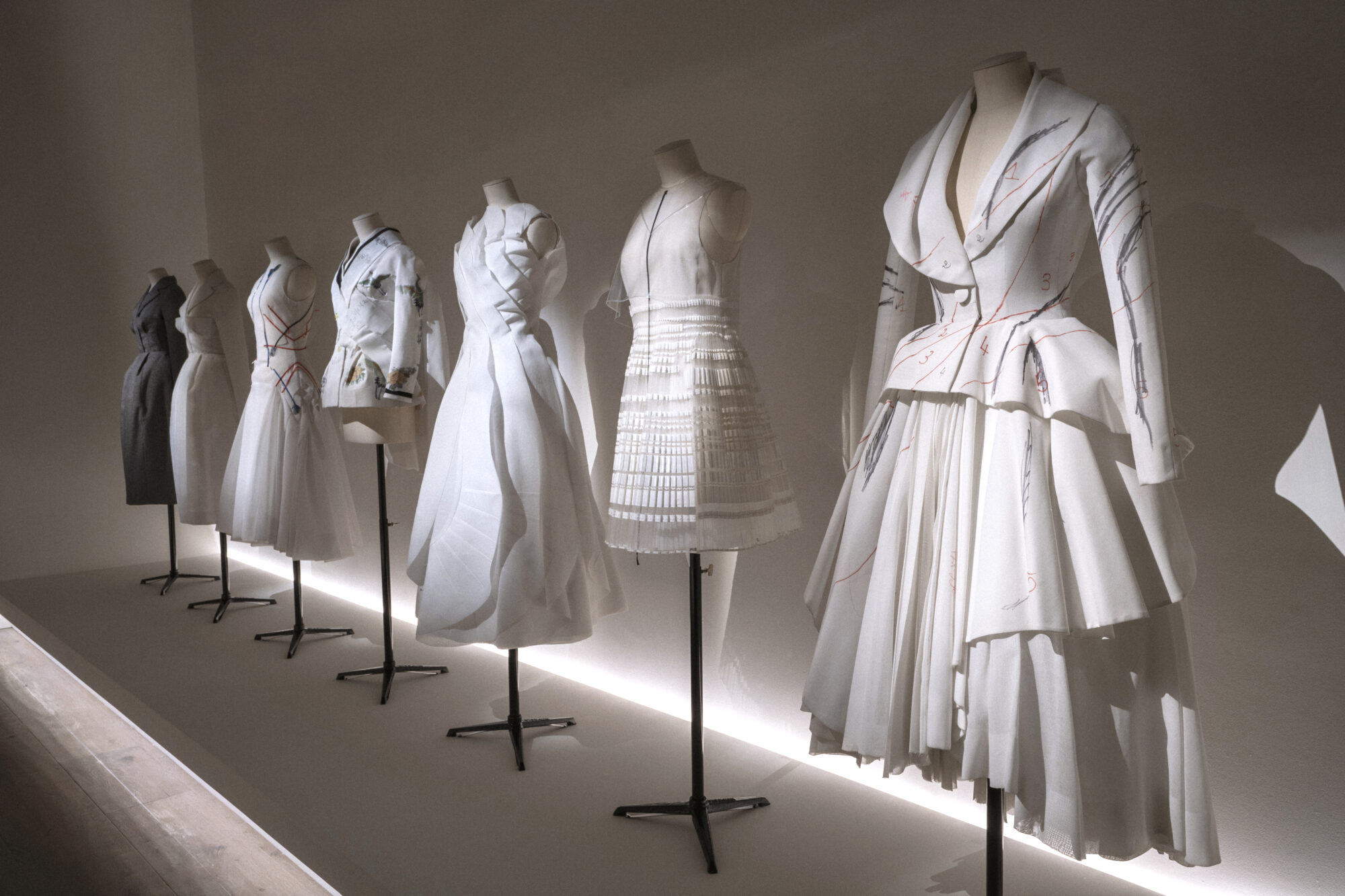
In Jonathan Anderson’s Dior Couture Debut, Nature is High Art written by Jenna Adrian-Diaz for Galerie Magazine. 

Shop this week’s inspired finds!

x Natalie

Follow TGP on Instagram: @theglampad
Follow Natalie on Instagram: @natalieealdridge
White: Pantone’s 2026 Color of the Year, The Boldest Choice of All?

Written by Natalie Aldridge.

Before the turn of the new year, Pantone crowns a Color of the Year, offering a glimpse into possible trends for the coming year and what we are meant to want right now. The ritual implies novelty, urgency, and a collective pivot toward something new. Each year, the color leans punchy, saturated, and somehow expected. This year, however, came with renewed surprise, as for the first time Pantone chose a white shade as its Color of the Year. Meant to represent calm, serenity, and a fresh start in a noisy world, Cloud Dancer is a soft, floaty white.

As an interior designer, I often think of white as a non-color. A given, and an accidental afterthought. Therefore, I initially rejected the notion of white being the Color of the Year. White exists entirely outside this system. It is not new, not reactive, and not especially interested in being noticed. White does not mark a moment. It ignores it. Yet, upon further thought, it brings to light the true role of white in interiors.

Lindsey Abernathy’s Rose Covered Cottage
Design by Ashley Hanley; Photography by Kip Dawkins Photography.
Anne Wagoner Interiors
Chad Graci

The recent framing of white as a “return to simplicity” misunderstands its role altogether. It is not a reaction to visual noise or a corrective to maximalism. It is not a detox. It is a constant. Long before trend cycles accelerated and color became content, white existed as an architectural and decorative baseline, ever-present and grounding. It has always been there, waiting for everything else to fall away.

Lindsey Abernathy’s Rose Covered Cottage
Hillary Taylor Interiors
The Fox Group
What makes white compelling is not its neutrality, but both its difficulty and necessity. A white room leaves nowhere to hide. Proportion, material, light, and craft are all exposed. Bad detailing becomes obvious. Cheap materials feel cheaper. There is no color to distract from imbalance or excess. White demands restraint, editing, and a clear understanding of when to stop. It is less forgiving than almost any color precisely because it appears so simple.

Design by Ashley Hanley; Photography by Kip Dawkins Photography.
Design by Todd Richesin; Photograph by Ben Finch
Josh Pickering, Pickering House Design 

Contemporary designers like Rose Tarlow, Axel Vervoordt, and Rose Uniacke have long understood this. In their work, white is not a backdrop but a discipline. It is layered, weighted, and deeply intentional. Plaster against linen, aged wood against stone, with light doing as much work as any object in the room. Suddenly, the textures of fabric, the finishes of surfaces, the shadows of moldings, and the curves of furniture take center stage. These are interiors that absorb history rather than erase it, where time is an asset, not something to be disguised.

Sara Hillery Interior Design
Design by Ashley Hanley; Photography by Kip Dawkins Photography
Anne Wagoner Interiors
Phoebe and James Michael Howard
Phoebe Howard

Historically, Elsie de Wolfe, arguably the original modernist in interiors, used white to reject Victorian heaviness. Her whites were about light, air, and clarity, a radical move in the early 20th century. White was used as liberation, not minimalism. The great Billy Baldwin quite often used white with equal elegance and ease. His rooms balanced comfort and refinement, using white to unify disparate furnishings and collections, making it livable rather than precious.

THE ELEGANT LIFE: Rooms that Welcome and Inspire by Alex Papachristidis written with Mitchell Owens© Courtesy of Rizzoli New York, 2022
Lindsey Abernathy’s Rose Covered Cottage

In our world, we champion color, often leaving us to believe white is a cop-out. Yet white asks more of a space than almost any hue. If it requires greater confidence, restraint, and understanding to get right, shouldn’t white be considered the boldest choice of all?
x Natalie

Follow TGP on Instagram: @theglampad
Follow Natalie on Instagram: @natalieealdridge